Good user experience (UX) starts with a simple test: can someone achieve their goal without guessing what to do next- A visually polished website can still fail if its navigation hides the right service, its forms reject valid information, or its confirmation message leaves people uncertain.
Consider a person paying a council bill on their phone. They need to find the correct payment option, understand the amount due, enter details confidently and know whether the payment succeeded. UX design connects every part of that journey: the information, interface, technology, accessibility and service behind it.
What Is UX Design?
UX design makes products useful, understandable and workable. For websites, it covers the journey from a person?s need through task completion and support, balancing user goals with business and technical constraints.
UX is not a decorative layer added after web development. It influences which features belong on a website, how content is organised, what a button does, how errors are handled and whether the underlying service delivers what it promises. Don Norman and Jakob Nielsen's broader definition of user experience also includes interactions with a company's products and services beyond a single screen.
For a website, three questions expose the foundations: Does it offer what people need- Can they find and use it- Can they complete the task under their real-world conditions? A fast checkout is not helpful if a delivery option is unavailable in the customer's area. Attractive navigation is not helpful if the service a visitor needs is missing.

UX vs UI, Usability and Accessibility
These disciplines overlap, but they solve different problems. Confusing them often leads teams to redesign colours and buttons when the actual issue is a missing service, unclear language or an overly complicated workflow.
| Discipline | Main question | Council-payment example |
|---|---|---|
| User experience (UX) | Can the person achieve the right outcome across the journey? | Find the payment, complete it and receive trustworthy confirmation. |
| User interface (UI) | How does the person interact with the screen? | Clear form labels, buttons, layout, typography and feedback. |
| Usability | How easy, efficient and satisfying is the interaction? | Few avoidable errors; no need to re-enter information unnecessarily. |
| Accessibility | Can people with different abilities and technologies use it? | Keyboard-operable controls, readable contrast and screen-reader-friendly errors. |
Usability has several dimensions. Jakob Nielsen describes learnability, efficiency, memorability, errors and satisfaction . Utility asks whether the product provides the necessary function in the first place. Both are essential: a website can be easy to use yet unable to solve the user's problem.
Related fields extend the picture. Interaction design shapes what happens when people act; visual design shapes hierarchy and appearance; content design makes instructions meaningful; and service design connects online tasks with staff, policies and offline touchpoints. Customer experience (CX) covers the wider relationship with an organisation, while UX often focuses on a particular product or service journey.
Eight UX Fundamentals That article Better Decisions
1. Design around user needs, not internal structures
Human-centred design, also called user-centred design, starts with what people want to accomplish. Identify the audience, the task, the environment and the barriers before choosing a layout. A council website should group services around public needs rather than assuming residents know the council's organisational chart. Interviews and task observation can reveal a different mental model from the one stakeholders expect.
2. Make the useful action findable
Good information architecture (IA) gives content a predictable structure through navigation, sitemaps, headings, search and content taxonomy. Label categories with words users recognise. On a service website, “Pay a bill” is often more actionable than an internal department name. Test whether someone can locate an option without being told where it lives.
3. Reduce unnecessary cognitive load
Working memory is limited. Long forms, competing calls to action and unfamiliar terminology force people to remember information that the interface could show. Use progressive disclosure, chunking, sensible grouping, readable whitespace and clear visual hierarchy to reduce choice overload. Break a complex task into meaningful steps, but avoid creating extra screens just to make each one look simpler.
4. Keep patterns consistent without hiding differences
Consistent navigation menus, links, buttons and error patterns make a website easier to learn. A design system or style article can help teams repeat accessible interface components. Consistency is not uniformity at any cost: a destructive action needs a different treatment from a routine next step.
5. Make system status and recovery visible
Every consequential interaction needs useful feedback. Show when a form is submitting, whether a file uploaded, what went wrong and how to fix it. Prevent avoidable errors with suitable constraints, but retain user control and freedom: people should be able to correct a mistake without losing their work. Replace vague “Invalid input” messages with a specific instruction close to the affected field.
6. Design accessibility into the first draft
Inclusive design considers people using keyboards, screen readers, magnification, touch or different input methods. Accessible names, visible focus indicators, labels, contrast and alternative text belong in wireframes and prototypes, not merely the final QA checklist. Accessibility improves participation but must still be checked against specific requirements rather than assumed from visual appearance.
7. Respect the device and situation
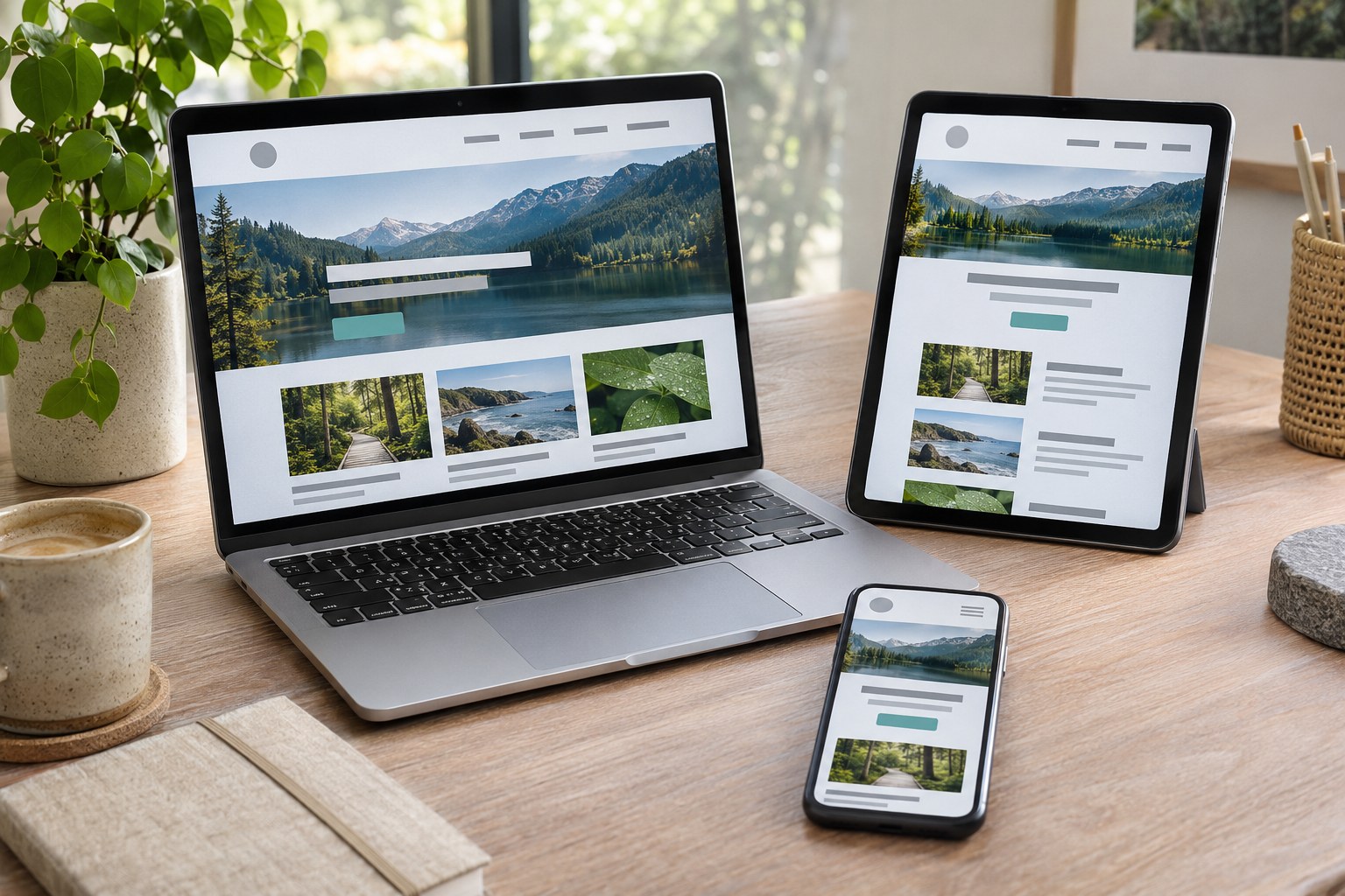
Responsive design should preserve task completion across small screens, zoom levels and different orientations. A tidy desktop form may become difficult on mobile when the keyboard covers the submit button. Site speed, web performance, interrupted connections and limited attention affect the experience as much as visual style.
Build trust with accurate content and clear outcomes
Trust depends on accurate content, clear costs, privacy information, working links and honest confirmations. A prominent button cannot fix unclear terms or a broken service. Morville?s honeycomb offers prompts, but does not replace observing people use the product.
A UX Process from First Questions to Interface
UX work is iterative rather than a fixed sequence of workshops. Its roots in human-computer interaction connect human behaviour with technology and interaction design. A team may move between discovery, planning, building, validation and improvement as new evidence appears. Each stage should answer a particular question and leave behind only the artefacts needed for the next decision.
- Discover the task. Define the audience, user goals, pain points and constraints. Review support requests, search logs, site analytics and existing findings. Conduct user interviews or observation when the underlying behaviour is unclear. Output: a clearly stated problem and evidence of where it occurs.
- Define what success looks like. Translate findings into a user scenario, an outcome and a measurable success criterion. A use case or user story can clarify what must happen; a persona or empathy map is useful only when grounded in observed behaviour and checked with user feedback. Output: a prioritised task, constraints and an agreed test.
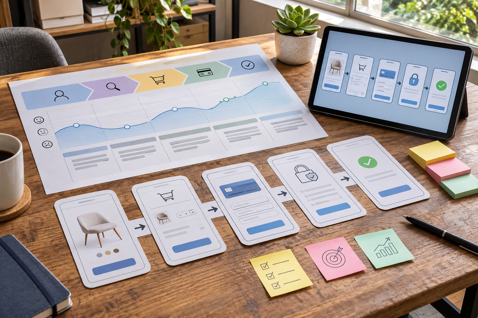
- Structure the experience. Map the user journey, user flow and information architecture. A sitemap shows content destinations; a user journey map shows the broader experience; a flow shows the steps and decisions needed to reach a goal. Card sorting can inform categories, while tree testing checks whether people can find items within them. Output: an understandable path through the service.
- Explore and prototype. Ideation and sketching generate alternatives. Low-fidelity wireframes test structure cheaply; mockups explore layout, typography, colour and content; interactive or high-fidelity prototypes make important states testable. Tools such as Figma or FigJam can support collaboration, but the tool itself does not validate a design. Output: a testable solution, not a finished-looking guess.
- Test before committing. Ask representative people to complete realistic tasks without coaching them through the interface. Observe hesitation, errors, unexpected routes and recovery attempts. Include accessibility checks and test with disabled users where relevant. Output: evidence about what succeeds, fails and why.
- Build, measure and iterate. Designers, developers, UX practitioners, content specialists and product stakeholders refine the interface, implement it with semantic HTML, CSS and JavaScript, then measure outcomes after release. Recheck the experience when content, policy, devices or user needs change. Output: continuous improvement against the original task.
The five planes of UX - strategy plane, scope plane, structure plane, skeleton plane and surface plane - provide another useful way to diagnose problems. If the strategy or scope is wrong, polishing the surface will not solve it. Design thinking is valuable when it encourages empathy, exploration and validation; a ritualised process without evidence is not.

Which UX Method Fits the Question?
Choose a method for the question at hand. Interviews and observation can explain why people struggle; quantitative measures can estimate how often a problem occurs. Attitudinal methods show what people say, while behavioural methods show what they do. Both can be useful.
| Question | Useful method | Important limitation |
|---|---|---|
| Why can't people complete a task? | Moderated usability testing, user observation, interviews | Small qualitative samples identify issues, not population-wide rates. |
| How should content be grouped or labelled? | Card sorting, tree testing, search-term analysis | A preferred category label does not prove the whole journey works. |
| Where are users dropping out? | Web analytics, funnel analysis, error logs | Drop-off reveals where something happens, not necessarily why. |
| What do different audiences need? | Interviews, field studies, surveys, questionnaires | Recruitment bias and self-reporting can distort findings. |
| Which of two live designs performs better? | A/B testing with defined success and guardrail metrics | Traffic, test duration and accessibility must support the comparison. |
Competitor reviews show common patterns, not how your audience behaves. Workshops and interviews surface ideas but cannot prove a navigation works. Use participant feedback to make a specific change, then test the task; keep consent and records clear.
For an existing website with a clearly defined task failure, observing a few relevant users can be more useful than producing new personas. For a new service with uncertain demand, begin with needs and context before testing interface details. Nielsen Norman Group's methods article similarly treats methods as choices suited to different questions rather than mandatory stages.
UX Example: Clarifying a Payment Journey
Imagine analytics show that people start a council-payment form but frequently abandon it. The original design has an ambiguous “Reference” field, a long ungrouped form and a confirmation screen that says only “Done”. A new button colour might increase attention but would not address the uncertainty.
- Observe: watch people attempt a realistic payment using test details. Ask what they expect “Reference” to mean, and examine support questions about payment confirmation.
- Change the mechanism: label the field according to the actual identifier required, add an example format, group related inputs and explain how a successful payment will be confirmed. Make any error actionable without clearing unrelated fields.
- Verify: test the revised prototype with the same task and comparable conditions. Compare task completion, errors, uncertainty and the ability to locate a receipt; check keyboard and screen-reader use.
- Monitor: after release, inspect valid payment completion rather than treating more clicks or a higher button-click rate as proof of success.
The useful improvement comes from resolving the uncertainty that causes the error, then verifying that people can finish the task - not from changing a visual detail without evidence.
Turning UX Decisions into Clear Web Interfaces
Interface design makes the intended action evident. Use a meaningful heading hierarchy, descriptive links and concise UX writing. A primary button should describe its outcome - “Confirm payment” conveys more than “Continue” when the action is final. Microcopy can explain an unusual field without overwhelming every screen with instructions.
Use hierarchy and spacing to guide attention; never rely on colour alone. Cards help compare options, accordions suit secondary details and search helps when users know what they need. Carousels can hide content; modals interrupt a flow.
Design principles are prompts, not laws. Familiar controls reduce relearning; fewer simultaneous choices can reduce effort; larger, closer targets are easier to select. Grouping and distinctive elements guide attention, while visual appeal can make a product seem easier than it is. Test the actual task.
For a quick expert review, Nielsen's ten usability heuristics cover visible system status; a match with real-world language; user control; consistency; error prevention; recognition rather than recall; flexibility; minimalist design; error recovery; and help or documentation. A heuristic evaluation can flag likely issues, but real users still need to validate their severity.
Accessibility and UX in Aotearoa New Zealand
Accessible UX is essential for public services and valuable for every organisation. People may use screen readers, keyboard navigation, voice input, zoom or assistive technology; others may face temporary injuries, difficult lighting, an unreliable connection or unfamiliar terminology. Design for the actual range of users instead of assuming a single ideal user.
For government websites, the legal and policy scope matters. The NZ Government Web Accessibility Standard 1.2 , effective from 17 March 2025, requires the organisations covered by the standard to meet WCAG 2.2 Level AA for relevant web pages, subject to its specified exceptions. The separate Web Usability Standard 1.4 addresses other government website requirements. Those mandates should not be described as automatically applying to every private-sector site.
Use W3C's WCAG 2.2 accessibility standard as a technical reference and the NZ Government Web Accessibility article for role-specific implementation advice. The following checks catch practical problems early:
- Give images meaningful alternative (alt) text when they convey information; avoid duplicating adjacent text.
- Use semantic HTML headings, lists, buttons, links and form labels so assistive technology can interpret the page.
- Ensure keyboard accessibility, a logical focus order, a visible focus indicator and focus that is not obscured by sticky elements.
- Check text contrast and the relevant contrast ratio, colour-standalone cues, zoom and reflow on narrow screens.
- Provide adequate touch-target size or spacing; WCAG 2.2 includes a target-size criterion with defined exceptions.
- Show errors in text, identify affected fields and provide accessible names and instructions.
- Include a skip link where useful, captions for relevant video and accessible alternatives for complex content.
- Test meaningful states: open menus, expanded accordions, form validation, loading feedback and successful completion.
Automated accessibility checks are useful but cannot establish full conformance or tell whether a task makes sense. Include disabled participants in usability testing and check real workflows with assistive technology. For New Zealand audiences, plain English is a sensible baseline; language choice, M?ori names and correct macrons, and any need for te reo M?ori or other language support should follow the people and services involved rather than stereotypes.
How to Test and Measure UX Improvements
Start with one realistic task and a baseline. Ask participants to complete it without describing which controls to use. Record both what happened and why it happened : success, hesitation, navigation mistakes, unexpected interpretations and errors. A usability test may be moderated in person or remotely; the important point is that the task, participants and observation method match the question.
| Measure | What it tells you | Watch out for |
|---|---|---|
| Task completion rate | Whether people finish the intended task correctly | Define what counts as success before testing. |
| Time on task | How long successful attempts take | Speed alone can hide rushed mistakes. |
| Error rate and recovery | Where mistakes occur and whether people can fix them | Separate minor slips from consequential failures. |
| User satisfaction or SUS | How people perceive the experience | Reported ease does not replace observed task success. |
| Conversion rate or valid submissions | Whether a live service achieves its intended outcome | Track quality and exclusion, not only volume. |
If a payment-field rewrite aims to reduce reference errors, track that error rate alongside task completion and accessibility. Compare similar audiences before and after; use an A/B test only when traffic and sample size support it.
Use web analytics to detect patterns, qualitative user testing to interpret them, and repeated measurement to see whether the change holds up. A heatmap may show where people click, but not whether those clicks helped. Optimising a sales funnel or engagement metric at the expense of clarity, privacy or task success is not a UX improvement.
Common UX Mistakes - and What to Do Instead
- Starting with a polished mockup: agree on the user task and information structure before investing in high-fidelity visual detail.
- Relying on assumptions about users: check support evidence, recruit relevant participants and observe behaviour instead of inventing a persona.
- Confusing activity with progress: more page views, clicks or screens do not necessarily mean better task completion.
- Making errors costly: preserve entered data, explain recovery and avoid surprising users with irreversible actions.
- Testing only on desktop: include mobile devices, zoom, keyboard use, slow connections and different ways of interacting.
- Treating accessibility as a final audit: design accessible interaction states and content from the start, then verify them.
- Copying fashionable interface patterns: compare the pattern with users' actual goals and cognitive demands before adopting it.
- Assuming one test settles the matter: revisit changes when the audience, service or content changes.
Start by Reviewing One User Journey
You do not need a complete redesign to apply UX fundamentals. Choose one high-value task - finding opening hours, submitting an application, booking an appointment or paying an invoice - and examine it end to end.
- State the outcome: “A first-time visitor can find the right service and complete the request without assistance.”
- Walk the path: begin from a likely search result or landing page, not only from the homepage.
- Check the interface: inspect navigation, headings, calls to action, input labels, progress feedback and error recovery.
- Check the constraints: use a phone, keyboard and zoom; consider actual content and accessibility requirements.
- Watch someone try: note where the person's expectation diverges from the interface, without coaching them.
- Make one targeted change: identify the mechanism it should improve and choose a metric that can confirm or challenge the hypothesis.
A successful first pass produces a more understandable journey and a specific next experiment - not simply a longer list of design recommendations.
UX Fundamentals: Frequently Asked Questions
Do you need to know how to code to learn UX?
Coding is not a prerequisite for understanding user needs and journeys, information architecture or prototyping. Basic familiarity with HTML, CSS and JavaScript helps UX designers collaborate with developers and understand interaction and accessibility constraints.
Which UX tool should a beginner learn?
Start with an actual user task and a simple sketch. A tool such as Figma can help with wireframes, components and clickable prototypes, but learning to ask a focused question and observe usability problems matters more than mastering a particular interface.
Can analytics replace usability testing?
No. Analytics can show where people abandon a workflow, while usability testing can reveal confusing labels, misunderstood expectations and recovery problems. The two methods answer different questions and work best together.