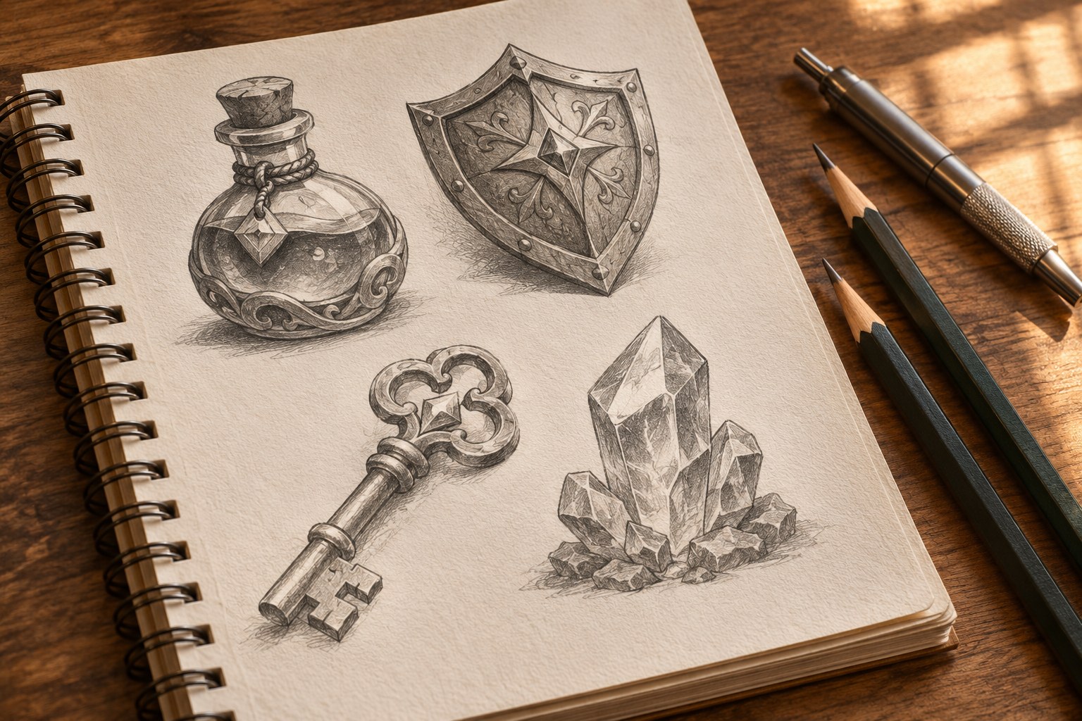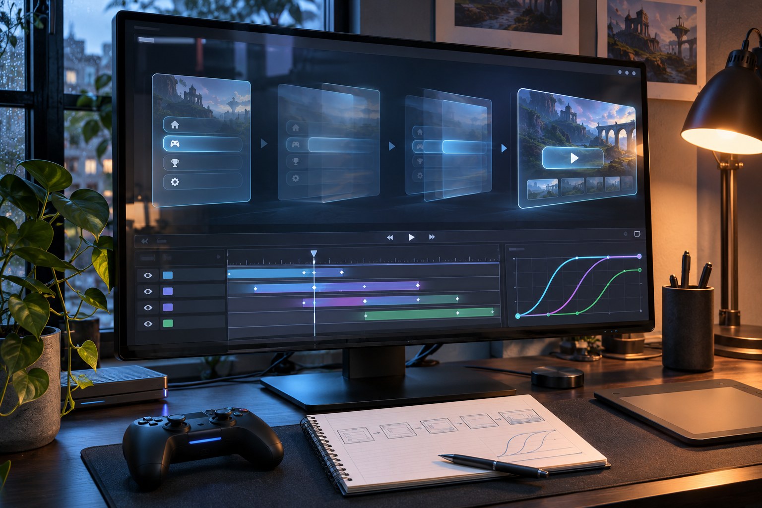
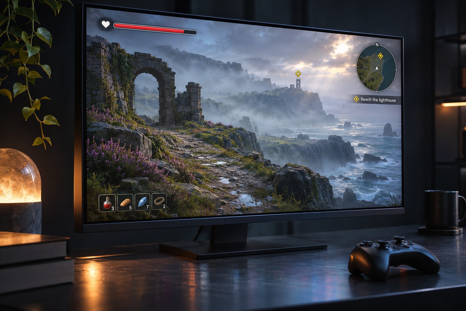
Game UI helps players read the game state and act: a health bar signals danger, a minimap supports navigation and an inventory shows available items. Each element should clarify a decision as well as fit the art style.
The defining design question is what does the player need to know at this moment? Information needed during a split-second encounter belongs within easy glance range. Detailed equipment statistics can wait until the player opens an inventory. An interface that ignores that difference competes with the game for attention.
What counts as game UI?
Game UI extends far beyond the heads-up display, or HUD. It includes what players see during gameplay, the screens they deliberately open, and the feedback they receive after an action. Its components change with the genre, platform and game loop.
- Gameplay HUD: health, shields, stamina, mana, ammunition, score, timers, crosshairs, reticles, cooldowns, minimaps, compasses and objective markers.
- Menus and navigation: title screens, pause menus, save and load slots, level selection, settings, tutorials and confirmation dialogs.
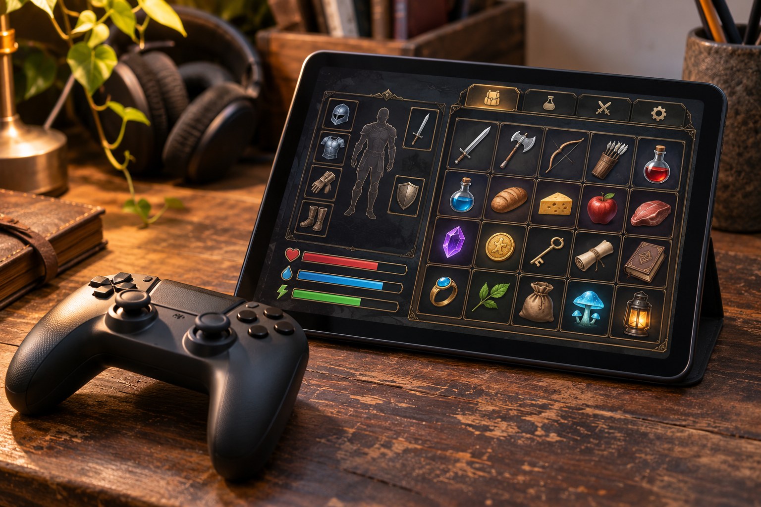
- Progression and equipment: inventory grids, equipment slots, crafting recipes, skill trees, ability bars, quest logs, maps, journals and character statistics.
- Communication and feedback: interaction prompts, dialogue choices, subtitles, tooltips, hit markers, damage indicators, notifications and achievement messages.
- Social and service screens: multiplayer lobbies, party lists, matchmaking states, leaderboards, profiles, in-game shops, virtual currencies and account controls.
UI is the visible layout, controls and states. UX covers the wider journey: learning rules, navigating, recovering from mistakes and understanding results. The HUD is one part of UI.
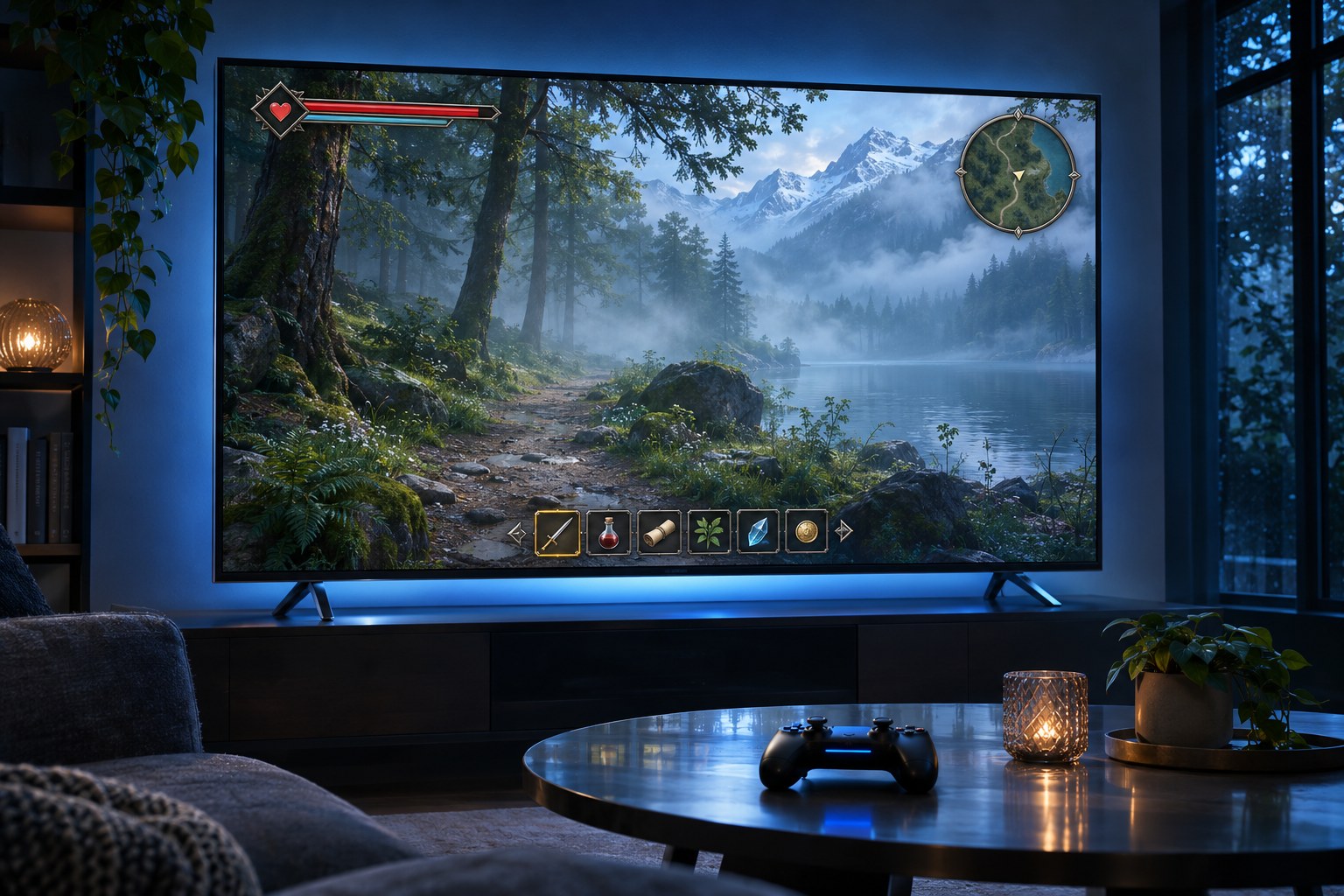
Four Game UI Types: Diegetic, Spatial and Meta
Game interfaces can be classified by whether an element belongs to the fictional world and whether it is positioned within the rendered game space. The distinction helps designers decide where a signal should live, rather than forcing every piece of information into a conventional overlay.
- Non-diegetic UI appears for the player's benefit outside the fiction. A fixed health bar, score counter or minimap in a screen corner remains readable even while the camera moves. It suits information that demands reliable visibility.
- Diegetic UI belongs to the game world and can be perceived by the character. The illuminated health indicator on Isaac's suit in Dead Space turns a status display into part of the character design. A dashboard gauge or an in-world map follows the same principle.
- Spatial UI is positioned within the 3D scene without existing as a fictional object. An outline around an interactable door, a floating enemy health bar or a waypoint anchored to a destination helps players connect information to a place.
- Meta UI communicates a fictional condition through a screen-level effect rather than a physical in-world object. Blood at the screen edges or a damage vignette conveys the character's state without asking the player to read a number.
These categories describe placement, not a ranking of quality. A fully diegetic approach can feel immersive yet hide an urgent warning in a visually busy scene. An overlay sacrifices some fictionality to protect clarity. Hybrid interfaces use the strengths of both: a spatial marker for the object being targeted, a stable HUD for scarce resources and a brief meta effect when the player takes damage.
Match interface patterns to the player's task
The strongest game UI pattern is the one that reduces the work required to make a particular decision. Placing every available statistic on-screen increases information density without necessarily increasing useful information.
| Player task | Useful UI pattern | What needs testing |
|---|---|---|
| Survive an encounter | Health or shield bar, damage direction, ammo and ability cooldown | Can the warning be recognised during combat without searching? |
| Find an objective | Minimap, compass, waypoint or contextual world marker | Does the marker point to a reachable route rather than merely the destination? |
| Choose equipment | Inventory grid or list, item tooltips, sorting, rarity and stat comparison | Can players compare trade-offs without memorising the previous item? |
| Use an ability | Ability bar or radial menu with a readable selected state | Are ready, unavailable and cooling-down states distinguishable without colour alone? |
| Make a story choice | Dialogue panel, speaker label, choice list and consequence cues | Is the meaning of each option clear before it is selected? |
| Join other players | Lobby, party status, matchmaking feedback and connection state | Can players tell whether they are waiting, ready or disconnected? |
Genre determines which patterns deserve constant space. A first-person shooter (FPS) prioritises aim, resources and threat direction. A role-playing game (RPG) needs deeper inventory, quests, character builds and dialogue. Strategy and multiplayer online battle arena (MOBA) games tolerate dense dashboards because players make repeated comparative decisions. A narrative adventure may need little permanent HUD, leaving room for the environment and conversation.
HUD design: visibility without visual clutter
A HUD should distinguish information by urgency and frequency. Health during combat and a rapidly expiring timer are immediate signals. A completed achievement, an encyclopaedia entry or a rarely used crafting statistic can appear on demand. Keeping the centre of the screen available for aiming, movement and world detail reduces the conflict between reading and playing.
Build an information hierarchy
Group readouts that are used together: health near shields, ammunition near weapon state, objectives near a navigation cue. Consistent positioning reduces repeated visual searching. Size, contrast, shape, spacing and motion establish priority, with urgent changes receiving stronger emphasis than ambient information. A low-health state should remain identifiable when effects, enemies and environmental lighting compete for attention.
Contextual or progressive disclosure can remove unnecessary permanent elements. An interaction prompt appears when the player approaches a usable object. An ammo warning becomes prominent when ammunition is scarce. A tutorial hint appears when a mechanic is first needed rather than remaining on-screen through an entire level. Such behaviour still needs predictable rules; a disappearing indicator must not conceal information required for a decision.
Design for the moving scene
Test the same HUD over snow, fire, bright skies, dark interiors, particles and camera shake. A white counter that reads cleanly in a Figma mock-up can become unreadable against a pale background. Text backing plates, outlines and restrained animation protect legibility. Use colour to reinforce meaning, not to carry it alone: a depleted resource can change its icon, length or pattern as well as its hue.
A minimal HUD is not automatically better. Removing a minimap from a game with complex navigation can transfer the effort from reading the screen to remembering a route. Reducing elements is worthwhile only when the player's necessary information remains available through another dependable signal.
Menus, inventories and progression systems
Menus are slower-paced decision spaces than combat overlays, but they still need clear hierarchy. A title screen should make the primary play action easy to locate. Pause menus should distinguish Resume from settings, accessibility controls and save management. Destructive choices such as overwriting a save need explicit labels and a way to cancel.
For inventories, grids show spatial fit while lists support search and comparison. Keep equipped-item values visible beside alternatives. Add filters and sorting when they reduce a real search burden.
Skill trees and progression screens need to distinguish unlocked, available, locked and unaffordable nodes. The visual connection between prerequisites should match the underlying rules. Shops and reward screens must show costs, currency types and the effect of a purchase before confirmation; visual excitement cannot substitute for transparent information.
Menu navigation is also an input problem. Every selectable item needs normal, focused, pressed, disabled and, where relevant, loading or error states. Keyboard tab order, gamepad directional focus and mouse hover should lead to the same logical destinations. Focus must remain visible after a modal closes or a list updates.
PC, console and mobile need different interface behaviour
PC interfaces can support precise mouse targets, keyboard shortcuts, hover tooltips and dense panels. The same design must remain usable for a player navigating entirely by keyboard or switching to a controller. On-screen prompts should reflect the active input device rather than continuing to display keyboard keys after the player picks up a gamepad.
Console interfaces are commonly viewed from a sofa rather than at desk distance. Small text that looks adequate on a monitor can be hard to read on a television across the room. Larger typography, clearly separated focus targets, predictable directional movement and screen-safe margins matter more than ornamental detail. Controller navigation should not require a mouse cursor unless that interaction has been intentionally designed and tested.
On mobile, fingers cover the action. Make frequent controls large, reachable and clear of screen cut-outs. Apple?s 44-by-44-point target is a useful iOS reference, not a universal game rule; test orientation and repeated gestures.
Responsive UI is not simply shrinking a desktop screen. A touch inventory may need separate tap-to-select and tap-to-place actions in place of hover and drag. A console equipment grid may benefit from deliberate focus paths or a radial menu. Split-screen, ultrawide monitors, handheld PCs and different aspect ratios require layouts that reflow, anchor or scale without hiding critical controls.
Accessible game UI supports more ways to play
Accessibility decisions affect information access, motor control, comprehension and comfort. A visually striking interface can still prevent someone from starting the game if its settings are unreadable or cannot be reached with their input method.
- Text and contrast: use legible typefaces, scalable HUD and menu text, and sufficient separation from changing backgrounds. A 4.5:1 contrast ratio is a practical benchmark for normal text, not an automatic certification of a whole game's accessibility.
- Colour and iconography: pair red/green or rarity colours with labels, shapes, patterns or position. Do not make a critical status depend on colour vision alone.
- Audio and captions: subtitle important dialogue and convey gameplay-critical sound cues visually. Speaker identification, adjustable subtitle size and standalone audio controls improve comprehension.
- Input and focus: support remappable controls, clear focus order and consistent confirm/back behaviour. Avoid requiring a precise pointer to configure an alternative input method.
- Motion and timing: provide controls for screen shake, flashing effects and intense UI animation. Give players adequate time for important prompts and avoid unnecessary time pressure in menus.
- Persistent preferences: retain accessibility and control settings between sessions, including changes to UI scale and narration where supported.
The Xbox accessibility criteria cover text display, contrast, UI navigation, focus handling and input. The game accessibility checks offer practical checks for interface readability and multimodal feedback. Neither replaces testing with players who use different devices, abilities and assistive technologies.
From wireframes and UI kits to an in-engine interface
A workable game UI process starts with player actions and system states, not decorative panels. List what a player must do, what the game must communicate, which input devices are supported and what failure looks like. A wireframe can then establish priorities before illustration and motion make changes expensive.
- Map the player flow. Connect launch, onboarding, gameplay, pause, inventory, progression, failure and return paths. Include empty screens, disconnections and cancelled actions.
- Sketch and prototype. Use low-fidelity wireframes for information architecture and interactive prototypes for selection, focus, transitions and feedback. Figma or Sketch can help with layout and visual systems.
- Define a design system. Create reusable components, typography rules, icons, colour tokens, spacing, input glyphs, animation timing and state variations. A ready-made game UI kit may accelerate exploration but cannot replace genre-specific interaction design.
- Integrate with game state. Connect health bars, quest trackers, inventories, menus and multiplayer status to real game data. Check loading, errors, delayed responses and dynamic changes.
- Test on target hardware. Check readability, focus navigation, memory use, performance, localisation, text overflow and safe areas under actual gameplay conditions.
Unity supports UI Toolkit and uGUI; Unreal uses UMG and Slate, with CommonUI for shared navigation patterns. Godot uses Control nodes, themes and containers. Roblox uses platform-specific components. Choose based on engine, input and target devices.
Moving artwork from a design tool into an engine does not transfer the interaction model automatically. Focus order, data binding, responsive layouts, controller glyphs, localisation and animation states still need implementation. UI designers, UX designers, UI artists, technical UI designers, engineers and QA testers share responsibility for the final experience; smaller studios often combine several of those roles.
DREDGE: Inventory as Part of Play
New Zealand studio Black Salt Games made inventory part of DREDGE?s play. Fish and equipment occupy different shapes in a limited cargo grid, making players weigh valuable catches against gear needed for safety and speed.
The grid also introduced interaction costs. Players needed to rotate irregular items, move pieces between storage areas and understand when a swap was possible. The team explored automatic movement, clearer placement and ways of teaching rotation through the arrangement of items, rather than relying entirely on a tooltip. Those choices are documented in the developer's spatial inventory design breakdown .
For iPhone and iPad, Black Salt Games replaced some mouse-hover actions with taps and adjusted virtual joysticks and thumb zones. Playtests aimed to reduce misplaced items without hiding the game world. Apple platform development presentation
The transferable lesson is not that every game needs a grid inventory. DREDGE makes spatial management meaningful because fitting cargo is part of its core loop. A fast-paced shooter with uninterrupted combat would face a different trade-off. The useful design principle is to test how the input method changes a player's decisions , rather than assume the same screen should behave identically on every platform.
How to test whether a game UI works
A static screenshot can establish visual direction, but it cannot reveal whether a player hesitates, misreads a prompt or loses controller focus. UI testing is most useful when each screen has a task and an observable result.
- HUD recognition: can a new player identify low health, the current objective and an unavailable ability while the scene is moving?
- Menu completion: how many wrong selections or backtracks occur when changing subtitles, remapping a control or loading a save?
- Inventory comprehension: can the player equip, compare, rotate or transfer an item without unexpected losses?
- Input continuity: does switching between keyboard, mouse and gamepad preserve focus and update button prompts?
- Resilience: what happens to the interface during a network interruption, long loading state, full inventory or missing resource?
- Legibility: does the UI remain readable at the intended viewing distance, at each supported aspect ratio, and over bright or animated scenery?
Observe task completion, hesitation, navigation errors and missed warnings alongside player feedback. Measure the outcome the interface is meant to improve: fewer incorrect purchases, faster access to settings or more reliable recognition of danger. A higher click rate or longer time spent in a menu is not inherently a better player experience.
Common mistakes in game UI design
Designing only for a clean mock-up misses motion, particles, language expansion and performance constraints. Leaving every indicator visible creates a crowded HUD that makes the most urgent signal harder to spot. Relying on colour or sound alone hides information from some players and fails under distracting conditions. Ignoring controller focus turns an attractive menu into a navigation obstacle.
Another failure is treating immersion as a reason to conceal vital information. A diegetic display should not demand a camera movement or lengthy animation every time a player needs to check an urgent resource. Monetisation screens bring a separate risk: unclear pricing, ambiguous currency conversion and misleading confirmation states damage trust even when the artwork is polished.
For teams working in Aotearoa New Zealand, English (NZ) spelling can be part of the copy style while the interface itself remains suitable for an international audience. Games incorporating te reo Māori need font support for macrons, space for translated labels and language review by fluent speakers. Localisation must be planned in the layout, not patched in after the English screens are finalised.