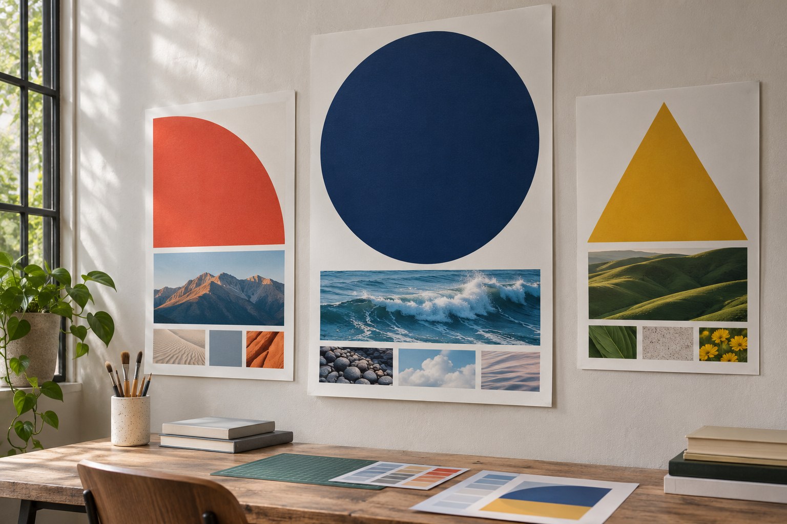
Start a graphic design palette with one dominant colour, supporting neutrals and one deliberate accent . Give each colour a job: establish hierarchy, identify an action, separate data or support readable text. If a hue has no clear role, remove it and see whether anything important is lost.
A logo may need only two colours; a dashboard needs distinguishable series and semantic states. The same combination can look excellent as loose swatches and fail on a mobile screen, a poster or a printed pack. Judge it in the finished medium.
Choose the palette by the job it needs to do
Before using a colour palette generator, decide who needs to read the design, where they will see it and what they should notice first. Those answers rule out unsuitable colours faster than an inspiration gallery.
| Design task | Good starting approach | Reject or revise when |
|---|---|---|
| Logo and brand identity | A recognisable primary colour, a restrained secondary palette and dependable black-and-white versions. | The identity only works on one background or depends on subtle gradients to remain recognisable. |
| Website or user interface (UI) | Role-based colours for backgrounds, text, links, buttons, focus and status messages. | Interactive states are indistinguishable or text fails contrast checks. |
| Infographics and data visualisation | Distinct category colours supported by direct labels, patterns or shapes. | Two series are hard to distinguish in greyscale or with colour vision deficiency. |
| Packaging and print | A compact brand palette checked in CMYK or specified with appropriate spot colours. | The critical hue changes noticeably on the intended stock or finishing process. |
| Social media and marketing | Consistent brand colours with a high-contrast call-to-action (CTA) and adaptable layouts. | The accent competes with the message or small mobile text becomes difficult to read. |
For quiet, unified work, try a monochromatic or analogous scheme. For a focal point, test complementary or split-complementary hues. Triadic schemes give you more separation, but they also need tighter control of saturation and visual weight.
Build a colour palette around roles, not swatches
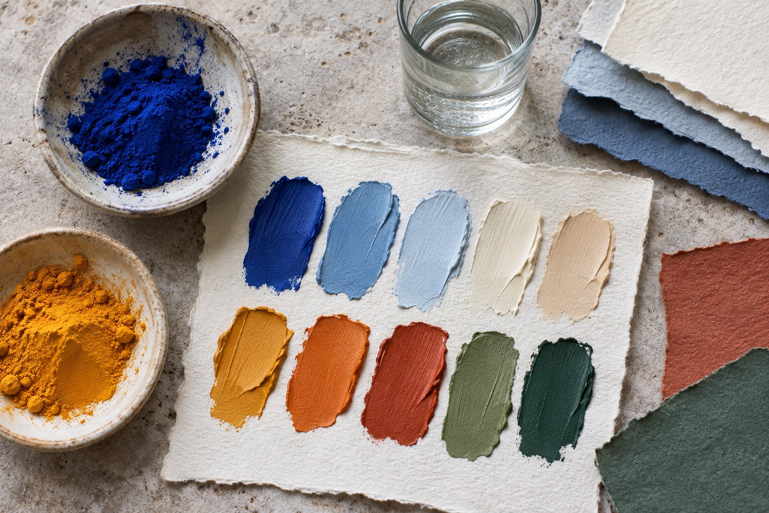
A colour palette contains the actual hues, tints, shades and neutrals chosen for a project. A colour scheme describes how its hues relate on the colour wheel. The wheel can suggest colour harmony; the finished layout determines visual balance and whether text and graphics have enough contrast.
- Define the brief. Name the audience, brand personality, central message, usage context and production limits. Look at competitor colours to learn category conventions, not to copy them.
- Choose a base colour. Start with an approved brand hue or one suited to the subject. View it on both light and dark surfaces.
- Give colours roles. Set primary, secondary, accent, background and text colours. Interfaces also need distinct success, warning and error states.
- Control the core. Three to five colours are often enough; add tints, shades, tones and neutrals before adding unrelated hues.
- Test in context. Put the palette on real typography, images, charts, interface components or packaging proofs. Keep only combinations that work.
The 60 - 30 - 10 rule offers a starting balance: roughly 60% dominant surface, 30% secondary colour and 10% accent. Treat it as a composition article, not an accessibility rule. A warning label needs sufficient contrast even if it occupies less than 1% of the design.
A design system also needs semantic roles. Do not confuse the
primary colour role
of a brand with the wheel's
primary colours
. For a UI, define
surface
,
text
,
action
,
link
,
visited-link
,
focus
,
success
,
warning
and
error
. These colour tokens let teams update a visual identity without changing what a button, link or status colour means to users.
Colour theory: the relationships that change a design
On the traditional red - yellow - blue (RYB) colour wheel, orange, green and purple are secondary colours; tertiary colours lie between a primary and a secondary. The wheel is useful for learning colour relationships, not for predicting how a screen or printer will reproduce a hue.
- Hue names the colour family, such as blue or coral. Saturation describes how vivid or muted it looks.
- Value describes perceived lightness or darkness. Brightness , lightness and relative luminance are not interchangeable: WCAG contrast relies on measured relative luminance.
- Tints, shades and tones traditionally add white, black and grey to a hue. They can extend a palette without adding another hue.
- Colour temperature broadly groups red, orange and yellow as warm and blue, green and many purples as cool. Neutral colours, pastel colours and earth tones can moderate either group.
- Simultaneous contrast makes a swatch appear different against different neighbours. Check it beside actual photography and type.
Gradients can add depth, but text placed across a gradient may lose contrast and the effect may reproduce poorly in a logo. Solid colour blocking is easier to control on posters, packaging and editorial layouts. Compare both in the actual artwork, including a greyscale view.
Types of colour palettes: how they differ
Seven common wheel-based schemes appear in Adobe's colour palette guidance and Figma's palette overview . A tetradic scheme is also called a rectangle or double-complementary scheme.
| Palette type | How the colours relate | When it works | What to check |
|---|---|---|---|
| Monochromatic palette | One hue with different tints, shades and tones. | Minimal identities, editorial layouts and calm interfaces. | Increase value contrast so the hierarchy does not disappear. |
| Analogous palette | Neighbouring hues on the wheel, such as blue, teal and green. | Cohesive illustrations, environmental themes and backgrounds. | Adjacent colours may be too similar for chart categories. |
| Complementary palette | Two opposing hues, such as blue and orange. | Posters, emphasis and a single clear call-to-action. | Avoid giving both hues equal saturation and area if they compete. |
| Split-complementary palette | A base hue plus the two neighbours of its opposite. | Expressive branding needing contrast with more flexibility. | Use one hue as the dominant anchor. |
| Triadic palette | Three hues spaced approximately evenly around the wheel. | Playful campaigns and multi-part illustrations. | Lower saturation or adjust area to prevent visual noise. |
| Tetradic / rectangle palette | Two complementary pairs forming a rectangle; also called double-complementary. | Complex systems with several distinct categories. | Establish hierarchy; four equally strong colours can overwhelm content. |
| Square palette | Four approximately equally spaced hues. | Bold illustrations and carefully controlled categorical systems. | Check every adjacent combination rather than relying on the geometry. |
Neutral and achromatic palettes sit outside that wheel-based classification. Neutral palettes can use beige, brown, grey and earth tones; achromatic ones use black, white and grey. A brand colour palette , website colour scheme or seasonal colour palette names a use, not a new wheel geometry. Seasonal accents can change while the brand's neutral base stays put.
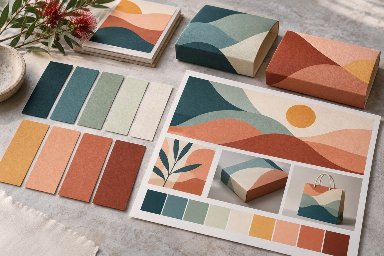
Four original colour palettes with HEX codes
HEX codes make digital swatches reproducible, but the real choice is which colour can carry text, which should remain an accent and what happens when a background changes.
| Scenario | Colour swatches and roles | Why it works - and its limit |
|---|---|---|
| Coastal editorial |
Paper
#F5F3ED
Text
#1C3240
Teal
#2D6773
Coral
#B45B3A
|
Navy and soft paper suit long-form typography. The coral accent is attractive for shapes but fails normal-text AA contrast on the paper background at about 4.21:1. |
| Environmental dashboard |
Surface
#F7FAF5
Text
#203328
Green
#185D50
Rust
#A34F25
|
Useful for sustainability stories; both green and rust clear 4.5:1 against the light surface. Graph categories still need labels or patterns. |
| Community campaign |
Cream
#FFF8F0
Text
#2C2333
Purple
#6A2C70
Yellow
#F7BE55
|
Clear dark typography with a bright attention cue. Use yellow for blocks and illustrations, not automatically for small text on cream. |
| Dark-mode interface |
Surface
#172633
Text
#F6F6F3
Action
#F0B35A
Action text
#1E2933
|
Light text on the navy surface is about 14.25:1; dark text on the amber button is about 7.96:1. Test focus outlines and disabled states separately. |
Worked correction:
coral
#B45B3A
against
#F5F3ED
gives approximately
4.21:1
contrast, below the 4.5:1 threshold for normal text. Use
#A55034
for small text instead: that pairing is approximately
4.98:1
. Keep the original coral for decorative shapes. Figures assume the exact opaque HEX colours and WCAG relative luminance.
RGB, HEX, CMYK and Pantone for Each Output
Screen colour and ink behave differently. Record values for the medium rather than expecting a web swatch to match a print run.
- RGB (red, green, blue) is an additive model for displays. Device profiles and viewing conditions affect the result.
-
HEX colour codes
, such as
#2D6773, specify RGB channel values for CSS, digital swatches and colour tokens. - CMYK (cyan, magenta, yellow, key/black) is a subtractive print model. Some vivid RGB colours fall outside a given print gamut.
- Pantone Matching System (PMS) provides named references and spot-colour specifications. Paper, ink and print method still affect the match.
For packaging or other print-heavy work, confirm the printer's colour profile, paper stock and finish. Proof any critical brand colours. In Adobe Illustrator or Adobe Photoshop, check colour mode and export settings; converting a HEX value to CMYK does not guarantee a visual match. Store approved digital, CMYK and spot-colour references together in the brand specifications.
Colour psychology, identity and the New Zealand context
Colour associations depend on context. Red may signal urgency or celebration; blue can feel calm or conventional; green can suggest nature or an established organisation. Imagery, typography, category and cultural associations shape how a palette reads, so test it in the design.
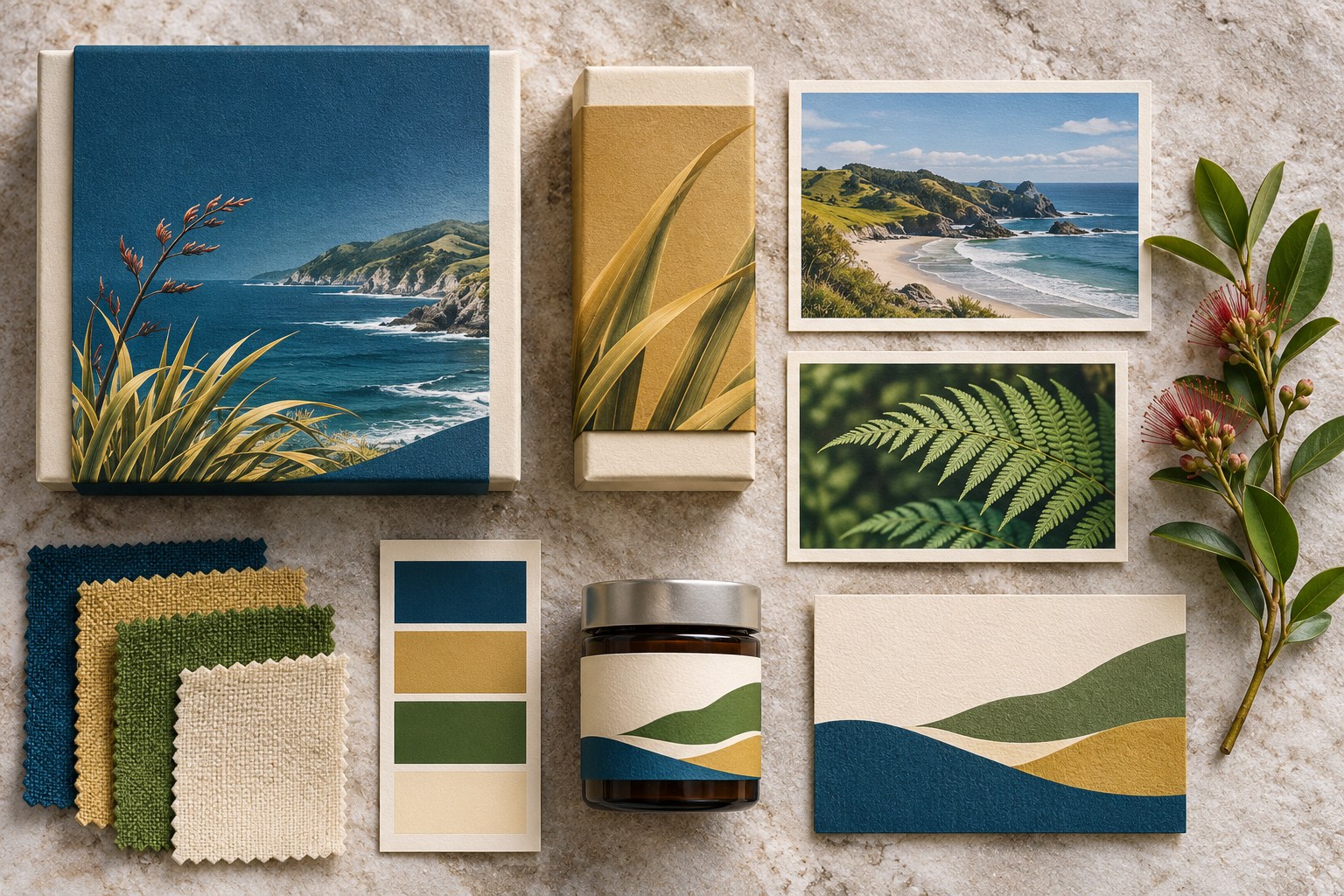
In Aotearoa New Zealand, references to coast, bush or built landscapes may lead to navy, teal, green, muted rust and soft beige. That can establish a regional visual setting without assuming every New Zealander reads those hues the same way. When a design draws on Māori cultural narratives or symbols, involve the relevant people; a colour association is not a substitute for cultural consultation.
The LAWA (Land, Air, Water Aotearoa) design case used an environment-led palette to support navigation and environmental data visualisation. An environmental-data interface needs colours that clarify the data; copying its swatches into unrelated packaging would miss the point.
A consistent brand identity does not require identical colour proportions everywhere. The accent might identify buttons on a website and cover a larger area on a poster. Carry the same core colours through logo design, packaging, social media design and marketing, while allowing carefully defined seasonal colours.
Govt.nz's published palette
uses blue
#336699
and orange
#D34322
as primary colours. These belong to that website, not to all New Zealand organisations. An
older NZ Government Design System (alpha)
recorded slate
#2A2A2A
, link blue
#005DBB
and focus purple
#B53CDE
; those historical tokens are not mandatory defaults for new projects.
Accessibility: harmony is not enough
Test contrast where the colours actually meet: body copy on its background, text inside buttons, focus indicators against adjacent surfaces and labelled shapes in charts. A harmonious palette can still conceal essential information.
| Element | Minimum ratio or principle | Practical check |
|---|---|---|
| Normal text | 4.5:1 normal-text contrast between text and background. | Check the actual foreground/background pair in each component. |
| Large text | 3:1 large-text contrast for qualifying large text (generally at least 18 pt, or 14 pt bold). | Do not apply the large-text exception to ordinary body copy. |
| Essential non-text elements | 3:1 non-text contrast against adjacent colours where needed to identify a control, its state or meaningful graphical information. | Inspect focus indicators, form boundaries and chart marks. |
| Meaning conveyed by colour | Colour must not be the only visual means of communicating essential information. | Pair error red with an error message, warning amber with an icon or text label, and chart colours with labels or patterns. |
The ratios and non-colour requirements come from the W3C WCAG 2.2 accessibility standard . Decorative elements and logos have specific exceptions. Check the requirement for the element in question rather than applying one ratio to every swatch.
The NZ Government Web Accessibility Standard 1.2 took effect on 17 March 2025 , replacing Standard 1.1. It adopts WCAG 2.2 Level AA for organisations within its scope. It is not a blanket legal requirement for every private website, although private-sector teams can use the same checks. Older NZ Government Design System (alpha) references to WCAG 2.1 do not describe the current standard.
Red and green may merge for someone with colour vision deficiency (often called colour blindness). Low contrast can also trouble anyone reading outside in strong sunlight. Check greyscale views, simulate colour-vision differences, inspect keyboard focus and test real text at mobile size. A contrast checker cannot tell you whether someone understands a chart or completes a task.
From Moodboard to Approved Palette
- Set constraints. Confirm audience, brand personality, content density, accessibility and all screen or print deliverables.
- Gather references. Explore a colour wheel, reference images or image colour extraction. Adjust sampled hues before using them for text.
- Compare three directions. Put a restrained neutral or monochromatic option, a related-hue option and a stronger-contrast option on the same mock-up.
- Test roles. Populate headlines, body copy, navigation, links, visited links, CTA, focus, success, warning and error states. Label chart series directly.
- Check the output. Measure contrast, inspect light and dark modes, print a proof where needed and ask representative users what they can find and understand.
- Hand over the system. Save approved swatches, HEX/RGB/CMYK or PMS values, font pairings, semantic tokens and examples in a brand kit. Record allowed seasonal accents.
A proper handover identifies approved pairings, forbidden combinations and the test used to approve them. A board of loose swatches leaves too much to guesswork.
Colour palette tools: choose by task
Use generators to explore, editing tools to apply the choices and a contrast checker to reject weak pairings. None can judge brand fit on its own.
| Need | Tools to consider | Important limitation |
|---|---|---|
| Generate wheel-based combinations | Adobe Color, Paletton, ColorSpace, Coolors and Colormind. | Generated harmony is not proof of usable contrast. |
| Browse colour inspiration | Color Hunt, ColourLovers, ColorLisa and curated examples in Canva or Venngage. | Attractive gallery examples may not suit your brand or task. |
| Inspect and compare references | ColorHexa, BrandColors, Brandfolder and the Toptal Colour Palette Builder. | Check that a reference is current and authorised before adopting a brand value. |
| Apply and manage designs | Figma, Adobe Illustrator, Adobe Photoshop and Canva. | Check exports, component states and colour profiles in the actual deliverable. |
| Measure contrast | WebAIM Contrast Checker and accessibility checks within your design workflow. | A passing ratio does not guarantee understandable charts, interactions or reading order. |
Common palette mistakes and their fixes
- Too many loud hues: choose one dominant colour and reserve accents for meaning.
- Colour psychology as a rulebook: test the mood with the intended audience and imagery.
- Bright but unreadable text: measure luminance contrast, not saturation.
- Red and green as the only chart key: add labels, symbols or patterns.
- One palette for light and dark mode: adjust surfaces, text, borders and interaction states separately.
- Skipping a print proof: approve CMYK or PMS against the intended stock rather than an RGB preview.
Frequently asked questions
How many colours should a graphic design palette contain?
Three to five core colours suit many small identities. A large UI may need more semantic tokens, but it rarely needs that many competing brand hues.
What should be checked before a palette is approved?
Check small text, focus and status cues, greyscale charts, light and dark surfaces and the printed result where relevant. Before sign-off, have someone unfamiliar with the design perform its main task.