
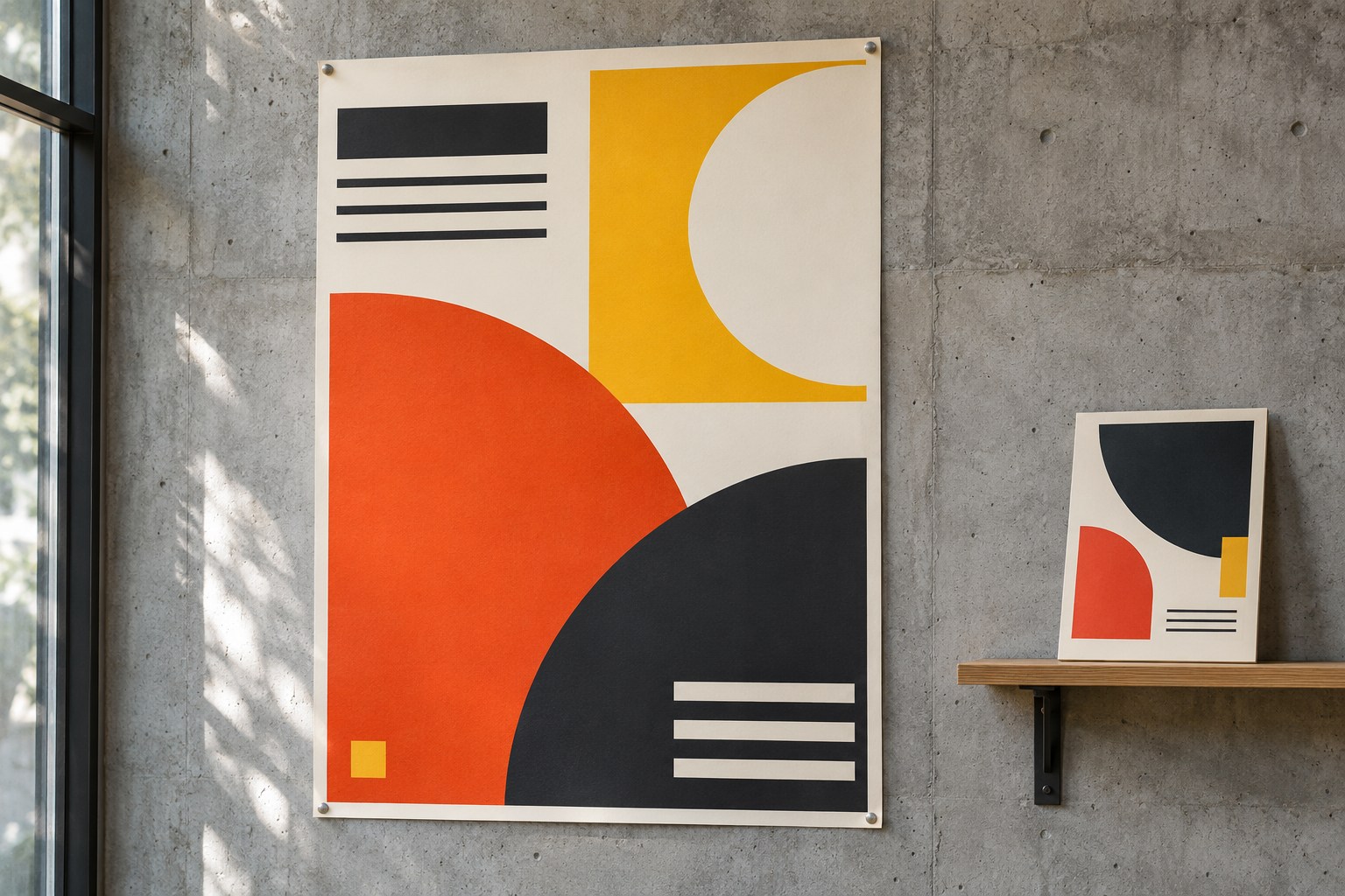
Composition in graphic design is the deliberate arrangement of text, images, shapes, colour and space within a defined area. It determines what people notice first, how they connect pieces of information and whether the message remains clear at a glance. A poster can have beautiful typography and photography yet still fail if the event date disappears into the background or the heading competes with the image.
Strong composition gives every element a job. A focal point attracts attention, visual hierarchy establishes reading order, grouping reveals relationships, and spacing provides room to process the message. These decisions apply to brand identities, editorial layouts, packaging, brochures, signage, social graphics and digital interfaces. The aim is not perfect symmetry or decoration; it is an arrangement that suits the audience, content and medium.
Composition and Layout: How They Differ
Composition concerns the visual relationships within a design: weight, contrast, proportion, rhythm, movement, unity and tension. Layout is the practical organisation of elements on a page or screen, including columns, margins, gutters and alignment. The two work together. A grid can structure a layout, while the placement and emphasis of content within that grid determine its composition.
A centred heading above a photograph produces a different mood from a small heading set beside an oversized, off-centre image. Both arrangements may use the same words, colours and typefaces. Their compositions change the way the message feels and the order in which it is understood.

The visual elements that make up a composition
Graphic designers work with a limited set of visual building blocks. Their relationships matter more than the number of elements used.
- Line: separates content, defines boundaries or directs attention. Horizontal lines suggest stability; diagonals can introduce energy and direction.
- Shape and form: geometric shapes provide structure, while organic forms create a softer or more expressive tone. Overlap, shadow and perspective suggest three-dimensional form.
- Colour: hue, saturation and value (lightness or darkness) establish contrast, mood and grouping. Colour relationships may be analogous, complementary or deliberately restrained.
- Space: positive space contains visible content; negative space surrounds and separates it. Both influence balance and clarity.
- Scale and proportion: relative sizes communicate importance and establish relationships between objects, images and text.
- Texture and pattern: photographic grain, illustration, surfaces and repeated motifs contribute character, depth and rhythm.
- Typography and imagery: headlines, body copy, captions, icons, illustrations and photographs carry the information that the composition must organise.
These are elements, not interchangeable design principles. Contrast is a relationship between elements; hierarchy is the order that relationship helps create. A large red circle is an element. Making it visually dominant through its size and colour is a compositional decision.
Visual hierarchy: decide what people should see first
Visual hierarchy ranks information through size, position, colour, contrast, type weight and spacing. A clear composition has an identifiable entry point, followed by secondary and supporting information. Without that order, every message appears equally urgent and readers must work out what matters.
On a community event poster, the event name might be the dominant headline, the date and venue the next level, and organiser details the final level. On a website, a page heading introduces the topic while subheadings, body text and interface controls form a predictable path. The most prominent element is not always the largest: an isolated small mark within generous negative space can become the focal point.
Dominance and emphasis should be used selectively. Two equally loud headlines, a vivid photograph and several competing badges create multiple focal points rather than one coherent message. A useful first test is to shrink the design to thumbnail size. The intended main message should remain identifiable even when fine detail disappears.
Balance: symmetrical, asymmetrical and radial compositions
Visual balance is the distribution of perceived weight across a canvas. Size, contrast, saturation, texture, shape, position and surrounding space all affect how heavy an element feels. A small dark object may balance a larger pale object; a detailed photograph may outweigh a broad area of flat colour.
Symmetrical balance
Elements mirror or closely echo one another across a central axis. Symmetry creates a controlled, formal and stable impression. It suits certificates, institutional communications and compositions that need a ceremonial or orderly tone. Too much symmetry can feel rigid when the subject calls for movement.
Asymmetrical balance
Unequal elements counterbalance one another without mirroring. A large image on one side might be balanced by a smaller, high-contrast heading and surrounding whitespace on the other. Asymmetry brings tension and energy to editorial spreads, contemporary posters and campaign graphics. Unequal positioning still needs a deliberate visual anchor.
Radial balance
Elements radiate from a centre, as in a circular badge, dial or illustrated burst. Radial arrangements draw attention inward and work best when a central subject is meaningful. They are less suitable for dense paragraphs or content that needs a straightforward reading sequence.
Balance does not require equal quantities of content. It requires a distribution that feels intentional and supports the desired tone.
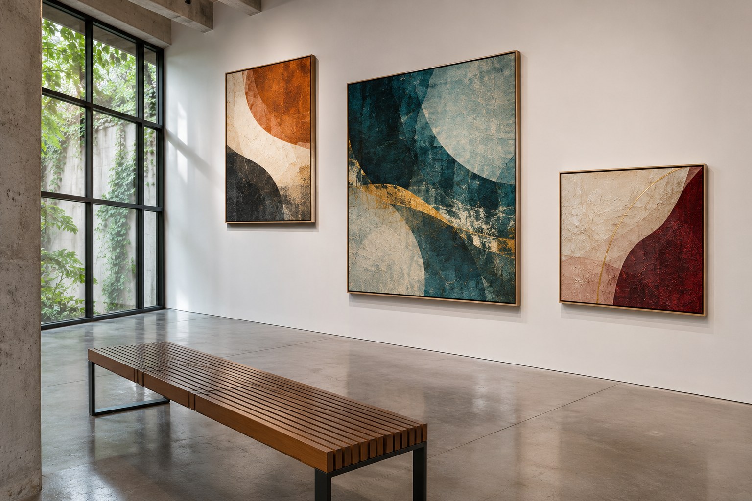
Contrast and emphasis: make differences meaningful
Contrast separates visual levels and helps readers distinguish essential information from supporting detail. Designers create contrast with light against dark, large against small, bold against regular, geometric against organic or dense against open space. Juxtaposition can make an unexpected pairing memorable, provided the message remains understandable.
Scale can create emphasis, but text still needs sufficient colour contrast. WCAG 2.2 AA generally requires 4.5:1 for normal text and 3:1 for large text. Charts should use labels, patterns or shapes as well as colour. WCAG 2.2 Level AA
Contrast is most useful when it serves a clear priority. Applying maximum colour, size and weight to every item erases the differences that make hierarchy work.
Alignment, grids and the structure beneath the design
Alignment connects otherwise separate elements through a shared edge, centre or baseline. It turns scattered content into an organised arrangement. Text blocks, photographs and captions feel related when they follow consistent alignment lines, even if their sizes differ.
A grid system provides repeatable structure without dictating every creative decision. Common grid types serve different needs:
- Manuscript or single-column grid: useful for long reading passages, straightforward documents and simple mobile content.
- Column grid: divides space into flexible vertical areas for brochures, editorial spreads and responsive websites.
- Modular grid: adds horizontal divisions to columns; useful for catalogues, dashboards and layouts containing varied content blocks.
- Baseline grid: aligns lines of type across columns and pages, supporting consistent typographic rhythm.
- Hierarchical grid: uses unequal divisions for content with different priorities, such as a feature image beside supporting stories.
- Responsive grid: adapts columns and spacing to screen size rather than forcing a desktop composition onto a phone.
Margins create a buffer at the edge of the canvas; gutters separate columns; alignment articles keep recurring features consistent. Grid lines need not remain visible in the finished design. Breaking a grid can create an effective focal point when surrounding elements still preserve order. Breaking every alignment at once simply removes the structure.
Negative space, proximity and Gestalt grouping
Negative space, often called white space, is not necessarily white or empty. It may be a plain background, an unoccupied part of a photograph or a deliberate gap between groups of text. Space helps separate unrelated information, gives a headline room to stand out and prevents dense content from becoming visually exhausting.
Proximity creates perceived relationships. A caption placed near its photograph is read as part of the same unit. A date separated from a venue by an oversized gap may appear unrelated, even when both refer to the same event. This is one of several Gestalt principles that describe how people organise visual information:
- Similarity: elements sharing colour, shape, size or style appear to belong together.
- Continuation: aligned edges, lines and curves encourage the eye to follow a path.
- Closure: viewers can perceive a complete form even when part of its outline is missing.
- Figure - ground: the distinction between a subject and its background determines what reads as foreground.
- Common region and connectedness: items inside the same boundary, or visibly linked, tend to be understood as a group.
These relationships explain why an interface card can group a heading, image and description without a heavy border around every item. They also explain a common failure: placing all content equally close together makes everything look related, so meaningful groupings disappear.
Rhythm, repetition, movement and unity
Repetition establishes a visual language. Recurring type styles, shapes, colour accents and image treatments create consistency across a single design or an entire brand identity. Pattern is repetition made visible; rhythm comes from the intervals, scale changes and pacing between repeated elements. Repetition without variation can become monotonous, while constant variation weakens unity.
Movement refers to the route attention takes through the design, not necessarily physical animation. Directional lines, diagonals, image sightlines, changing scale and the alignment of blocks can carry the eye between a focal point and supporting information. A strong route also has a sensible stopping point. A composition that directs attention away from the event details or the page heading has sacrificed communication for motion.
Unity makes distinct pieces feel like one design. Variety prevents that unity from becoming dull. Consistent typography might hold a publication together while image sizes and whitespace change the pace from spread to spread. The useful question is whether each variation adds information, emphasis or a deliberate change of mood.
Rule of Thirds, Golden Ratio and Other Tools
The rule of thirds divides a frame into three rows and three columns. Placing a subject near one of the four intersections creates an off-centre point of interest. It works well for cropping photographs, positioning an illustration or leaving a clear area for typography.
The golden ratio , approximately 1:1.618, can inform proportion, division and scale. It is a construction option, not a guarantee that a layout will look better. Content length, legibility, audience expectations and production constraints are stronger reasons to change a layout than strict adherence to a mathematical ratio.
Other techniques include a central axis for formal balance, diagonal composition for energy, deliberate overlap for depth and the rule of odds for arranging small groups of subjects. A Z-shaped reading path is useful as a rough planning model for some simple left-to-right layouts, but real attention changes with content, device and task. None of these techniques replaces testing the actual message.
Typography and imagery must work as one composition
Typography does more than display words. Typeface selection, font size, weight, line length, leading, tracking and kerning change visual density and reading pace. Leading controls the space between lines, tracking changes spacing across a run of letters, and kerning adjusts particular letter pairs. A clear typographic hierarchy might use a distinctive display face for a short headline and a restrained body typeface for longer reading.
Left-aligned paragraphs generally provide a steady reading edge for English-language copy. Centred type works for brief invitations or a compact title, but long centred passages create uneven starting points. Full justification can introduce distracting gaps if the line width and word spacing are poorly controlled.
Use crop, contrast, texture and subject direction to support reading order. Leave simple areas for overlay text and check mobile crops, where the focal subject may disappear.
A logo, icon, illustration or photograph should not be enlarged merely to fill a gap. The relationship between imagery and text must make the content easier to identify, understand or remember.
Composition for Print, Brands and Screens
The same principles apply across media, but the viewing conditions change the solution.
Posters, flyers and brochures
A poster should communicate its subject and headline at a glance; brochures can carry more text and sequence. Confirm trim size, safe area, bleed, colour profile and resolution with the printer, whose specifications take precedence.
Brand identity and packaging
Consistency matters across different sizes and surfaces. Repeated colour, typographic relationships, logo clear space, illustration style and graphic motifs create recognition. Packaging introduces physical folds, edges and viewing angles; a focal point that works on a flat screen may be interrupted by a carton seam or label curve. Essential information must remain legible in its real position.
Websites, interfaces and social media
Responsive composition rearranges hierarchy rather than shrinking a large canvas. Multi-column content may become a single column on mobile; images may need a different crop; typography and spacing must retain readable proportions. Interface controls should remain visually distinct from decorative elements. A social square, vertical story and website banner often need separate compositions built from the same content and brand system.
Accessibility, Language and Cultural Care in Aotearoa
Composition for audiences in Aotearoa New Zealand needs to work across diverse people, devices and communication settings. Accessible contrast, readable type, meaningful heading order, text alternatives for informative images and labels that do not rely solely on colour strengthen both digital and printed communication. The New Zealand Government accessibility guidance emphasises planning for accessibility from the start, rather than treating it as a final visual adjustment.
When a design includes te reo Māori , choose typefaces with correct macron support and check spelling, line breaks and pronunciation-related language markup in digital content. A heading containing Māori or whānau should not lose its macron during font substitution or export.
Traditional Māori forms and patterns carry cultural meaning. Motifs such as koru , kōwhaiwhai , tukutuku and tāniko are not interchangeable decorative textures. Intellectual Property Office of New Zealand guidance recommends cultural understanding and working with artists or designers familiar with tikanga Māori when using or commissioning Māori artwork. Appropriate use includes attention to meaning, attribution, permissions and the people connected to a design.
How to build a composition from a brief
A workable composition begins with the message, not a preset template. Consider an A4 community arts event poster that must also become a mobile social graphic. Its purpose is to communicate the event name, date and location quickly, with programme details available at a closer reading distance.
- Rank the content. Place the event name first, date and venue second, and supporting information third. Remove details that do not belong on the first-view version.
- Choose the viewing conditions. Set up the A4 print format and the mobile dimensions separately. Identify how far away the poster will be read and what must survive on a small screen.
- Sketch several thumbnails. Compare a centred composition, an asymmetric image-led version and a type-led version. Low-detail sketches reveal hierarchy before colour and decorative choices obscure it.
- Establish the grid. Use consistent margins and a column structure. Reserve space for a distinct information group containing the date and location.
- Set one focal point. Make the event name dominant or use a strong image with the name immediately connected to it. Reduce competing accents rather than making everything larger.
- Build typographic levels. Distinguish heading, event information and small supporting copy through scale, weight and spacing. Check line length, leading and letter spacing at actual size.
- Adjust the visual weight. Balance the photograph, headline, background and negative space. Move an element when the eye gets stuck in an unimportant corner.
- Adapt rather than crop blindly. Reposition the image and stack information for mobile. Confirm that the date and venue remain visible instead of being pushed below an oversized graphic.
- Test comprehension and production. View the layout as a thumbnail, in greyscale and at its intended dimensions. Ask an unfamiliar viewer what the event is, when it happens and where. Check text contrast and printer specifications before export.
If viewers notice the artwork but cannot locate the date, the composition has failed its communication task. Enlarging the date may help, but changing its position, grouping and contrast could be more effective with less disruption to the rest of the composition.
Common composition mistakes and how to recognise them
- No clear focal point: several headlines, saturated colours and oversized objects compete. Reduce the emphasis of supporting elements.
- Unrelated spacing: a caption sits closer to another image than its own. Regroup information using proximity and a consistent spacing system.
- Misalignment: small deviations between text and image edges make the page feel accidental. Align to a shared article unless the offset has a visible purpose.
- Too little negative space: long text, icons and graphics crowd the margins. Remove low-priority material before squeezing the remaining content.
- Over-reliance on symmetry: everything is centred despite different information levels. Introduce a stronger hierarchy or asymmetrical balance where the message needs movement.
- Rigid use of a formula: a subject is forced onto a rule-of-thirds intersection despite an awkward crop. Let the content and viewing format determine placement.
How to judge whether a composition works
A successful composition makes the intended message clear without requiring the viewer to decode the arrangement. Visual appeal alone is not sufficient; the design must communicate in the environment where it will be used.
- First-glance clarity: can someone identify the subject or main message immediately?
- Reading order: does attention move from the focal point to the next relevant details without confusion?
- Grouping: are related details visibly together and unrelated details separated?
- Legibility: can essential text be read at realistic size, distance and contrast?
- Consistency: do alignment, spacing, type and colour relationships feel intentional across a series?
- Adaptability: does the hierarchy survive changes in aspect ratio, crop, language length and output medium?
- Cultural appropriateness: are language, imagery and visual references suitable for their intended audience and setting?
Good composition is not the arrangement with the most elements, the most accurate ratio or the most elaborate grid. It is the one that gives the right information the right visual weight, holds the parts together and stays understandable where the design is actually seen.