
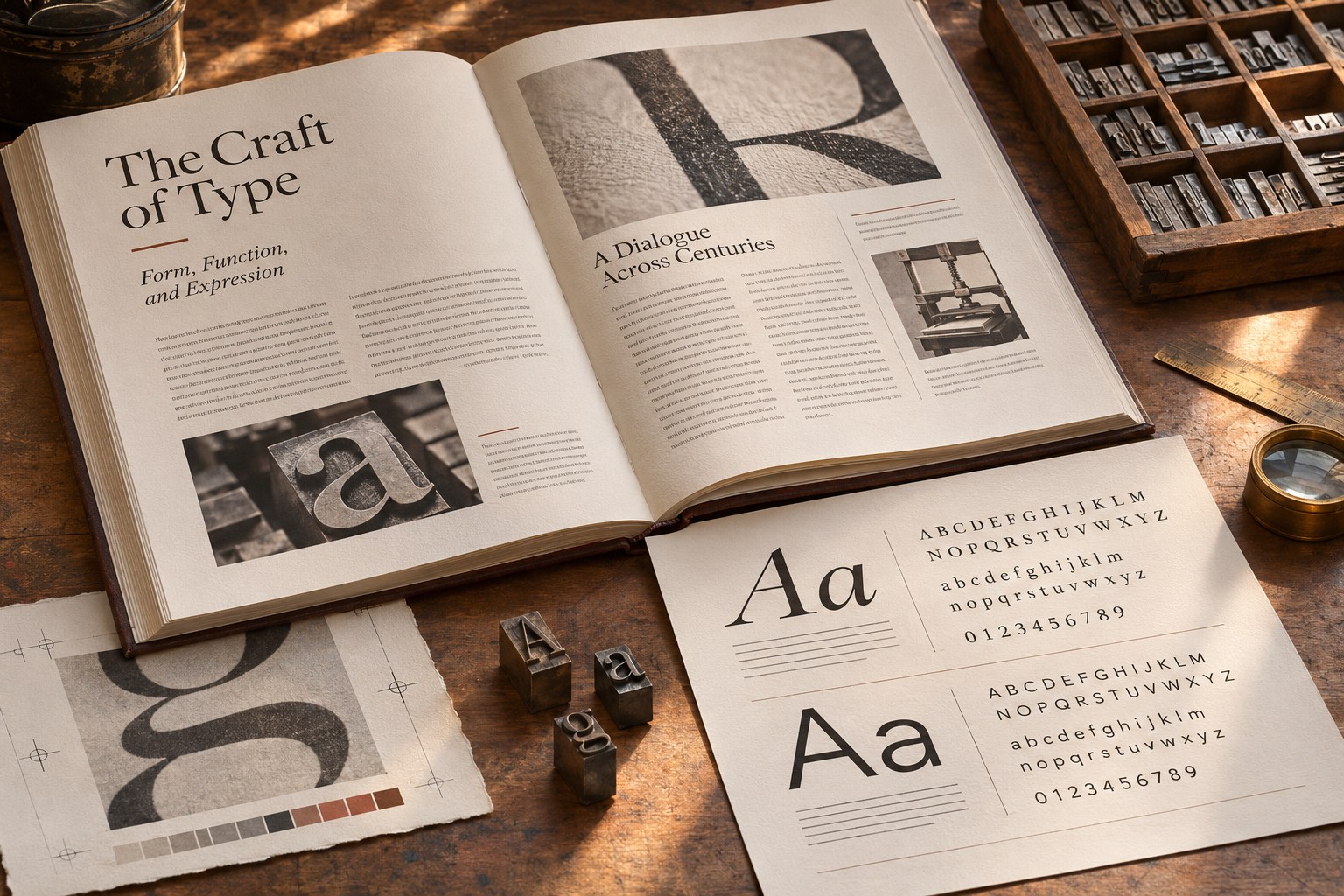
Typography is the arrangement of type: choosing letterforms and setting them so people can find, read and understand words. In graphic design, a headline, a small label and a page of copy have different jobs. The same logo face may fail on a phone, in print or when the words contain the macrons used in te reo Māori .
Start with where the words will be read. A poster across a room, a report on a desk and an ingredients panel in someone's hand demand different sizes, spacing and levels of detail.
What typography does in graphic design
Font size, weight, letter spacing, line length, alignment, colour and placement work together. They tell a reader where to start and which details belong together. Headings lead; body copy explains; captions and labels identify what might otherwise be missed.
Legibility is about recognising letters and words; readability is about moving through connected text without undue effort. A decorative face may be legible as a four-word poster headline but tiring across a full page. Even a restrained text face becomes hard work in long columns or against a low-contrast background.
Type also gives a brand a voice. A high-contrast serif, a grotesque sans serif and a rounded humanist design suggest different tones. None has a fixed meaning: imagery, subject matter and the people reading it alter the impression.
Typeface, font, lettering and type design
A typeface is the design of a set of characters, such as Fira Sans or Gotham. A font is the usable file or instance; in metal type it referred to a particular size and weight. Designers often use the terms interchangeably, but the distinction helps when ordering files or checking licences. A font family contains related weights, styles and sometimes widths.
Typography sets type; type design creates its letterforms. Lettering makes letters for one composition, such as a wordmark, while calligraphy produces them through writing. A logo can mix these practices. A report generally needs consistent typesetting.
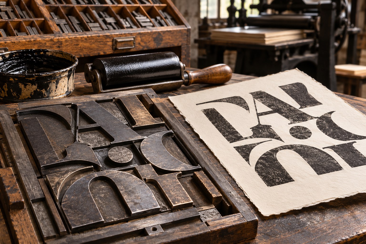
The anatomy of type: details that change the result
Two fonts set at 16 pixels need not look equally large. Their x-heights, stroke shapes and openings may differ enough to change how small text reads.
- Baseline, x-height and cap height
- Most letters rest on the baseline. The x-height measures the lowercase x; cap height measures capitals. A generous x-height makes lowercase forms appear larger at the same nominal size, without guaranteeing readability.
- Ascenders and descenders
- In b and h, the strokes rising above x-height are ascenders. The tails in g and p are descenders. Both affect line spacing and the texture of a paragraph.
- Stem, stroke, bowl and counter
- The main upright is a stem. A bowl is a curved stroke enclosing a counter, the white space inside a letter. When counters fill in at small sizes or heavy weights, shapes become less distinct.
- Aperture, terminal and serif
- The opening in c or e is an aperture. A terminal finishes a stroke; a serif adds a small finishing stroke to a main one. Check these details at the size people will actually see.
- Weight, width and contrast
- Weight is stroke thickness; width describes condensed or extended characters; contrast is the difference between thick and thin strokes. Fine hairlines that suit a display headline may vanish on a small printed label.
A glyph is the drawn form of a character. Sidebearings provide space beside it; a ligature combines forms such as fi. Some families include an optical size axis or separate optical cuts for different viewing sizes. Details that work at 60 points may disappear at 10.
Types of typefaces and where they work
Type categories are useful for shortlisting, not choosing. Judge the actual letters and the text the project has to carry.
| Type category | Common use | Selection risk |
|---|---|---|
| Serif | Books, magazines, cultural identities, editorial headlines | Fine strokes and delicate serifs can break down at small sizes. |
| Sans serif | Websites, interfaces, signage, contemporary branding | A geometric face that looks strong in a heading may feel repetitive in long text. |
| Slab serif | Posters, packaging, bold editorial display | Heavy rectangular serifs may crowd compact labels. |
| Script and handwritten | Short invitations, expressive display, selected wordmarks | Joined or irregular letters can obscure unfamiliar names. |
| Display and decorative | Large titles, campaign graphics, event identities | Distinctive forms often lose clarity when reduced. |
| Monospace | Code, technical labels, data-oriented visual identities | Fixed-width characters consume more space in running text. |
Old-style, transitional and high-contrast modern faces belong to the serif tradition. Humanist, grotesque and geometric describe different sans-serif approaches. Open apertures in one humanist design may help at small sizes; repeated circular forms in a geometric design change the texture. “Serif” and “sans serif” alone tell you little about accessibility.
How to choose a typeface for a real project
Choose the everyday typeface for the hardest routine task. A brand with product labels, a website, social graphics and an annual report can use an expressive headline face, but the body-text family must survive all four.
- Define the reading task. Separate display text, extended reading, interface labels, numerical information and small-print requirements. One family may cover several roles, but each needs testing.
- Test the actual language. Set genuine product names, addresses, prices and paragraphs. For Aotearoa New Zealand, include Māori words with macrons and the precise names the project uses.
- Inspect the family. Check regular and bold weights, true italics, medium or semibold options, numerals, punctuation, currency symbols and relevant OpenType features. Fake bold and synthetic italics can produce inconsistent results.
- Check size and medium. Review small labels at their finished print size and web copy at normal viewing distances. Judge narrow, bold and light styles separately.
- Confirm delivery and licensing. A desktop licence for creating static artwork does not automatically authorise hosting font files on a website or embedding them in an app. Read the applicable end-user licence agreement (EULA).
Set a specimen using a real paragraph, headline, button, price and date. Check 0 O 1 I l for ambiguous shapes; add Māori, whānau, Tāmaki Makaurau, Ōtautahi and ā ē ī ō ū . Inspect punctuation and numerals too. A macron that triggers a visibly different fallback face is a failed font test.
New Zealand public-sector systems show how different type choices can work. The Govt.nz typography system specifies Fira Sans, then Helvetica, Arial and generic sans-serif fallbacks. The Ministry of Education's design system uses Gotham Screensmart and calls for Latin Extended support. Neither is a default recommendation for other projects.
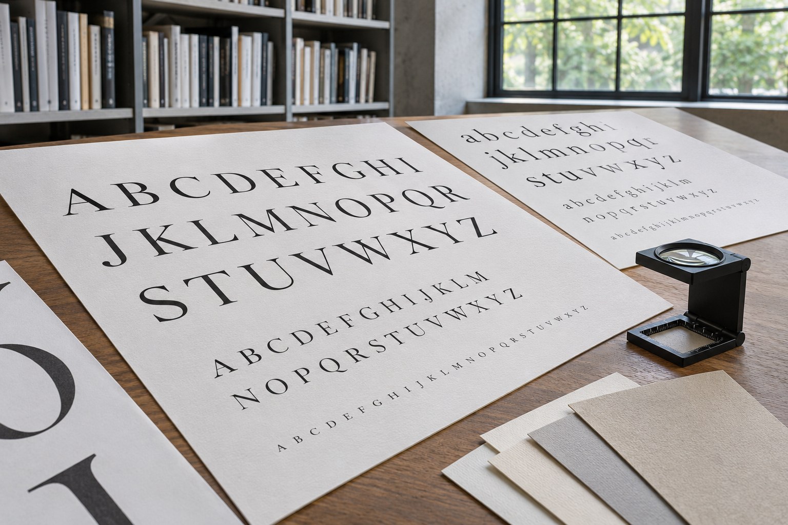
Build a typographic hierarchy before polishing details
Build hierarchy around the body copy: its flaws repeat across the whole page. Set a reliable reading size and measure, then distinguish titles, section headings, subheadings, captions and labels. The aim is a clear route through the information, not a competition between large type styles.
Size is only one cue. Weight, position, spacing and colour can give a heading prominence without making it enormous. Repeated roles need repeated treatments; if every heading looks different, readers cannot learn the pattern.
A workable digital type scale
The sizes are trial settings for a reading-focused website. Check them in the chosen typeface, including narrow screens, before making them part of a design system.
| Role | Starting size | What to verify |
|---|---|---|
| Body copy | 16 - 18px | Comfortable reading, line breaks and sufficient contrast |
| Small supporting text | 14 - 16px | Still readable when enlarged and on a phone |
| Subheading | 20 - 25px | Clearly distinct from body copy |
| Section heading | 26 - 32px | Visible structural break without excessive wrapping |
| Page title | 36 - 44px | Natural wrapping on narrow screens |
A modular scale with a 1.25 ratio gives approximately 16, 20, 25 and 31 pixels. The sequence is convenient, not mandatory. A font with a high x-height or unusually wide capitals may need smaller jumps - or larger ones - to separate heading levels.
HTML heading levels
<h1>
to
<h6>
describe document structure for navigation and assistive technology; CSS controls their appearance. A visually small subheading still needs the right heading element, rather than a plain paragraph tag.
Line length, alignment and white space
The measure is a line's length. For sustained English reading, try about 45 - 75 characters per line; phone columns will often be shorter. At either extreme, the reader spends more effort finding the next line or following a cramped series of breaks. Judge the rendered page, not the character count in the copy file.
Left alignment gives left-to-right paragraphs a stable starting edge. Centre short titles or quotations if the layout calls for it, but avoid centring long passages. In narrow justified columns, word spaces can open into distracting gaps unless hyphenation is well controlled.
Space is part of the setting. Keep captions close to their images, separate a new section from the one above and line up repeated elements on the grid. A baseline grid can steady multi-column print work, provided it does not force uncomfortable leading.
Kerning, tracking and leading: three different controls
Kerning, tracking and leading adjust different spaces: between two letters, across a run of text, and between lines.
- Kerning changes the space between a particular pair of glyphs. Pairs such as AV, To and Wa can leave visually awkward gaps even when their numerical spacing is correct. Start with the font's built-in kerning; use optical or manual adjustment when a large heading or logo still looks uneven.
- Tracking changes letter spacing across a selection. Slightly open tracking can help a short all-capital label breathe. Applying the same treatment to lowercase paragraphs usually damages word shapes and reading rhythm.
-
Leading
describes the vertical distance between lines of type. In digital design, the related CSS property is
line-height. Too little space lets ascenders and descenders crowd each other; excessive space weakens the connection between successive lines.
For body copy, try a line-height of 1.4 - 1.6 times the font size, then adjust for the face and column width. Display headings often need less. At 18px with a 1.5 line-height, CSS lays out lines on 27px intervals. Test with actual ascenders, descenders and wrapped sentences.
Fix typeface, width, size and line-height before fine-tuning letter pairs. A heading that fits at 700 pixels may break badly on mobile. In longer reports, look for awkward hyphenation, widows and orphans, isolated last words and punctuation at the margin.
Font pairing and brand consistency
One capable family can handle most of a design system. Its weights and widths may provide all the contrast needed. Add a second family only when it has a distinct role, such as a display heading or long-form reading.
Pair for contrast without a mismatch in texture. A serif heading above a quiet sans-serif paragraph is one option; two branches of a superfamily can offer a subtler shift. Compare their perceived size and rhythm with the actual words.
Put both fonts into the same layout. Check x-height, figures, italics and punctuation side by side. When the two faces shout equally loudly, hierarchy suffers; when they barely differ, the extra font adds maintenance without a visual benefit.
Name roles in the brand system: “Display / semibold / tight line-height”, “Body / regular / comfortable measure”, “Data / tabular numerals”. Figma text styles, Adobe Illustrator character styles and Adobe InDesign paragraph styles can enforce them. Translate the same choices into design tokens for digital products, including fallback faces and missing-weight rules.
Readable and accessible typography
There is no universally accessible typeface. Even familiar text faces falter at smaller sizes, lower contrast or higher zoom. Test the whole setting - including line breaks and controls - rather than trusting the font's marketing.
At Level AA, WCAG 2.2 requires at least 4.5:1 for normal text and 3:1 for qualifying large text , subject to specified exceptions. Grey labels on white and type over photographs are common failures. Colour alone should not convey a link or status; an underline often makes text links easier to identify.
Under WCAG, text must remain usable at 200% enlargement. Test overrides of 1.5 line-height, paragraph spacing of 2 times font size, letter spacing of 0.12 times font size and word spacing of 0.16 times font size, without clipping or losing content. Those values are test conditions , not default typography settings.
Web copy should stay selectable rather than becoming a picture of text. Selection, zoom, translation and assistive technologies all depend on real text. Long all-capital passages, thin small labels and rigid-height controls make reading harder, especially after enlargement. Heading order must still make sense without the visual treatment.
Neither serif nor sans-serif wins every readability test. Compare the proposed face at its intended size on the devices people use; include actual content and readers where feasible. Category labels cannot substitute for that check.
Typography for Aotearoa New Zealand
New Zealand English design frequently shares space with te reo Māori . Names, place names and other words may contain macrons; a typeface that drops them is unsuitable even if its English specimen looks perfect.
Check ā, ē, ī, ō and ū and the corresponding capitals in every weight. Test Māori , whānau and Tāmaki Makaurau in headings, captions and exported PDFs. If a fallback font supplies only the macron-bearing letters, differences in stroke or spacing can become obvious.
The Ministry of Education calls for Latin Extended coverage in its font guidance. The NZ Digital Government guidance on te reo Māori addresses spelling, language attributes and dialect preferences. Some iwi use double-vowel conventions for particular words; replacing an approved form with a macron is not an automatic correction.
Give the document its proper language setting and mark Māori-language passages with
lang="mi"
where needed. Māori words do not need italics merely because they are Māori. Have a qualified reviewer check names, translations and whakataukī; visual font coverage does not validate the language.
Follow the characters from source file to final output. Check Unicode in the design app, browser, CMS and exported PDF, then inspect what the printer or developer actually receives. Font substitution can change a macron or a line break long after the original layout looked correct.
Print, web, packaging and signage need different typography
Editorial and publication design: Long-form print brings paper stock, ink spread, columns, margins and page breaks into the choice. Old-style and transitional serifs are candidates, but a humanist sans can also make good body copy. Proof at finished size on the intended stock - not only at 400% zoom.
Posters and advertising: A large condensed or expressive heading can carry the idea, while the date, venue and other essentials need calmer type. Inspect the poster from its real viewing distance.
Brand identity and packaging: The logo's display face may be unsuitable for ingredients, warnings or prices. Check the smallest text in print, make sure bold weights are genuine and confirm the producer's font licence.
Check type in navigation, forms, cards and narrow layouts. Slow web fonts can delay rendering or shift layout when they load. Use WOFF2, suitable fallbacks and restrained subsets; variable fonts are not always smaller or faster.
Signage and wayfinding: Test letter recognition and contrast at the viewing distance, under the actual lighting and against the finished material. Someone moving past a sign needs a destination more than expressive letterforms.
A practical typography workflow
- Map the information. Identify the main message, secondary details, body copy, labels and any legal or safety text. Decide the order in which someone needs to encounter them.
- Write a representative specimen. Include genuine headings, full paragraphs, numbers, punctuation, product names and all required languages. Replace sample copy before release.
- Shortlist by functional fit. Compare no more candidates than can be tested properly. Check weights, italics, glyph coverage, formats, cost and licence terms before committing to a visual direction.
- Set body text and measure. Establish font size, line-height, column width and paragraph spacing. Judge the result at normal scale, not only in a zoomed design canvas.
- Create hierarchy and pairing. Assign consistent styles to information roles. Add another typeface only if it solves a clear problem.
- Refine optical spacing. Fix conspicuous gaps, uneven line breaks and cramped punctuation after the layout has settled. Do not repair a poor font choice through endless manual kerning.
- Test and hand over. Inspect mobile and desktop, 200% text enlargement, contrast, Māori macrons, print proofs, exported PDFs and font substitutions. Record the approved type styles and licence restrictions for anyone producing the final work.
When typography looks wrong
| Symptom | Likely cause | Better check |
|---|---|---|
| The heading feels uneven | Awkward kerning pairs or unsuitable tracking | Inspect large letter pairs at the final size. |
| Paragraphs feel tiring | Long measure, cramped leading or weak weight | Shorten the column and compare line-height and weight. |
| Every element competes | Too many bold, colourful or display styles | Limit emphasis and assign a clear role to each style. |
| Names look inconsistent | Missing macron glyphs or font fallback | Inspect full Unicode coverage and the actual rendered characters. |
| Mobile labels clip | Fixed heights or inflexible spacing | Test narrow layouts, zoom and text-spacing overrides. |
| The shipped site shifts as it loads | Web-font swapping or mismatched fallback metrics | Review font loading, fallback choices and layout stability. |
The final test is the finished setting: a mobile label that does not clip, a printed paragraph that reads at size, and Māori names whose macrons survive every export. Those details tell you more than a beautiful specimen.