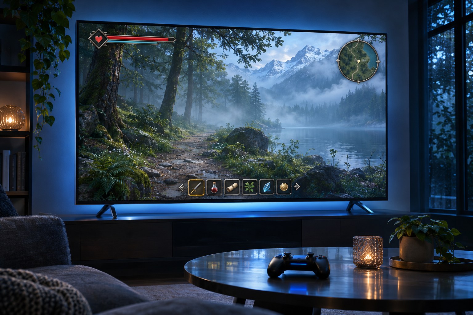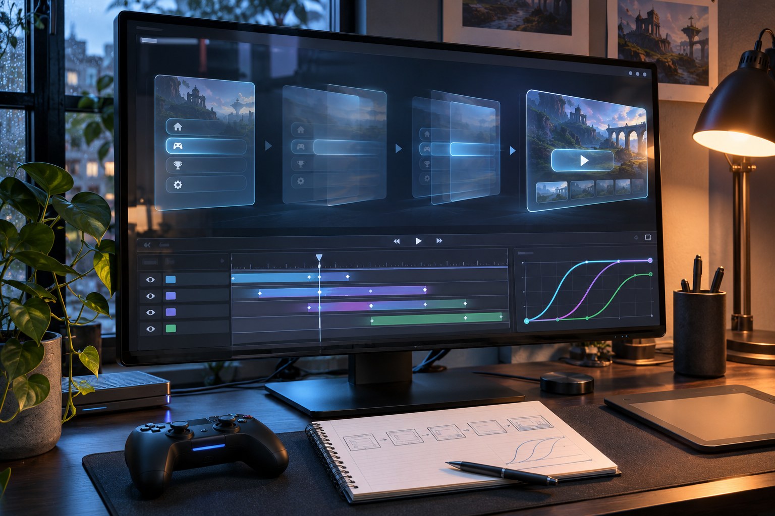
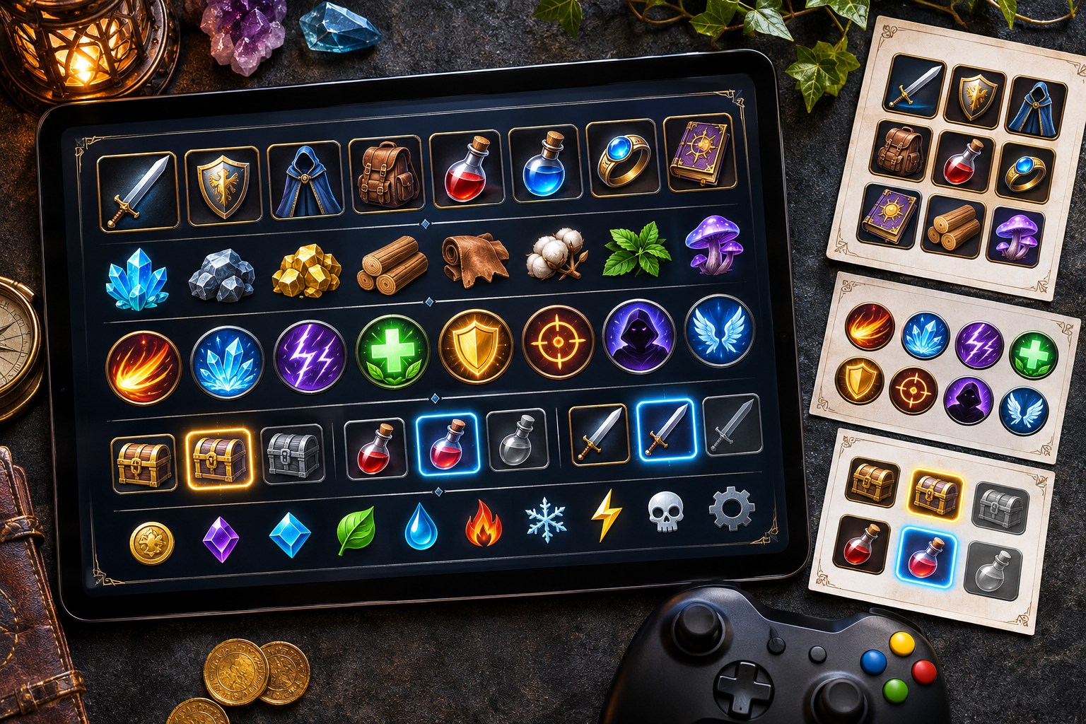
A sword symbol in an inventory usually means something different from the same sword on an action bar. One identifies equipment; the other may show an attack, its cooldown or whether the player has enough stamina to use it. Scale, placement and feedback make the distinction clear. The player should not have to stop and decode the symbol.
icons and game elements connect game rules to visible controls. A mobile HUD can look clear in a static mock-up yet become illegible against a moving, textured background. New Zealand studios also need to account for international platform conventions and the appropriate use of local cultural imagery.
What counts as an icon or game element?
Game icons stand for an action, object, resource, location or status. Game elements also cover interface components and in-world assets. A health icon may sit in a HUD widget; a health pickup lives in the world. Both track the same resource, but players use them differently.
| Element | Typical assets | Player question answered |
|---|---|---|
| Item and inventory icons | Weapons, armour, potions, keys, crafting materials, loot, equipment slots | What do I own or have equipped? |
| Ability and action icons | Spells, attacks, movement, interaction, skill trees, quick-slot abilities | What can I do now? |
| Status and resource indicators | Health, mana, stamina, shields, ammunition, buffs, debuffs, cooldowns | What condition am I in? |
| Navigation and objective elements | Minimaps, compass markers, waypoints, quest symbols, dialogue prompts | Where should I go or look? |
| Menus and HUD components | Buttons, tabs, panels, progress bars, sliders, tooltips, cursors, shop and settings screens | How do I interact with this system? |
| Gameplay and world assets | Collectibles, coins, gems, tokens, tiles, character sprites, environmental props, particle effects | Which objects or events matter in the world? |
A sprite is an image resource; an icon is defined by what it communicates. A UI component adds layout, behaviour and interaction states. A pack of 100 icon images is not a working inventory or menu.
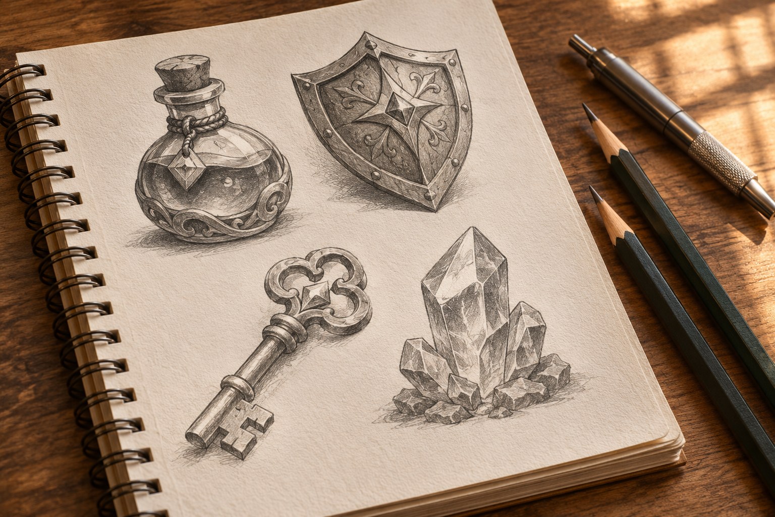
Start with the decisions players make
An ability bar follows player intent → game state → feedback . Before acting, players need to see whether a skill is ready. If a locked skill looks active, the interface promises an action the game will reject. After input, the icon should register the press and show the resulting cooldown.
Give each symbol one primary meaning within a game. A padlock suggests locked content, a crossed-out weapon an unavailable attack, and a radial sweep a cooldown. Do not use the same badge to mean “locked” in a skill tree and “selected” in an inventory. Familiar close controls and visibly disabled buttons are covered in Roblox's UI and UX design guidance .
A combat HUD competes for space with the action itself. Keep health, stamina, ammunition and incoming-damage cues noticeable; move crafting recipes, equipment comparisons and long quest descriptions into menus. A minimap, timer or score counter must not obscure the reticle or an opponent.
In survival games, a low-health warning must remain visible during camera motion and damage. Puzzle players may need move count, undo and hints instead. A copied HUD won't meet both needs.
Build one visual language across the whole game
Silhouette, visual metaphor and negative space
A bow and a sword must look different at inventory-slot size. Inspect silhouettes before adding engraving or highlights. Enough negative space should remain for each shape to read against a bright landscape, a dark dungeon or a crowded inventory.
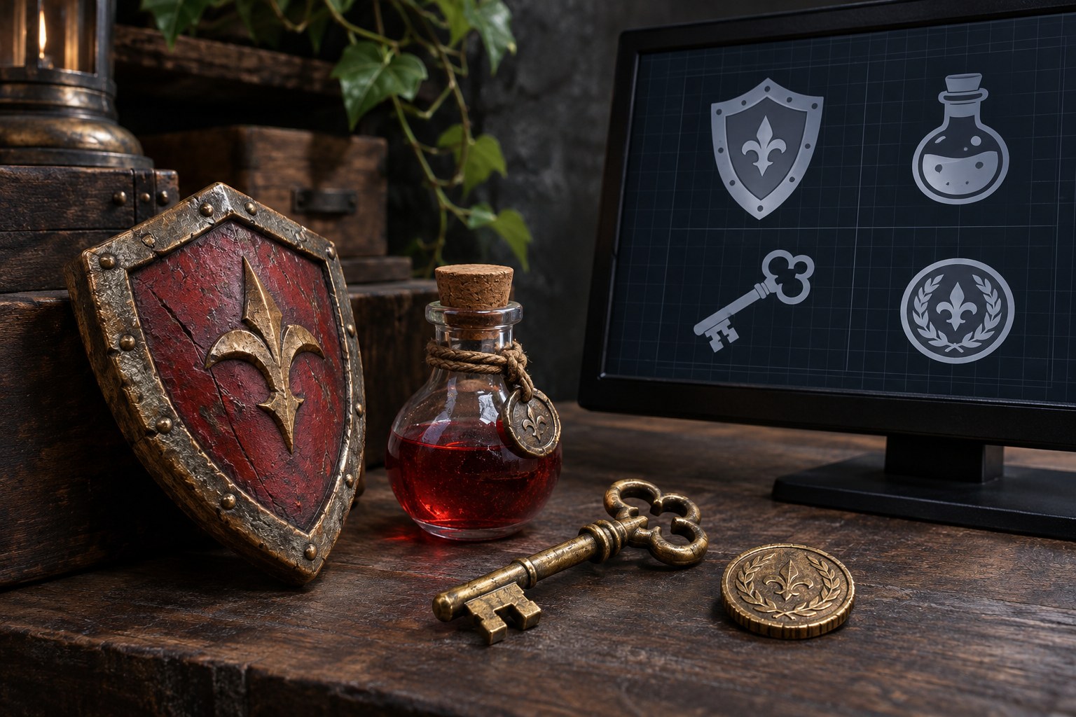
Use a consistent treatment: outline, solid fill, pixel art, painterly illustration or low-poly rendering. An isometric potion beside a flat shield can look like an accidental mix of packs. Specify grid, padding, optical alignment, stroke weight, corners and lighting direction. Inspect exports at their actual size. Unity's iconography principles cover pixel alignment and optical balance.
Colour, typography and hierarchy
Colour can group familiar resources - green for health, blue for mana, a separate accent for interactable objects - but the game must establish those meanings. Shape, labels, patterns or numbers need to carry essential distinctions too. Two effects that differ only in red versus green are easy to confuse for some players.
A resource count needs to be easier to read than decorative detail inside its icon. Keep typography consistent across inventory slots, equipment statistics, dialogue, shops, achievements and settings. Test fonts against the textures and lighting of the game, not only on a Figma canvas.
Different genres need different icon priorities
| Genre | High-value icons and elements | Design pressure |
|---|---|---|
| RPG and action RPG | Inventory, armour, weapon classes, mana, skill trees, quest markers, loot rarity | Large inventories need distinct silhouettes and reliable filtering. |
| Strategy and simulation | Resources, unit types, build actions, technology trees, production queues, status effects | Many symbols must remain comparable without covering the map. |
| Action and shooter | Crosshairs, ammo, shields, hit direction, cooldowns, ability prompts, minimap | Information must register during rapid movement and combat. |
| Casual mobile and puzzle | Levels, stars, hints, undo, boosters, progress bars, energy, rewards | Touch controls need clear boundaries and reachable placement. |
| Platformer and adventure | Collectibles, checkpoints, keys, interact prompts, map markers, dialogue | Indicators should preserve attention on the environment. |
Give every interactive element a complete set of states
Artwork does not define interaction on its own. Buttons, inventory slots and ability widgets need a state model : default, focused or hovered, pressed, selected, disabled and locked, where those states exist. Abilities may also display cooldown, insufficient resources and readiness. An equipped item is not automatically pressable; a disabled control should not suggest that pressing it will work.
Use visible changes beyond colour. A focus ring marks controller or keyboard selection; a check or frame can identify equipped gear; a radial fill and remaining-time label show cooldown. Audio and haptics can reinforce urgent feedback on supported platforms, but players must be able to understand it without sound.
Mouse hover, touch activation, keyboard focus and directional gamepad navigation do not behave alike. The on-screen prompt should change with the active device: showing a keyboard key to someone holding a controller creates an avoidable error. Apple's game-control conventions distinguish gamepad, touch and pointer inputs.
Choose asset formats around the production pipeline
Work from an editable master, then export for the engine. Figma, Illustrator, Inkscape, Photoshop and Aseprite support different parts of that workflow. The deliverable may need SVG, PNG, atlases or layered source files, according to the art style and how the game renders its interface.
| Format or method | Best suited to | Production consideration |
|---|---|---|
| SVG and vector masters | Flat icons, scalable symbols, recolouring and iteration | Engine support varies; retain approved raster exports when required. |
| PNG with transparency | Inventory art, HUD imagery, pixel art, effects and textured icons | Export appropriate resolutions and verify texture filtering. |
| Sprite sheets and atlases | Large icon libraries and 2D UI collections | Document sprite boundaries, padding and naming to avoid sampling artefacts. |
| Nine-slice or 9-slice panels | Resizable windows, dialogue boxes, buttons and frames | Protect corners and borders while stretching the centre or edges. |
| Layered source files | Customisation, animation variants and future platform updates | Include fonts, layers, effects and asset ownership information. |
A 32 × 32 pixel image is not a 32 × 32 touch target. Source size, on-screen size, display density and hit area are separate decisions. Pixel art needs deliberate integer scaling and texture filtering; painterly assets may need larger exports. Atlas packing and tight sprite meshes can reduce transparent overdraw, while oversized textures cost memory. Unity's asset-preparation guidance addresses sprite editing, pixels per unit and nine-slicing.
Make the design system work inside the engine
A flat screen mock-up can break when translated text wraps, the aspect ratio changes or focus moves between controls. Keep artwork, layout and game logic separate.
- Unity: UI Toolkit provides a component-based approach to interface layout and styling. Sprite settings, asset imports and nine-slice backgrounds need validation at the intended panel scale. UI artists and UX designers should agree on token names and reusable components before export.
- Unreal Engine: UMG widgets manage interface components. Anchors, widget hierarchy and DPI scaling rules help accommodate differing viewport sizes; final layouts still need testing at the target resolutions.
- Godot: Control nodes use anchors and offsets to handle aspect-ratio changes. Theme resources centralise style items, while anchor presets support consistent placement of panels and controls.
- Roblox: A coherent visual language links icons, text, buttons and game-state feedback. The interface must behave consistently across the devices the experience supports, rather than assuming the desktop mock-up is the final layout.
Shared design tokens define colour, spacing, type, borders, states and animation timing. They give artists, engineers and QA a consistent reference for every shop button and inventory slot.
Accessibility and legibility are part of the artwork
Game UI must remain legible without assuming perfect vision, precise touch or audio. WCAG 2.2 non-text contrast guidance uses 3:1 for necessary graphical indicators and interface boundaries; 4.5:1 is a common benchmark for standard text. WCAG applies to web content and does not automatically certify a game interface. For game-specific checks, the Xbox accessibility criteria on contrast address visibility during play.
Put icons over the game's brightest and darkest scenes and test them in motion, with particle effects on screen. A red flash alone is a weak low-health warning; pair it with a shape, label or other visible cue. Distinct status symbols, UI scaling, remappable controls, subtitles, reduced-motion settings and clear focus indicators give players more than one way to read the game.
On phones, the tappable area must fit a finger, not just the painted icon. A 44 × 44 point target is a platform-specific reference rather than a universal pixel minimum. Allow for safe areas, screen cut-outs and thumb reach. On a television, check text and icons at sofa distance. Epic's mobile-design guidance discusses clear silhouettes, a simplified HUD and touch interaction.
Ready-made icon packs or custom artwork-
Asset packs are useful for prototypes and game jams. Before building a UI around one, check that it includes required states and allows the intended use. Free packs may require attribution; paid packs are not necessarily exclusive.
| Approach | Strong fit | Trade-off to check |
|---|---|---|
| Free or open asset packs | Game jams, prototypes, early UI layouts, budget-limited projects | Licence conditions, attribution, artistic mismatch, incomplete state coverage |
| Commercial marketplace packs | Rapid production with a compatible established aesthetic | Commercial scope, redistribution rights, updates, source-file availability |
| Custom icon and UI systems | Distinctive IP, complex mechanics, brand consistency, long-lived games | Art direction time, revisions, maintenance and hand-off requirements |
Kenney's UI Pack includes buttons, panels and sliders under CC0, which generally carries no attribution requirement. Game-icons.net has a large symbol library with CC BY attribution terms and some assets of different public-domain status. Packs on itch.io and OpenGameArt have their own licence conditions. Check the individual download rather than relying on its marketplace label.
For each asset, record the creator, original URL, licence, version and modifications. Check commercial use, editing, redistribution of raw files and marketing rights. Fonts and sound effects need separate checks. Keep the rights manifest with the approved exports and editable masters.
Design considerations for New Zealand studios
The New Zealand Game Developers Association's 2026 industry survey reported NZ$1.002 billion in 2025/26 revenue, with 95% from international consumer sales. For teams in Auckland, Wellington, Christchurch and elsewhere in Aotearoa, export markets affect language length, control prompts and platform testing.
M?ori motifs such as koru, hei matau and manaia carry specific meanings; they are not generic fantasy assets. Agree permissions, relationships and attribution when drawing on iwi, hap? or artists? knowledge. IPONZ and NZ On Air publish relevant guidance. IPONZ NZ On Air's Game Development Sector Rebate guidance
Consultation may change a proposed symbol's name, meaning or approval process. A stock asset licence does not confer cultural authority.
Specify the deliverables before production
Start with an asset inventory , not an illustration quota. For each icon, list an ID, gameplay meaning, screen location, platform, rendered size, priority, states and source-file requirements. Group resources, equipment, combat, navigation, progression, menus and status effects. Keep one-off hero illustrations distinct from reusable UI symbols.
A usable hand-off includes clearly named PNG exports or sprite sheets, editable masters when contracted, padding rules, a colour-and-type style article, state variants, import notes and the asset-rights manifest. Specify how a new ability joins the family. Until its icon exists, the interface still needs a labelled or otherwise understandable fallback.
Check whether players can actually use the system
Hide an icon's label and ask players what action they expect. Note confusion between inventory items, locked and selected states, cooldowns and pause. Record recognition accuracy, time to identify the action and wrong selections. Preference surveys alone will miss those errors.
Test a crowded inventory, the smallest mobile HUD, particle-heavy combat, the longest translated label and a controller-only menu on target devices. Include accessibility settings. Inspect frame rate and memory after atlas packing; look for blurry icons, cropped labels, missing focus outlines and distorted nine-slice corners. When players struggle, change one variable - silhouette, wording, layout, colour or feedback timing - before testing again.
A new status effect should not be mistaken for an existing one. When players confuse poison with healing, revisit the silhouettes or labels before adding ornament.
Common questions about icons and game elements
Game Icons vs Game Assets
An icon conveys a meaning; an asset is any reusable resource, from textures and models to fonts, sound and UI panels. Icons are one type of asset.
Are SVG icons better than PNG icons for games?
SVG suits editable vector masters. PNG suits transparent raster exports and pixel art. Some pipelines need both, with raster versions tested at their final size.
Can free game icons be used commercially?
CC0 and CC BY differ on attribution. Marketplace terms may restrict source-file redistribution, too. Check and save each pack's actual licence.
How many icons does a game need?
Count mechanics and states, not genre labels. An arcade game may reuse a few symbols; a large RPG can require hundreds of variants. The asset inventory sets the scope.
What makes a game UI icon accessible?
Check silhouette, contrast, meaning, focus state and any label at the final display size. Verify recognition during gameplay, not just in a clean mock-up.