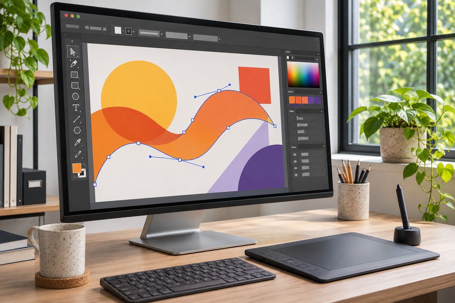
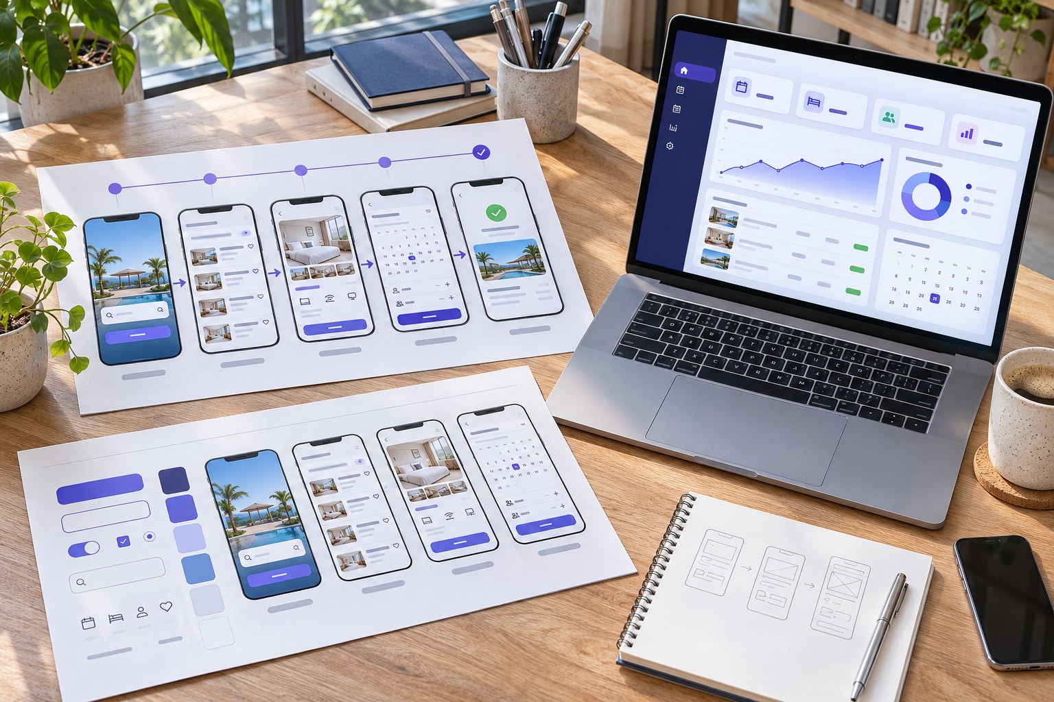
Figma is a collaborative platform for designing websites, apps, prototypes and design systems. Teams review screens on a shared canvas. Figma Design is the main interface tool; FigJam and Dev Mode support planning and handoff.
Figma is useful when teams share reviews, adapt designs across devices or need consistent developer handoff. It does not make a mock-up accessible, tested or production-ready by itself.
What is Figma used for?
Figma sits within the design tools category, with a particular focus on user interface (UI) design, user experience (UX) design, prototyping and collaborative product development. A typical file contains frames representing screens, vector shapes, typography, imagery, reusable components and connections that simulate user interactions. Designers work on a shared canvas while reviewers can follow links, leave comments and inspect approved work.
The distinction between UI and UX matters. UI design shapes the controls, layout, colour and visual hierarchy of a product. UX work establishes whether people can understand the navigation, complete tasks and recover from errors. Figma supports both activities, but a clickable prototype is not a substitute for interviews, usability testing, analytics or a functioning service.
- Website and app design: responsive landing pages, mobile screens, dashboards, booking journeys and e-commerce interfaces.
- Wireframing: low-fidelity page structures and user flows before detailed visual styling begins.
- Prototyping: interactive demonstrations of navigation, overlays, transitions, form states and conditional journeys.
- Design systems: reusable buttons, fields, navigation patterns, colour tokens, type styles and documentation.
- Team collaboration: comments, shared libraries, file permissions, version history and developer handoff.
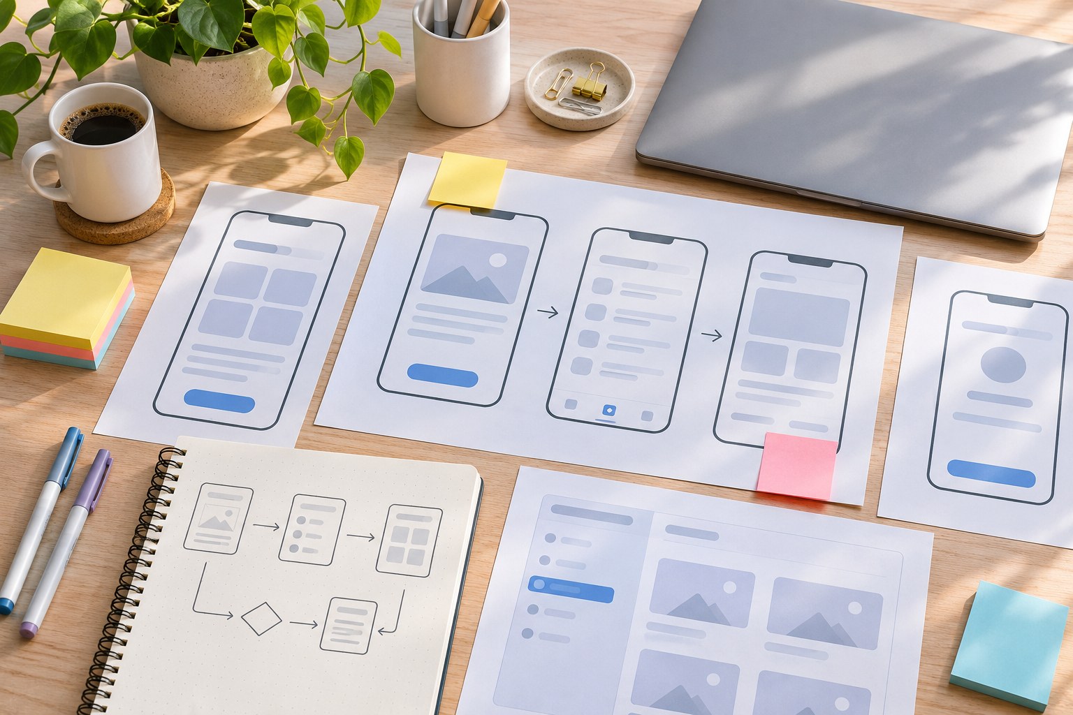
How the main Figma design features work together
Frames, vectors and Auto Layout
A frame acts as a screen or container. Within it, designers arrange text, shapes, images, icons and nested frames. Vector networks and drawing controls make it possible to refine icons and interface details without relying on a separate illustration application for every change. Constraints help objects respond to resized parent frames, while Auto Layout defines direction, spacing, padding and resizing behaviour.
Auto Layout keeps spacing and sizing consistent as content changes: buttons fit longer labels and cards grow with descriptions. Test realistic viewport sizes; a layout that works on desktop may fail on mobile.
Components, variants, variables and design tokens
A component is a reusable element such as a button or form field. Instances inherit changes from the main component, and variants can represent states including default, hover, focus, disabled and error. Component properties let designers change labels, swap icons or control visibility without breaking the shared pattern.
Variables hold reusable values such as colours, numbers, strings and booleans. Collections and modes can express light and dark themes, density options or other product states. Alongside typography and effect styles, these values form part of a design-token system. A team can change a brand colour in one place rather than manually finding every screen that uses it.
The benefit only survives implementation when tokens and components are named consistently. If the design library uses
colour/action/primary
while the codebase hard-codes unrelated hex values, changing the design theme still creates engineering work. Figma's
Code Connect
can link design components to their counterparts in a code library, reducing the distance between the intended pattern and the one developers actually use.
Interactive prototypes and realistic states
Figma prototypes connect frames through triggers such as clicks and hover interactions. Smart Animate , overlays and transitions help demonstrate how an interface responds. Variables, expressions and conditional logic support richer flows: a selected option can change a value, an error state can appear after a particular action, or a checkout prototype can reflect items added to a basket.
These behaviours make stakeholder reviews more concrete than a collection of screenshots. They still need a usability plan. A prototype that reaches the final screen proves only that its predefined path can be followed; it does not establish that real users understand the wording, can operate it with assistive technology or will complete the task on a live service.
Shared editing, feedback and file organisation
Multiple people can work within the same design file, use multiplayer cursors and communicate through comments. Teams organise work with drafts, projects, folders and libraries. Permissions distinguish between people who may edit and those who may only view or comment. Version history supports recovery and comparison; higher-tier plans add controls such as branching and merging for changes that should not immediately affect the main design.
Clear file structure matters more as a project grows. A useful working convention is to separate discovery, exploration, approved designs and archived ideas; label frames by journey and state; and mark the screens engineers should build. Otherwise several visually similar versions can circulate as competing instructions.
Figma products: which tool does what-
Figma is now a product family rather than a single screen-design editor. The tools overlap in collaboration, but their outputs serve different purposes.
| Product | Primary use | Practical distinction |
|---|---|---|
| Figma Design | UI/UX design, components and prototypes | Editable screens and shared interface libraries |
| FigJam | Brainstorming, user flows and workshops | Whiteboards, sticky notes, diagrams, voting and timers |
| Dev Mode | Developer handoff | Measurements, assets, code snippets, annotations and change inspection |
| Figma Draw | Illustration and detailed visual work | Expressive drawing tools inside design files |
| Figma Slides | Presentations and reviews | Collaborative slide decks that can include designs and prototypes |
| Figma Make | AI-assisted functional concepts | Prompt-to-app workflows for interactive prototypes and web apps |
| Figma Sites | Website design and publishing | Responsive site creation and publication; feature availability varies during beta |
| Figma Buzz | Brand and marketing assets | On-brand templates and repeatable creative production |
| Figma Motion | Animation and transitions | Timeline, keyframes and exportable motion; beta capabilities vary by seat |
| Figma Weave | Generative creative workflows | Node-based image, video and other media workflows with connected tools |
Newer capabilities also include code layers , which place interactive code-backed elements on the design canvas, and Specs , which connects Markdown requirements with design and implementation context. These capabilities were introduced in 2026 and have beta or staged-rollout conditions. A team should check availability in its own workspace before planning delivery around them.
From a brief to a working digital product
Consider a Wellington-based team redesigning a booking process for customers across Aotearoa New Zealand. The work involves a UX practitioner, one product designer, a developer and a client representative. A reliable workflow keeps discovery and implementation connected without treating the Figma file as the final product.
- Map the problem in FigJam. Capture customer questions, existing pain points, journey stages and decision points. Separate observed evidence from assumptions. Sticky notes and diagrams help the team agree on the task before screen design begins.
- Sketch the flow. Create low-fidelity wireframes for selecting a service, choosing a time, entering details and confirming a booking. Include cancellation, invalid inputs and unavailable time slots rather than designing only the successful path.
- Build a small component library. Define type styles, spacing, buttons, fields, validation messages and navigation components. Use variables for colours and relevant modes, then apply Auto Layout to content that may grow or shrink.
- Prototype realistic behaviour. Connect the screens and simulate key states with overlays and variables. Preview them on desktop and on an actual mobile device using Figma's mobile preview tools.
- Test with intended users. Watch people complete realistic tasks without coaching. Record where labels confuse them, where they hesitate and where keyboard or screen-reader behaviour creates barriers. Adjust the design rather than treating an attractive visual review as acceptance.
- Hand off through Dev Mode. Agree which frames are approved, attach annotations, export assets and inspect spacing, typography and component behaviour. Developers can connect implementation components through Code Connect and work with tools such as GitHub, Jira and Storybook where the team supports those integrations.
- Check the implemented service. Compare the built pages with the intended states, test responsive layouts and accessibility, and verify real form validation, performance and data handling. A prototype does not cover backend logic, payments or deployment.
Success is easier to judge through completed user tasks, fewer handoff questions, fewer inconsistent components and fewer defects found after development. The number of frames created is a poor substitute for those outcomes.
Figma pricing in New Zealand
Figma offers Starter, Professional, Organization and Enterprise plans. Plans set feature tiers; seats define each person?s access. Published prices are in US dollars, so New Zealand buyers should account for exchange rates and applicable charges.
| Plan | Full seat | Dev seat | Collab seat |
|---|---|---|---|
| Starter | Free, limited access | - | - |
| Professional, annual billing | US$16 | US$12 | US$3 |
| Professional, monthly billing | US$20 | US$15 | US$5 |
| Organization, annual billing | US$55 | US$25 | US$5 |
| Enterprise, annual billing | US$90 | US$35 | US$5 |
The prices are per person and can change. Annual figures are monthly equivalents under an annual commitment; they are not necessarily the amount charged each month. Figma's pricing schedule is the authoritative source for a current quote and product entitlements.
Full seats edit designs; Dev seats add advanced Dev Mode; Collab seats focus on FigJam, Slides, viewing and comments. View seats allow basic viewing and comments where permissions permit. Assign access by role.
Starter suits learning and small drafts, but file limits, history and reduced library or developer access can constrain ongoing work. Professional suits many freelancers and small agencies; Organization and Enterprise add governance. AI access and credits vary by plan and seat and may cost extra.
What NZ Teams Should Check Beyond the Canvas
Accessibility and inclusive design
Figma can help a team plan accessible experiences, but it does not certify a finished website. Designers still need meaningful reading order, legible contrast, visible focus states, descriptive labels, usable error messages, keyboard navigation and realistic assistive-technology testing. Figma's accessible prototype features can expose structure to screen readers, yet the implementation must be assessed in the browser or app where people will use it.
New Zealand?s government Web Accessibility Standard 1.2 requires covered organisations to meet WCAG 2.2 AA, subject to exceptions. A proposed 2027 standard is not yet in force. Private organisations can use WCAG as a quality target. Web Accessibility Standard 1.2
English, te reo Māori and local usability
An interface for Aotearoa should account for local terminology, New Zealand English spelling, dates, addresses, phone-number formats and time zones. Text must accommodate Māori macrons in names and place names, including forms, labels and exported assets. Testing with realistic content also exposes whether Auto Layout handles longer labels and whether a narrow mobile screen preserves the intended reading order.
Locale-specific components are more useful than a single generic international template when a service needs address entry, currency amounts in NZD, or guidance that reflects local terminology. They still need review by people familiar with the audience and service.
Client confidentiality, permissions and AI controls
Figma is a cloud service. Agencies handling confidential customer records, unreleased products or sensitive prototypes need to review sharing permissions, guest access, contractual obligations, retention and security requirements before uploading material. Figma describes security controls and maintains compliance documentation, including a SOC 2 Type 2 report; that does not, on its own, establish suitability for every regulated project.
Under New Zealand?s IPP 12, overseas cloud processing is not automatically a disclosure when a provider acts only as an agent; the provider?s role and data use matter. Minimise personal details in prototypes and use fictional or de-identified records. Office of the Privacy Commissioner
Figma also provides administrative settings for AI content training . Starter and Professional teams have content training enabled by default, with admin controls to turn it off for new content and edits; access to AI features is managed separately. Team owners should check these settings before using client material in AI-assisted workflows. AI-generated interface copy, images or functional prototypes still require editorial, legal, security and accessibility review.
Where Figma is strong - and where it is not
Its strongest fit is shared product design across roles and operating systems. Designers on Windows and macOS can work through the browser or desktop app, while Linux users can use a supported browser. Real-time editing, reusable libraries, interactive prototypes, community resources and developer inspection make it easier to maintain one evolving source of design intent.
Internet dependence
is a genuine constraint. Figma can retain edits to previously loaded work during a connection loss and synchronise them later, but it has no fully featured offline mode. New files, unloaded pages, cloud libraries and live collaboration are limited without connectivity. A local
.fig
export is a snapshot rather than a complete backup of comments and version history.
Learning and maintenance effort rise with complex design systems. Auto Layout, variables, nested components and permissions require shared conventions. A poorly maintained library can propagate inconsistent patterns just as quickly as a well-managed library propagates improvements. Extremely large files can also become harder to navigate and may need to be separated by feature or release.
Design output is not production software. Dev Mode code snippets and AI-assisted code layers support implementation, but developers remain responsible for application architecture, backend services, authentication, data integrity, performance, security and testing. Figma Sites offers a publishing path for suitable websites; it is not equivalent to every CMS, custom application or commerce platform. Figma Make can produce functional concepts, but production suitability needs standalone technical assessment.
Figma compared with other design tools
The right alternative depends on what the team needs to control: the interface library, the hosting environment, native Mac design, the published website or high-fidelity interactions.
| Tool | Strongest scenario | Key trade-off |
|---|---|---|
| Sketch | Mac-based interface designers with an established native workflow | Design editing requires macOS; web access supports review and inspection |
| Penpot | Teams prioritising open source, open formats or self-hosting | Different plugin ecosystem and additional infrastructure responsibility if self-hosted |
| Framer | Marketing teams whose main deliverable is a published website | Not a direct substitute for every app-oriented design system and engineering handoff process |
| Canva | Fast social, presentation and brand-template production | Less focused on complex interactive product interfaces and developer handoff |
| ProtoPie | Specialist prototyping of complex interactions and device behaviour | Usually complements rather than replaces a shared UI design system |
Adobe XD may still appear in older comparisons, but it is no longer sold as a standalone product for new buyers. Treating it as an equal new-procurement option would give a misleading picture of the current market.
Choose by workflow: shared files may suit a small studio; self-hosting may favour Penpot; publishing site content may favour Framer or a CMS. These tools address different needs, not a single quality ranking.
Frequently asked questions
Can Figma create a live website?
Figma Design creates editable layouts and prototypes, not an automatically deployed production website. Figma Sites adds a website-publishing workflow for suitable projects. More complex applications still need decisions about hosting, content management, authentication, integrations and ongoing maintenance.
Does Figma replace a developer?
No. Dev Mode, Code Connect, code layers, Specs, the Figma MCP server and Figma Make can bring design and code closer together. They do not remove responsibility for secure implementation, accessibility conformance, test coverage, monitoring or production operations.
Can Figma be used on Windows, Mac and Linux?
Figma Design works in a compatible web browser across these systems; desktop applications are available for Windows and macOS. The mobile app on iOS and Android is designed mainly for viewing, commenting and prototype testing rather than editing Figma Design files.
Can teams work in Figma without internet access?
Only in a limited way. Previously loaded pages can remain editable while disconnected, with changes stored locally for later synchronisation. Figma does not offer a complete offline editing and collaboration environment.
Is Figma suitable for New Zealand government projects?
It can support design and review work, but suitability depends on the agency's security, procurement and information-management requirements. Delivered web pages within the scope of the NZ Government Web Accessibility Standard 1.2 must meet WCAG 2.2 Level AA, subject to the standard's exceptions. Approval of a Figma prototype is not proof that the deployed service meets that requirement.
When Figma is the right choice
Figma makes the most sense when a team needs one shared environment for UI design, responsive layouts, interactive prototypes, design systems and implementation handoff. Its value grows when product decisions move between designers, engineers and reviewers frequently enough for shared context to prevent duplicated work.
Figma suits collaborative product design. Solo graphic work may not need its breadth, while self-hosting requirements may rule out its cloud model. For a live website, assess publishing and content management alongside design.