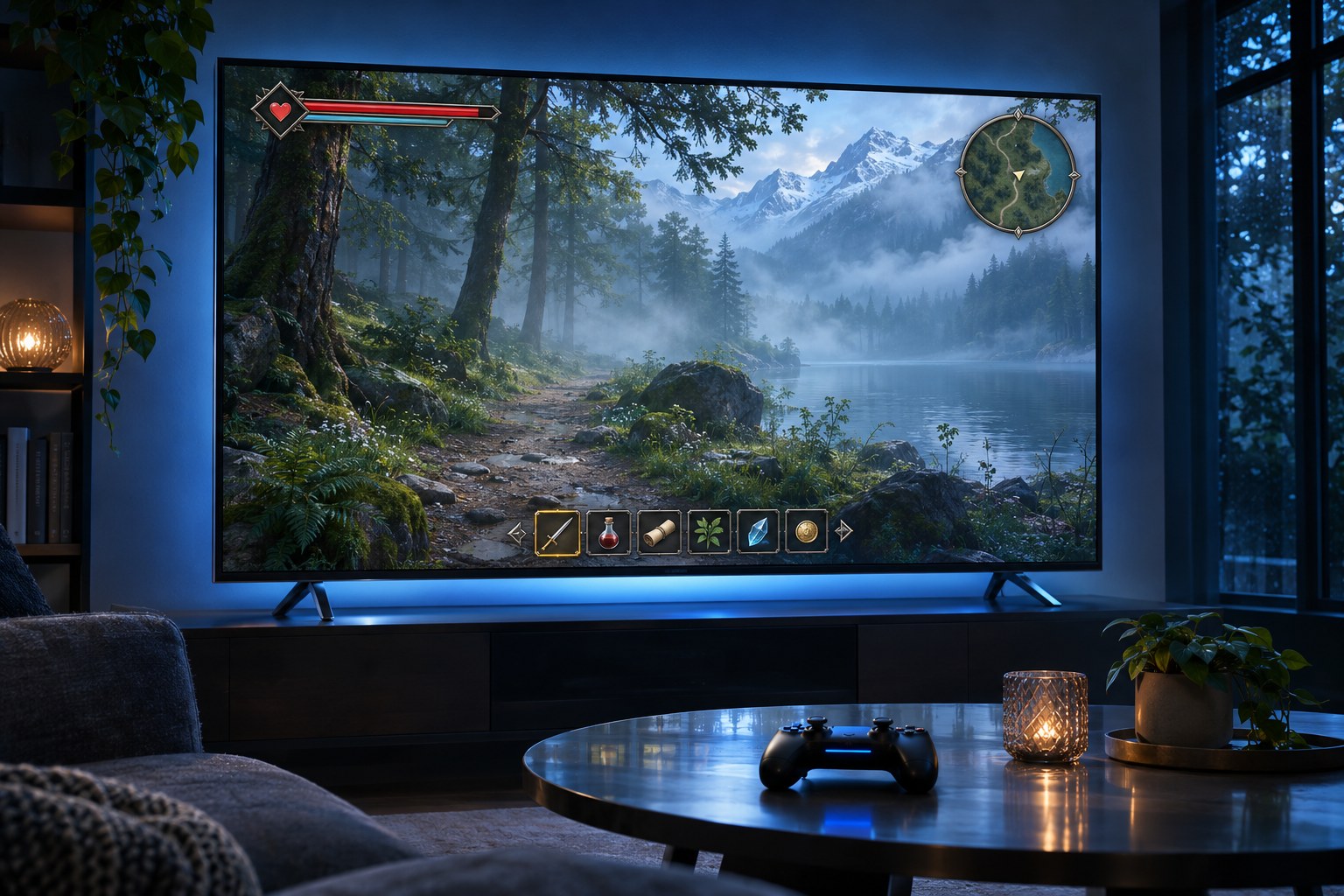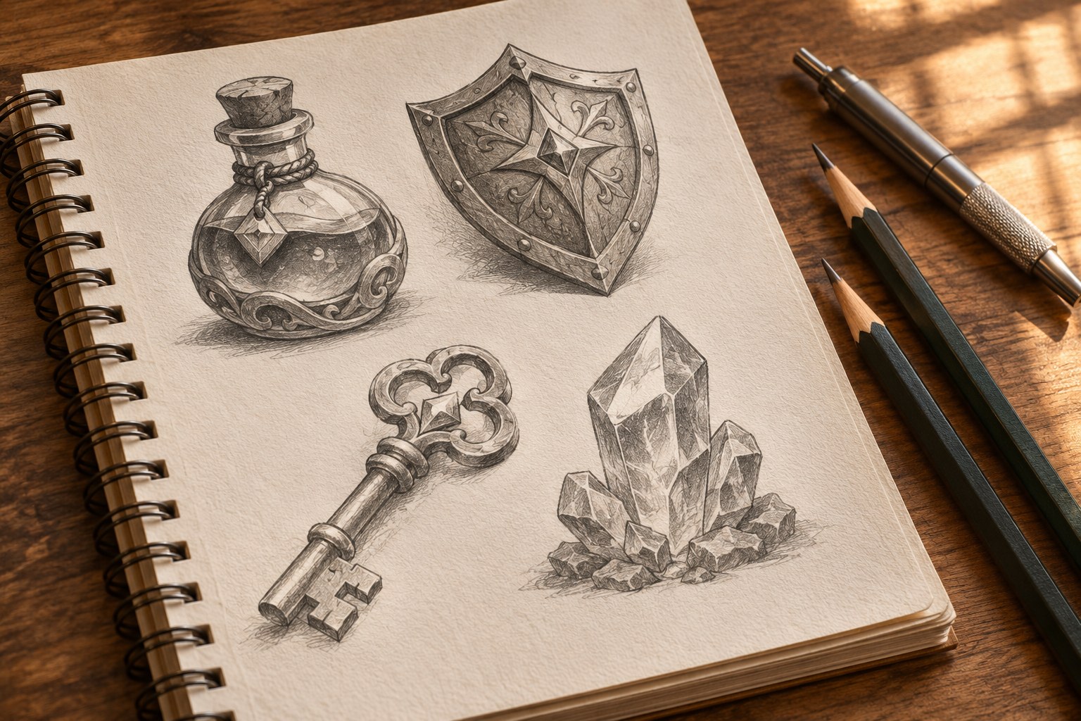
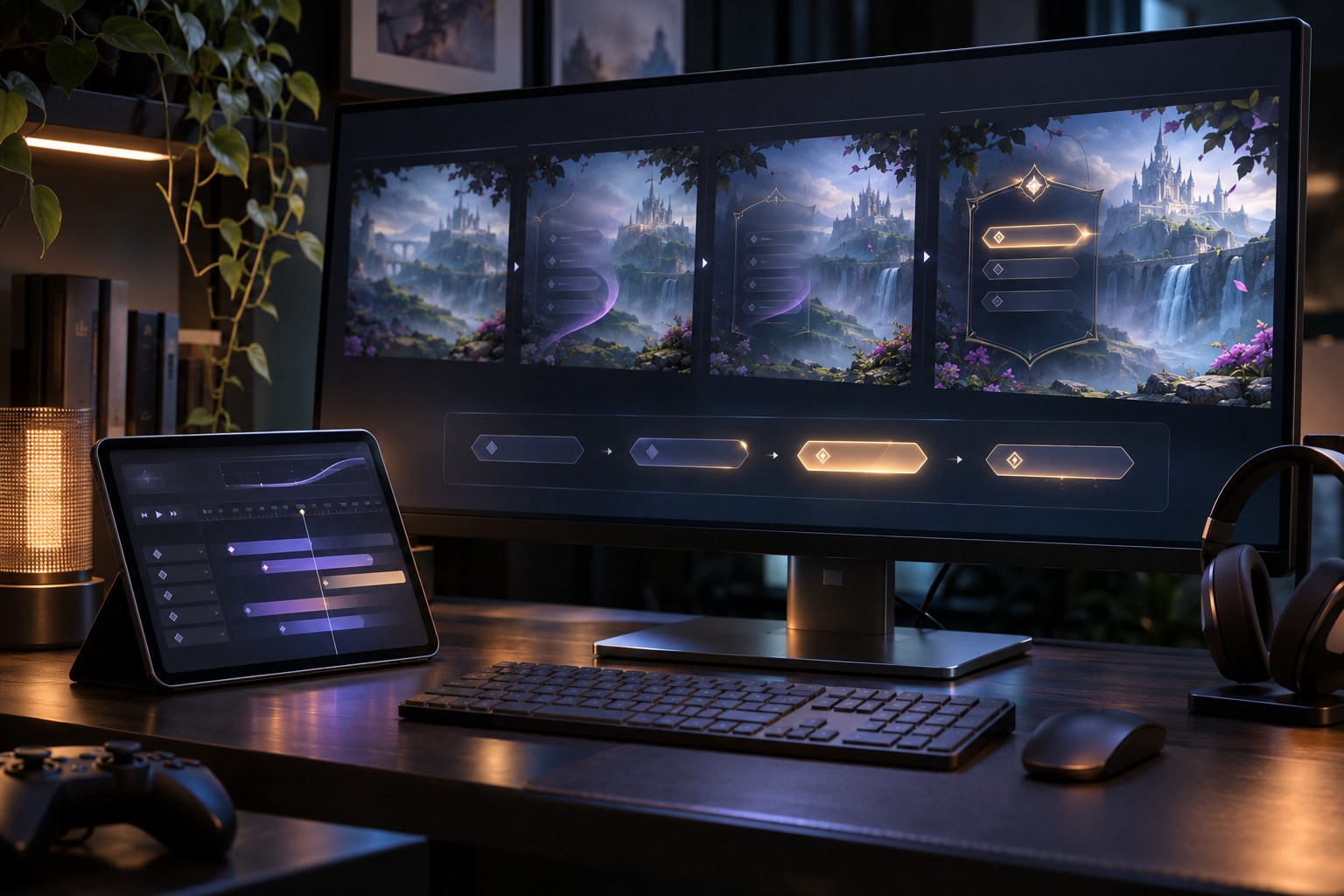
A game interface has to answer the player, often during a fight. A button presses in, an inventory item moves to another slot, a health bar loses a chunk after a hit. The movement matters when it makes the game's response easier to read, not when it merely makes the screen busier.
Did the input register- What changed- What can I do now? Those are the questions behind useful interface animation. A transition that stalls the answer, however polished, slows play. Feedback should appear immediately; longer movement has to clarify navigation or serve the game's tone.
What counts as interface animation in a video game?
Interface animation applies to heads-up displays (HUDs), menus, buttons, inventories, quest logs, maps, dialogue options, skill trees, multiplayer lobbies, stores, loading indicators and settings. It covers state transitions as well: pausing, opening a submenu, changing tabs or moving controller focus.
A character animation shows action within the game world. Cinematic motion graphics can carry a scene's mood. UI animation is judged by a different test: can the player read the state and control it- Damage vignettes, floating combat numbers and objective markers can serve both presentation and feedback.
UI names the controls and information on screen. UX concerns the complete interaction. A menu can look impressive when it opens and still feel awkward if its closing animation ignores the Back button.
Five jobs that make game UI motion worthwhile
1. Confirm input without waiting for the outcome
A button press should be acknowledged before the resulting action finishes. When equipping an item, the pressed state confirms the command; changes to the equipment slot and character model confirm the outcome. An online purchase needs a pending state until the server replies. Showing a success animation early would misrepresent what happened.
2. Show where information comes from and goes
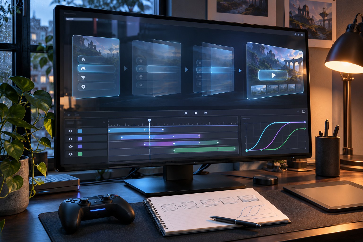
Open an inventory item's details in a way that preserves its position on screen. A panel can grow out of the selected item; returning to the parent menu can reverse that motion. If the destination feels unrelated to the source, players have to reconstruct the path themselves.
3. Establish information hierarchy
One changed value does not justify moving the whole HUD. Keep health, ammo and cooldown updates near the affected indicator. Give a new objective the first beat, then show supporting text without competing for the player's eye. The next decision sets the visual priority.
4. Make game states readable
A shrinking cooldown ring indicates time remaining; a filled progress bar indicates how far an operation has advanced. A loading spinner merely shows that something is happening. Do not substitute a fictional progress percentage for a process the game cannot measure.
5. Reinforce the game's visual identity
An arcade menu might use a quick scale-up with restrained overshoot. Survival horror often suits slower, quieter fades; a racing UI can borrow some directional energy from the game. Typography, sound effects and visual effects (VFX) can share that character, but essential information must remain easy to read.
Choose motion for the interface type and the player's task
Game interfaces can be non-diegetic, diegetic, spatial or meta . Each category positions information differently in relation to the game world, changing what kind of movement feels appropriate.
| Interface type | Typical example | Useful animation approach | Risk to test |
|---|---|---|---|
| Non-diegetic | Health bar, ammunition counter, minimap, pause menu | Short value changes and consistent screen transitions | Covering the playfield or delaying frequent actions |
| Diegetic | In-world monitor, wearable device, equipment display | Movement tied to the object and its place in the world | Small text, camera shake, occlusion and low contrast |
| Spatial | Objective marker, enemy outline, interaction prompt | Subtle anchoring, tracking and distance-aware emphasis | Jitter, clutter, depth conflicts and distracting motion |
| Meta | Damage vignette, blood-spatter overlay, environmental screen effect | Brief changes in intensity linked to a game event | Flashing, visual fatigue and confusion with real-world UI |
During fast combat, HUD elements should stay stable. Strategy games ask players to track resources, production queues and selections; narrative games have more scope for scene-linked transitions if control remains available. Mobile designs must account for compact layouts and battery use. Console focus cues must still read clearly from a sofa.
Dead Space puts health information on the character's suit. Far Cry 2 uses a map inside the game world. Persona 5 makes menu movement part of its unmistakable visual style. These are distinct solutions to different player tasks, not interchangeable templates.
Diegetic UI is not inherently clearer. A wrist display may suit the fiction but force players to read tiny text while dodging an enemy. For information needed in the middle of combat, a conventional overlay can be the better interface.
Timing, easing and motion hierarchy
Set timings across components, not afresh on every screen. Reusable duration tokens make related interactions predictable. The table gives prototype starting ranges, not industry standards ; adjust them for the device, action frequency and observed player behaviour.
| Motion event | Initial timing range | Behaviour to verify |
|---|---|---|
| Button press or selection feedback | 60 - 120 ms | The response feels immediate and never delays the command |
| Tooltip, toast or small badge | 140 - 220 ms | The message can be read without stealing focus |
| Inventory panel or modal | 180 - 320 ms | The destination is clear; the panel can be closed or interrupted |
| Full menu transition | 240 - 400 ms | The new screen is usable as soon as its controls are ready |
| Score or reward count-up | 300 - 700 ms | The final value is obvious and the sequence can be skipped |
Ease-out helps an entering panel settle; ease-in speeds its departure. Use ease-in-out when an element travels between two known locations, and linear movement where a value changes at a steady rate. Spring motion, anticipation, squash and stretch, overlap, follow-through and overshoot can suit the art direction. They will not repair confusing navigation.
A header may arrive from above, a footer from below, and nested panels from the side. Keep those directions consistent. Staggered reveals help when items genuinely have a reading order; in a full inventory, they force the player to watch rows appear instead of finding an item.
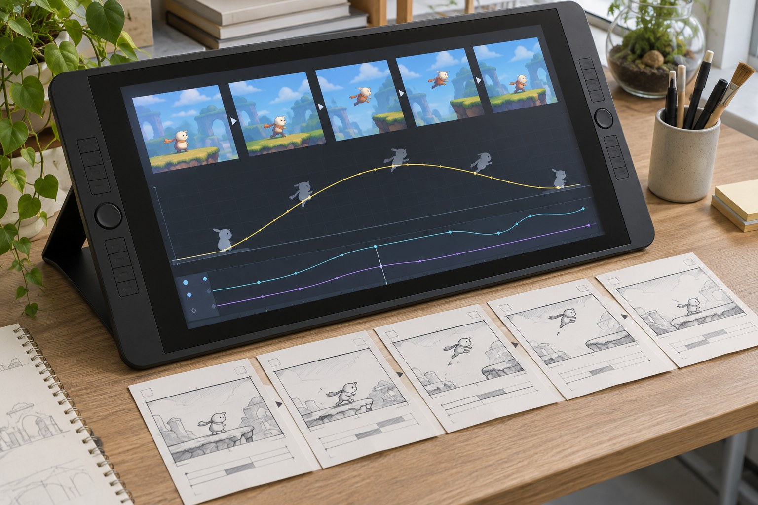
Animation patterns for common game UI states
HUD feedback during active play
Menus, inventories and equipment screens
Keep menu text legible while the panel opens. Hover, focus, selected, disabled and loading states are not the same thing, especially with a controller. If a drag fails, the item should return clearly to its original slot; if it succeeds, show the source and destination updating together.
Rewards, achievements and progression
An uncommon level-up or unlock can carry anticipation, light, particles and a larger scale change. For routine loot or daily rewards, repeated spectacle turns into waiting. Support skipping or speeding up those sequences, with the next command available straight away.
Onboarding, tutorials and contextual prompts
A short pulse can point new players towards a control, provided the target is still usable. Once the action is learned, the prompt should retire. On a device switch, substitute the appropriate controller glyph or keyboard prompt rather than replaying a long tutorial.
Loading, saving and network states
Treat input received , pending , completed and failed as separate states. The save icon should only indicate completion after the save succeeds. Lobbies and stores connected to a server also need readable status text, timeout handling and a way to recover. Animation alone cannot explain a network failure.
Design an animation system before producing the final assets
Begin with the player's actions and the game's state model, not a collection of polished GIFs.
- Map the interaction flow. List critical screens, player verbs, input methods and state transitions. Include pause, back, cancel, failure and reconnection paths, not just the ideal route.
- Set the motion purpose. Label each proposed effect as feedback, navigation, state change, hierarchy or expression. Remove effects with no identifiable function.
- Define motion tokens. Establish reusable durations, easing curves, movement directions, scale ranges and reduced-motion variants. Record which effects can be skipped.
- Prototype realistic states. Use wireframes and interactive prototypes with representative text, inventory length, health values and screen proportions. A Figma Smart Animate prototype can communicate transitions, but a prototype does not prove engine timing or input handling.
- Implement state-driven behaviour. The animation should observe authoritative game state rather than become the source of truth. Connect transitions to input, gameplay events and completed operations.
- Validate and refine. Review the tenth opening of a menu, not only the first; test screen changes while the game is busy and while inputs arrive rapidly.
A motion specification needs a trigger, start and end states, properties, duration, easing, interruption policy, focus behaviour and reduced-motion alternative. Note the sound or haptic cue and performance cost as well. UI designers, animators, engineers and QA can then verify the same behaviour rather than interpret a video differently.
How interface animation is implemented in game engines
Select a tool for the runtime behaviour: a style change, a value driven by code, or an interactive vector asset. Engine compatibility matters more than how impressive the authoring demo looks.
Unity
In Unity, UI Toolkit uses UXML and Unity Style Sheets (USS) for runtime interfaces; UI Toolkit supports reusable styles, events and eligible USS transitions. Unity UI (uGUI), Canvas and Animator still matter in existing projects. Adopting a second UI system solely to animate one panel brings extra maintenance and integration work.
Unreal Engine
In Unreal Engine, Unreal Motion Graphics (UMG) animates widgets through Widget Blueprints, tracks, timelines and keyframes. Blueprints connect motion with player input and game events. The game state should remain authoritative if the player reverses or interrupts a widget animation.
Godot
Godot's AnimationPlayer works with node-property tracks and keyframes. Tweens are useful when the target value changes at runtime, such as a health bar updating after damage. Control nodes build the UI; signals and scripts connect the visuals to game state.
Rive and dedicated motion tools
Rive offers interactive vector animation, timelines, state machines and data binding, subject to the runtime supported by the target engine and platform. Figma is useful for showing interaction flows, and Adobe After Effects for exploring motion or exporting sequences. Neither a prototype nor a rendered clip substitutes for a state-driven interface that must handle localisation, changing health values and controller focus.
Before approving an asset, check export compatibility, memory, draw calls, dynamic text, controller navigation and frame-rate drops. A motion preview that works alone can still fail in a populated HUD.
Accessibility: provide meaning without requiring motion
Continuous background movement, flashing, parallax and animated camera effects can be uncomfortable for players with vestibular sensitivity, photosensitivity or attention-related needs. Microsoft's Xbox motion and visual distraction criterion 117 discusses visual distractions and motion options. W3C guidance on animation from interactions supports disabling non-essential movement. WCAG applies to web content; it does not certify an entire game's accessibility.
Reduced motion must retain the same information and focus order. Swap a flying menu for an immediate change or brief fade; keep focus visible; show damage in a number, label or shape rather than relying on a screen pulse. Camera shake, head bob, motion blur and other movement effects need separate controls when present.
Essential feedback should not depend on motion, colour, audio or haptics alone. A quest completion can retain a readable label and icon after the optional effect ends. Give players time to read and keep moving backgrounds away from text. Review contrast, enlarged text, narration support and remappable controls with animation preferences enabled.
Performance and interruption are part of the design
Animation shares the frame budget with rendering, physics, audio and gameplay. Test on the hardware players will use, including representative phones and handhelds when those are target platforms. A silky transition on a development PC says little about its performance in the shipping build.
Animating opacity, position or scale in a small component is often cheaper than rebuilding a large layout. Long list cascades, layered blurs and particles on frequently visited screens can add overdraw, reflow, allocations and frame-time spikes. If a HUD effect makes combat harder to read or hurts performance, scale it back.
Repeated input is a better stress test than a perfect demo. A player opens inventory, presses Back, changes tabs midway through the close animation or reconnects during loading. Decide whether the transition reverses, cancels, completes instantly or yields to the latest valid state. Keyboard and controller focus must track the interface actually on screen.
Testing whether interface animation actually works
Test motion during real gameplay, not only on an empty mock-up. Give players tasks with the intended controller, mouse, keyboard or touch controls. A visual effect has done its job only if players can act on the information it conveys.
| Design question | Primary check | Warning signal |
|---|---|---|
| Can a player recognise that input registered? | Repeat presses and input-to-feedback time | Accidental double activation or hesitation |
| Can a player track menu navigation? | Wrong turns, backtracks and task completion | Players repeatedly lose their place |
| Can a player read HUD changes during action? | Detection accuracy under live gameplay | Missed health, cooldown or objective updates |
| Does motion remain comfortable? | Reported discomfort and use of reduced-motion settings | Nausea, distraction or avoidance of menus |
| Does the animation run reliably? | Frame time on target hardware and interrupted-state tests | Stutter, focus loss or stuck input |
Compare the animated screen with a simpler version when the change is meaningful. A quicker menu is not better if players choose the wrong item more often. Pair completion time with errors, HUD recognition with frame time, or comfort ratings with reduced-motion use. Test repeated sessions; a transition that charms once can frustrate after the twentieth visit.
Interface animation for New Zealand game teams
Aotearoa New Zealand teams ship games for mobile, desktop and console audiences well beyond the local market. PikPok's UI designer role description connects UI animation and VFX with asset creation, interaction flows and work inside the engine. It illustrates the overlap between design and implementation without implying that every studio uses the same pipeline.
English UI written for New Zealand players may also need to ship in other languages. Leave room for longer labels, support right-to-left layouts where the product requires them, and account for different button glyphs. Check the same motion on televisions, phones and handhelds. Reduced-motion behaviour belongs in the original component specification, not in a late accessibility patch.
Common interface animation mistakes
- Every element moves: attention has no hierarchy, and the animation competes with the game.
- Menus cannot be interrupted: familiar actions become slower on every visit.
- Transitions hide interaction state: a button looks available before it can be activated, or focus sits on an invisible control.
- Decoration imitates confirmation: a purchase, save or matchmaking action looks finished before the system has completed it.
- Effects are specified only as video: engineers lack triggers, timing tokens, focus rules and fallback behaviour.
- Motion is tested only on an empty screen: busy backgrounds, long item names and low-end hardware expose failures late.
- Reduced motion removes information: essential selection, progress or warning states disappear along with the animation.
A useful standard for finished game UI motion
A finished motion system survives more than the first smooth demo. Open and close the same menu quickly; switch focus mid-transition; test long labels, reduced motion and slow frames. The screen must show the correct state and leave the next control available.
When the player sees that the menu answered, the health value changed and the next control is ready, the animation has already done enough.