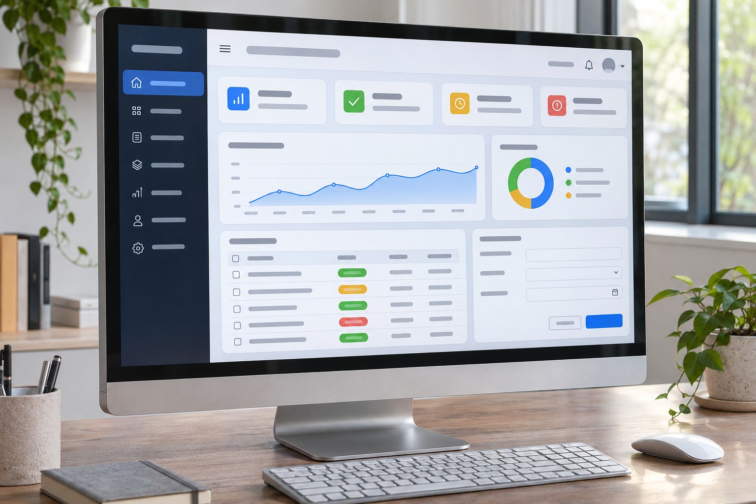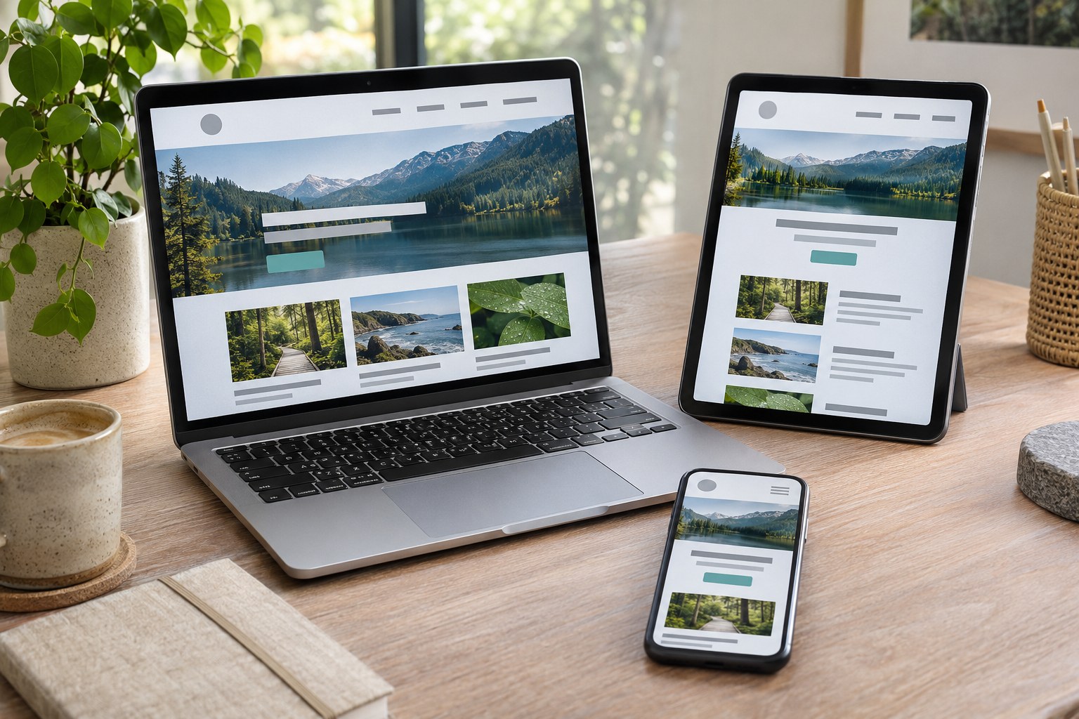
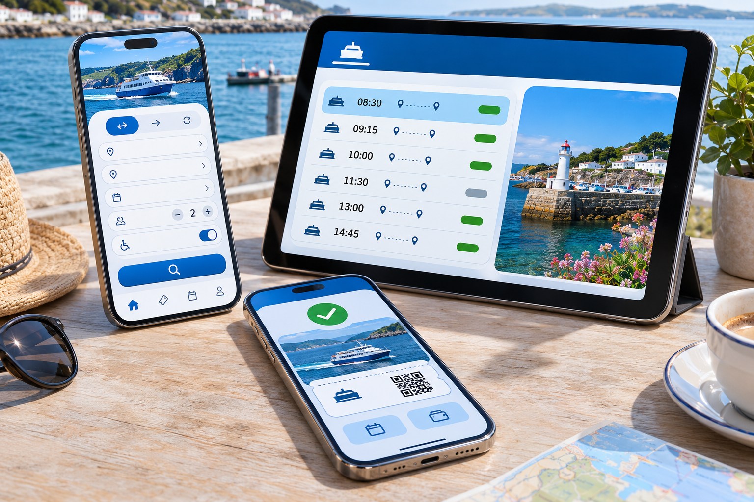
Mobile app design must account for what happens after someone taps a button, not just how the screen looks. A booking might appear to fail when reception drops, even though the request went through. Good UX makes that state understandable and prevents a second booking. The same care belongs in navigation, content, touch controls and the way an app works with assistive technology.
For a New Zealand business, startup or public service, the decision begins earlier than the first mockup: why would someone install this instead of using a mobile website? Frequent tasks, useful device features or a real need to work offline may justify an app. An occasional information lookup usually does not. The answer affects the budget, the user experience (UX) , the user interface (UI) and the build.
What is mobile app design?
UX design organises the task: information architecture, navigation, user flows, feedback and recovery when something goes wrong. UI design handles what people see and operate: typography, layout, colour, icons, forms, motion and component states. Interaction design specifies what a tap, swipe, long press or system event actually does.
A polished mockup without tested flows or implementation detail is unfinished design.
- Product definition: intended users, jobs to be done, core features, minimum viable product (MVP) boundaries and success measures.
- Experience structure: user personas grounded in evidence, journey maps, information architecture and task flows.
- Design artefacts: wireframes, interactive prototypes, high-fidelity mockups, a component library and design tokens.
- Production detail: loading, empty, error and offline states; accessibility behaviour; responsive layouts; developer handoff and acceptance criteria.
A mobile-first website shares much of this work. Installed apps add platform conventions, permissions, notifications, store review and maintenance. Budget for those tasks from the outset.
Native App, Cross-Platform App or Mobile Website?
A browser link needs no installation; a native app adds store distribution and release work.
| Approach | Strong fit | Trade-off to test |
|---|---|---|
| Responsive mobile website | Public information, search-led discovery, occasional bookings and services opened from shared links. | Browser-based interactions need to satisfy the job without an installed product. |
| Progressive web app (PWA) | Web-first products that benefit from an installable experience, caching and selected offline or notification features. | Browser and operating-system support differ; validate every required capability on target devices. |
| Native iOS and Android apps | Deep platform integration, specialised hardware interaction or experiences requiring close adherence to each operating system. | Separate platform implementation and ongoing design QA add complexity. |
| Cross-platform app | A shared product serving both iPhone and Android audiences with substantial common functionality. | A shared codebase does not remove the need for platform-specific navigation, permissions and device testing. |
iOS teams may build with Swift or SwiftUI; Android teams with Kotlin or Jetpack Compose. Flutter and React Native offer cross-platform code reuse, but they handle rendering and native components differently. None of these frameworks is a visual design style. One Figma project can still specify different iOS and Android behaviours.
A PWA needs more than an icon on the home screen. Its service workers, caching, installation and offline behaviour must work on the devices customers use. The MDN guidance on progressive web apps covers the underlying capabilities. A web-view wrapper is not automatically a substitute for a native app either: Apple's App Review requirements expect functionality beyond a repackaged website.
Think about frequency and the cost of failure. Someone checking a council rubbish-collection date once needs a quick answer, not necessarily an install. A courier scanning parcels, collecting signatures and working with intermittent reception has a different problem. The second task makes a stronger case for a dedicated app.
The mobile app design process, from discovery to handoff
1. Define the user's task and the product boundary
Begin with the people doing the work. Interviews, observation, support enquiries and existing analytics can reveal what slows them down. Identify the job to be done and the setting: at a desk, on a bus or outside with poor reception. A persona should describe observed behaviour, not an invented biography. Map the journey through entry points, decisions and failures to the useful outcome.
Keep the minimum viable product (MVP) focused on complete tasks. A repeat-prescription service needs ordering, confirmation and status before it needs a rewards programme. Prototype the assumptions that would otherwise force an expensive redesign.
2. Map the information architecture and user flows
Information architecture (IA) groups content and features so people can find them. A user flow follows a task across screens and decisions, including what happens after a failed payment, expired session, rejected permission or forgotten password. A safe way back belongs on the map.
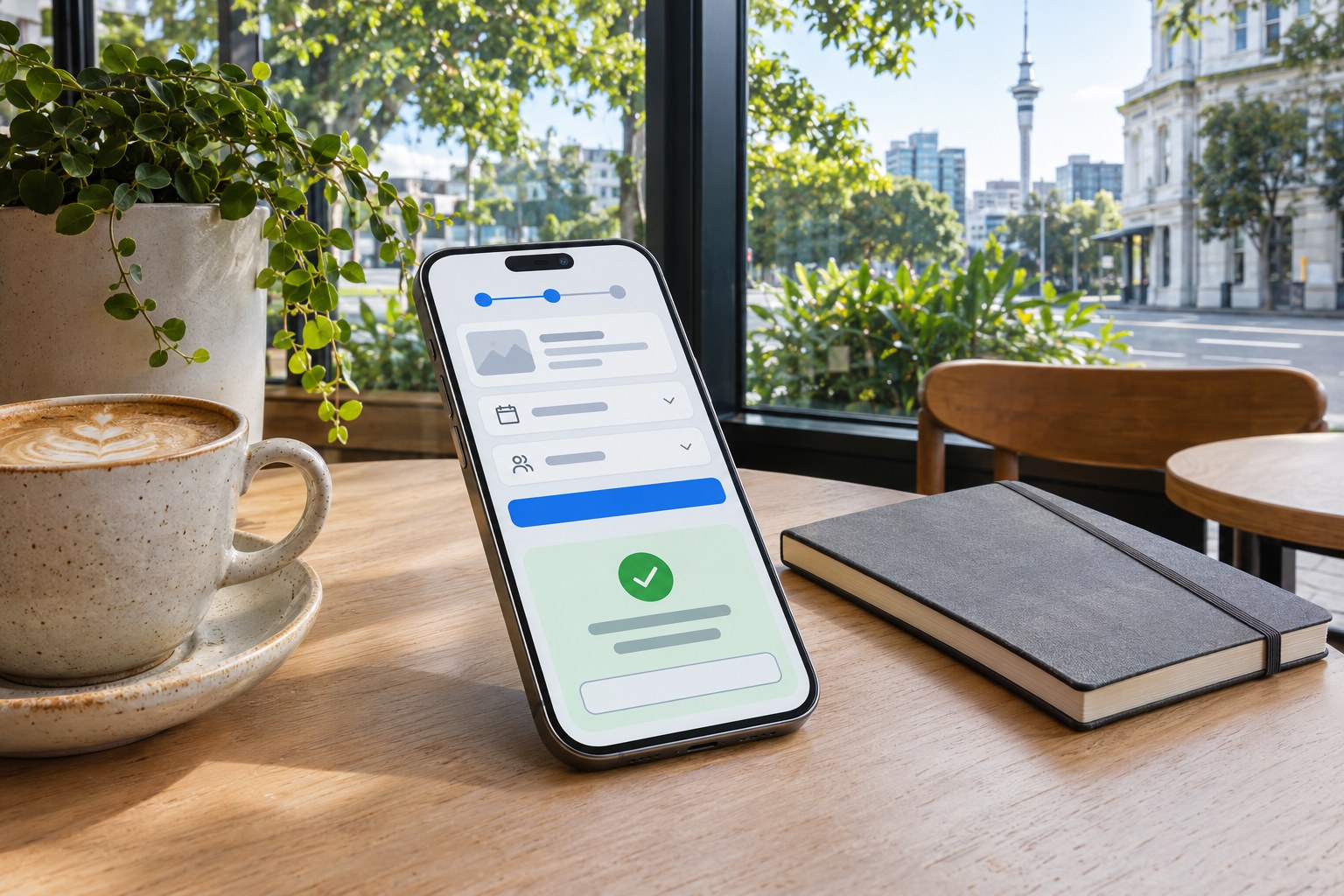
For a booking, the visible path is simple: choose a service and time, provide details, review the price, then confirm. The harder question comes after submission. If the connection drops, can the person tell whether the booking exists- A status check or safe retry prevents an accidental duplicate.
3. Create wireframes before high-fidelity screens
Wireframes are the place to settle hierarchy, navigation and content placement. Populate them with plausible names, dates and messages. A button that fits 'OK' may not fit a longer translated label or the enlarged text chosen by a user.
Once the flow survives early tests, develop the visual UI. A design system records typography, spacing, icons, colour contrast, imagery and component states. Reuse the same field, dialog and status pattern across screens instead of redrawing each one.
4. Prototype and test on physical devices
A Figma prototype can link screens before any code exists. Choose its fidelity to suit the test: rough wireframes for navigation, more realistic interaction states for forms, gestures and sensitive transactions.
Give usability-test participants a goal rather than a script of taps. Watch where they pause, make errors or misunderstand feedback. Check the prototype on physical iPhones and Android devices as well as the desktop preview. If several people struggle at the same step, review the flow before debating the shade of a button.
5. Prepare an unambiguous developer handoff
A link to mockups is not enough for developer handoff. Specify design tokens, assets, typography, spacing, screen variants, responsive behaviour, interaction notes and accessibility labels. Document loading, timeout, validation and permission errors wherever an API or system service is involved. Acceptance criteria and design QA then let the team check the built behaviour across devices and text sizes.
After launch, compare task completion, support enquiries and app analytics with what usability testing predicted. Keep store screenshots, app icons and release details consistent with the product shipped to the Apple App Store or Google Play. A successful store submission says nothing about whether users can complete their tasks.
Mobile UI patterns that reduce effort and mistakes
Navigation should reflect the user's mental model
Primary destinations should be easy to recognise. A bottom navigation bar works for a small set of frequent tasks; search, nested tabs and contextual actions handle secondary ones. Google's Android navigation guidance describes three to five top-level destinations in a navigation bar. If the product needs more, reorganise the hierarchy rather than squeezing in another icon.
Show where the person is and preserve their place when they go back. Essential actions need visible controls; a gesture can be a shortcut, but should not be the only route to payment, cancellation or another critical task.
Design for touch, reading and one-handed use
A target can look small and still need a generous tappable area. Apple's accessibility guidance gives 44 × 44 points as a default iOS and iPadOS control size; Android recommends at least 48 × 48 density-standalone pixels (dp) . Leave space between neighbouring controls. Points and dp are not the CSS pixels used in web accessibility criteria.
Text enlargement is a useful stress test. Does a long button label wrap- Does the keyboard hide the form's next action- Check readable typography, visual hierarchy, safe areas, notches and the orientations the app supports. Dark mode, high contrast and reduced motion also need real component states; they are not cosmetic extras.
Make forms, feedback and recovery unmistakable
Ask only for fields the task needs. Choose a suitable keyboard, support autofill where appropriate and keep field labels visible. Put validation messages beside the problem and retain everything the person entered correctly. One typo should not send them back to the first field.
Feedback must match the actual state. 'Sending' is not 'sent'. An empty result needs a clear explanation; a failed request needs a retry or saved-progress route. Destructive actions need confirmation or an undo option. 'Payment received' tells someone more than a green tick alone.
Simplify Onboarding, Permissions and Notifications
Onboarding should let a new user reach the first useful task without sitting through a long tutorial. Apple's onboarding guidance favours brief, optional guidance built into interaction. Guest access makes sense when registration serves no immediate purpose. Collect account details when they become necessary.
Request camera, location, contacts or notification access at the point of use, and explain why. A courier can see the camera prompt just before scanning a parcel, rather than on the welcome screen. Let people control push notifications and keep sensitive information out of lock-screen previews. Badges, haptics and animation can supplement a status message, not replace it.
Designing for iOS, Android and larger screens
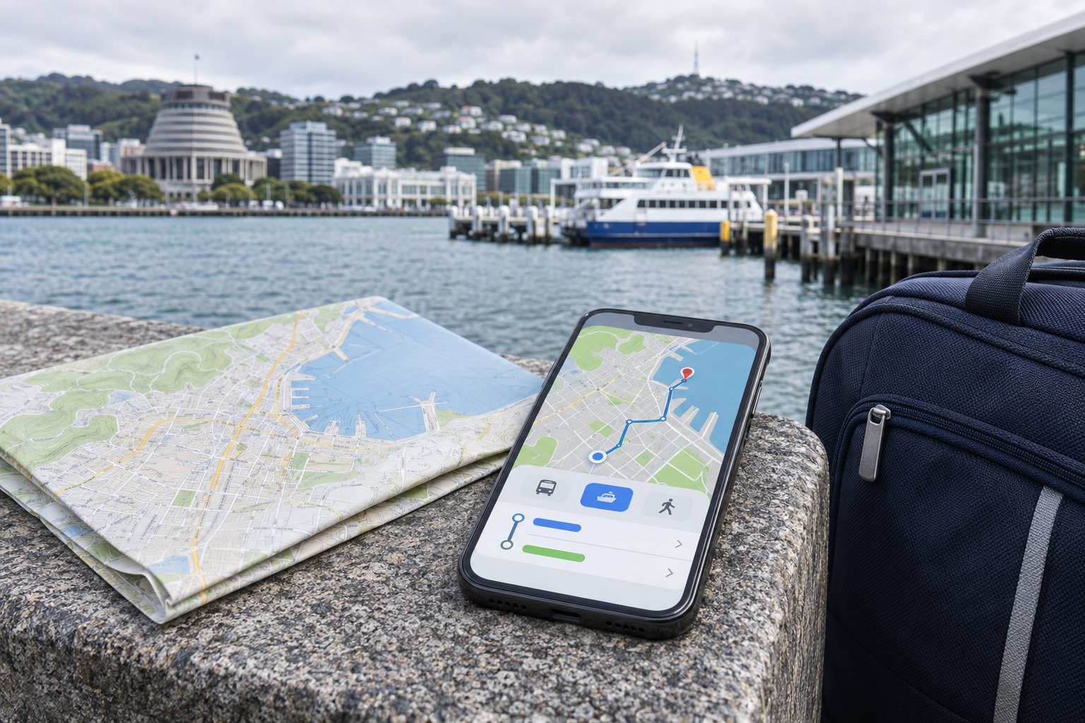
A shared brand does not require identical iOS and Android screens. Apple's Apple's interface design documentation describe iOS navigation, system controls and input behaviour. Material Design 3 provides Android-oriented components, adaptive layouts and motion guidance.
iOS uses points (pt) for layout; Android uses density-standalone pixels (dp) and scalable text units. Follow each platform's expected back action, sheets, pickers and permission prompts. Brand colours, content rules and design tokens can stay shared while individual controls behave natively.
A tablet is not a stretched phone. Split-screen use, foldables and resizable windows change the space available for navigation and content. A bottom bar may become a navigation rail or persistent side panel. Test those layout changes, not just the screen width.
Build Accessibility into the Design
Accessibility covers touch, screen readers, keyboards, switch control, voice access and other assistive technologies. Check focus visibility, control names, reading order, instructions, error recovery, captions, contrast and an alternative to gesture-only input.
WCAG 2.2 provides web accessibility criteria. The W3C's WCAG2Mobile guidance explains their relevance to native, hybrid and mobile web apps; it is informative, not a separate legal standard. WCAG 2.2 Level AA sets a 24 × 24 CSS-pixel target-size criterion for web content, subject to exceptions. Apple's and Android's recommended touch targets use different units and larger dimensions.
New Zealand's government mobile accessibility guidance covers orientation, focus, screen structure, images, controls, forms and gestures. Check which government standards apply to the agency or service concerned; do not assume every private app has the same legal obligations.
Automated contrast checks do not reveal whether a screen reader can use a form. Test VoiceOver on iOS and TalkBack on Android, including larger text, labels, focus order and the full error-recovery path. People who use assistive technology should take part in usability testing.
Designing for people in Aotearoa New Zealand
A New Zealand service needs local details to work, not decorative localisation. Write in natural New Zealand English; use NZD for prices and familiar addresses. Spell out the month where a numeric date could be ambiguous. State whether GST is included when it affects a purchase. Check regional delivery conditions, travel and time zones for services where those details matter.
Support te reo M?ori macrons in fonts, search, input and screen-reader output. Bilingual services need a clear language choice and correctly marked language changes. Translation alone is not cultural review; involve M?ori partners early where appropriate. NZ Digital Government te reo Māori guidance
A field worker in rural Aotearoa may lose reception midway through a record. A visitor may be watching mobile-data use; someone else may have an older handset. Test these situations with the intended users. Light screens, explicit offline messages and saved progress can be more useful than animation.
Privacy, security and trust should shape the screens
New Zealand's Privacy Act 2020 governs how organisations collect, use, store, disclose and handle access to or correction of personal information. Privacy principle 3A took effect on 1 May 2026 and introduces notification duties for specified cases of indirect collection. Before drawing the consent or account screens, identify what data the service needs, where it comes from and what must be explained.
Privacy by design starts with collecting less data and using privacy-preserving defaults. The NZ Digital Government privacy-by-design approach covers the information lifecycle. People also need practical controls: correcting details, reviewing transactions or audit history, signing out on a shared device and requesting account deletion where the service allows or requires it.
A neat interface can still conceal an expensive decision. Preselected marketing consent, unclear subscriptions, hidden cancellation routes and coercive permission prompts undermine trust. Show material terms and charges before confirmation. Authentication, session expiry, biometrics and multi-factor authentication also need recovery paths; otherwise legitimate users can get locked out.
How much mobile app design work should be in scope?
A price per screen hides much of the work. Ten straightforward information screens may take less effort than one payment flow involving authentication, third-party services, error handling and accessibility checks. Separate design-only costs from engineering, backend work, QA, store release and support when comparing scope.
| Scope | Expected output | What drives effort |
|---|---|---|
| Discovery or UX audit | Problem definition, user evidence, priority flows and recommended MVP boundary. | Recruitment, interviews, complexity of existing services and stakeholder alignment. |
| Focused feature design | Flows, wireframes, prototype, tested states and handoff for a defined task. | Branching logic, forms, permissions, revisions and platform variants. |
| End-to-end product design | User discovery, IA, complete UI, accessibility work, design system, prototype and developer specifications. | Unique components, multiple user roles, integrations, localisation and testing rounds. |
| Ongoing product design | Design QA, new features, experimentation, component maintenance and post-launch improvements. | Release cadence, device coverage, analytics maturity and support findings. |
When comparing a New Zealand design agency with a freelance UI/UX designer, ask what is included: user interviews, test recruitment, prototype revisions, source-file ownership, accessibility checks and developer support. Clarify whether error and loading states count as separate screens. Missing specifications cost time when developers have to invent the interactions later.
A focused feature may fit into a short sprint; a full product needs time for task discovery and user tests and a reusable design system. A schedule devoted entirely to polished UI leaves no room to find out whether the flow works.
Two practical New Zealand app design scenarios
Repeat orders for a local healthcare service
For a local healthcare service, repeat ordering must make status and identity unambiguous. The screen should show the correct item, availability or turnaround, an appropriate verification step and an unmistakable confirmation without leaking sensitive details in notifications. Test whether users distinguish 'request sent' from 'order approved', especially after a connection failure. Track completed requests, duplicates, corrections and support contacts.
Rubbish and recycling reminders for a council
A council resident often wants just three things: the next collection date, a list of accepted materials and perhaps a reminder. Address lookup and clear holiday changes matter more than a dashboard. Check whether the task needs a mobile site, PWA or installed app. Measure correct answers and avoidable enquiries, not only downloads.
How to measure whether the app design works
Start measurement with the task. Record completion and failure events before release; then use those events to judge changes. More screen views are not necessarily good news. People may be taking extra steps to get the same result.
- Task completion rate: the proportion of people who finish the intended booking, submission, order or lookup.
- Time on task and step drop-off: where an otherwise successful journey becomes slow or confusing.
- Error and recovery rates: failed submissions, repeated attempts, permission denials and successful retries.
- Activation and retention: whether users reach the first useful outcome and return when the service genuinely calls for repeat use.
- Accessibility and support signals: assistive-technology failures, complaints, abandoned forms and customer-service contacts.
Choose a primary outcome and a guardrail. For checkout, track completed purchases alongside refunds or mistaken orders. For onboarding, track the first useful task rather than the number of people who skip a tutorial. Analytics collection must match the privacy commitments shown to users.
A readiness check before development begins
Check these points before developer handoff:
- Can a new user identify the primary task and complete it without a spoken explanation?
- Is every critical flow, branch and recovery path represented in the prototype?
- Do the UI components cover loading, empty, error, success, disabled and offline states?
- Can people use the product with larger text, a screen reader and alternatives to gesture-only input?
- Are privacy notices, permissions, pricing and data practices clear at the point of decision?
- Does the handoff define tokens, assets, behaviour, accessibility labels and acceptance criteria?
One final handoff check: ask an engineer to describe the most failure-prone flow without help from the designer. If the specification cannot explain the recovery path, that part of the design is not ready.