UI design (user interface design) determines what people see and operate when they use a website or app: navigation, forms, controls, content and the feedback that follows an action. A successful interface makes a task understandable without requiring users to work out how the screen is meant to behave.
A beautiful booking form can still be hard to use. Perhaps its date picker cannot be reached by keyboard, or an error wipes out the details someone has entered. The test is straightforward: can a person complete the booking, recover from a mistake and recognise the confirmation?
What is UI design?
A user interface (UI) is where someone interacts with a digital product. On websites, graphical user interfaces (GUIs) bring together buttons, links, menus, text fields, icons, cards, tables and notifications. Voice user interfaces (VUIs) rely on spoken prompts; gesture-based interfaces need gestures people can discover and understand. The controls differ, but clear feedback matters in each.
UI designers turn user needs and product requirements into screen layouts and interaction rules. Their work covers typography, colour, spacing, visual hierarchy, responsive behaviour and component states. The default view is only one part of the design. What does the user see while a payment processes- What appears when a search returns nothing-
UI design vs UX design: where the responsibilities meet
User experience (UX) design deals with the whole journey, from choosing a service to completing it. UI design deals more closely with the screens and controls used along the way. Interaction design, usability and accessibility sit across both disciplines; job titles and responsibilities vary between teams.
| Discipline | Primary question | Typical outputs |
|---|---|---|
| UX design | Does the product solve the right problem with a workable journey? | User journeys, user feedback, information architecture, service flows and usability findings |
| UI design | Can users see, understand and operate each part of the interface? | Screen layouts, components, states, visual specifications and interactive prototypes |
| Interaction design | What happens when a person takes an action? | Interaction rules, transitions, feedback, error recovery and behavioural patterns |
| Visual design | How do visual elements communicate hierarchy and identity? | Typography, colour, iconography, imagery, grids and visual styles |
| Web design | How do content, interface and technical presentation work as a website? | Web page designs, responsive layouts and site-wide visual patterns |
Take an online appointment service. UX work helps establish whether people need to book, reschedule or cancel, and whether the journey makes sense. UI work makes available times legible, keeps the selected date visible and explains the result of pressing Confirm. Neither discipline can fix a service that has no appointments in the right location.
The principles behind effective UI design
1. Establish a clear visual hierarchy
A page needs a clear order of attention. Size, type weight, colour contrast, readable line lengths and whitespace tell people what matters first. Reserve the strongest visual treatment for the main action at that decision point. Decorative effects cannot rescue a layout in which the form label, price and button all compete equally.
Content design and UX writing shape decisions too: “Confirm appointment” tells people what happens; “Continue” does not. Keep helper text beside the field it explains.
2. Keep patterns consistent without hiding differences
People learn patterns as they move through a site. Keep navigation, labels and button behaviour consistent, while showing genuine differences between actions. “Delete account” needs a different level of warning from “Save changes”; making them look interchangeable is risky.
A checkout that calls the shopping basket “Basket” on one screen and “Cart” on the next invites doubt. Stick with terms customers recognise.
3. Make system status visible
Submitting a form, saving a record or paying for an order should produce visible feedback. A spinner indicates activity, not success. After payment, people need an outcome they can understand and, where the service provides one, a receipt or reference number. Selected filters and progress steps need equally clear states.
4. Reduce cognitive load
Too many choices at once make a task harder to scan. Put related controls together and reveal optional settings when they become relevant; this is progressive disclosure. An account form rarely needs every preference on its first screen. Alignment and proximity help users recognise which label belongs to which control.
Hiding delivery charges or field requirements does not simplify a screen. It delays the confusion.
5. Prevent errors and support recovery
Prevent avoidable errors with suitable input types, visible labels, sensible defaults and validation rules that match the data being requested. When something goes wrong, name the affected field and keep entries that are still valid. Before an irreversible action, explain the consequence and provide confirmation or undo where the product allows it.
“Invalid input” leaves someone guessing. “Enter a four-digit New Zealand postcode, such as 6011” gives a specific correction. That rule belongs only on forms requiring an NZ postcode, not on a field intended for international addresses.
6. Design for different abilities and input methods
A mouse is only one way to operate a website. People also use touch, keyboards, switch devices and screen readers. Every essential action needs an accessible name, visible focus and an input method that works without hovering. Contrast, touch-target spacing and motion settings must be considered while designing the component, not added as a final cosmetic pass.
Essential UI elements and component states
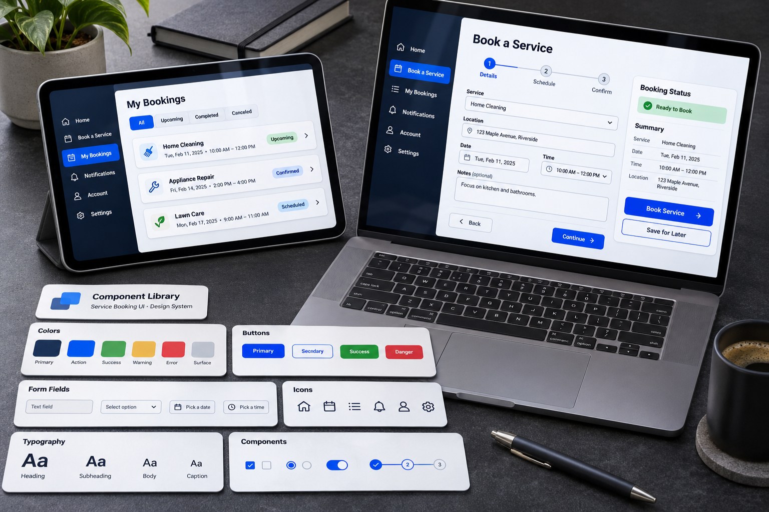
Component libraries work best when controls are grouped by purpose: buttons act, links navigate and inputs collect data.
| Component group | Common elements | What to check |
|---|---|---|
| Actions | Buttons, text links, icon buttons, toggles | Clear action labels, correct semantics, priority and feedback |
| Inputs | Text fields, checkboxes, radio buttons, select menus, date inputs, textareas, file uploads | Labels, input formats, helper text, validation and error recovery |
| Navigation | Headers, menus, tabs, breadcrumbs, search, pagination | Current location, discoverability, focus order and responsive behaviour |
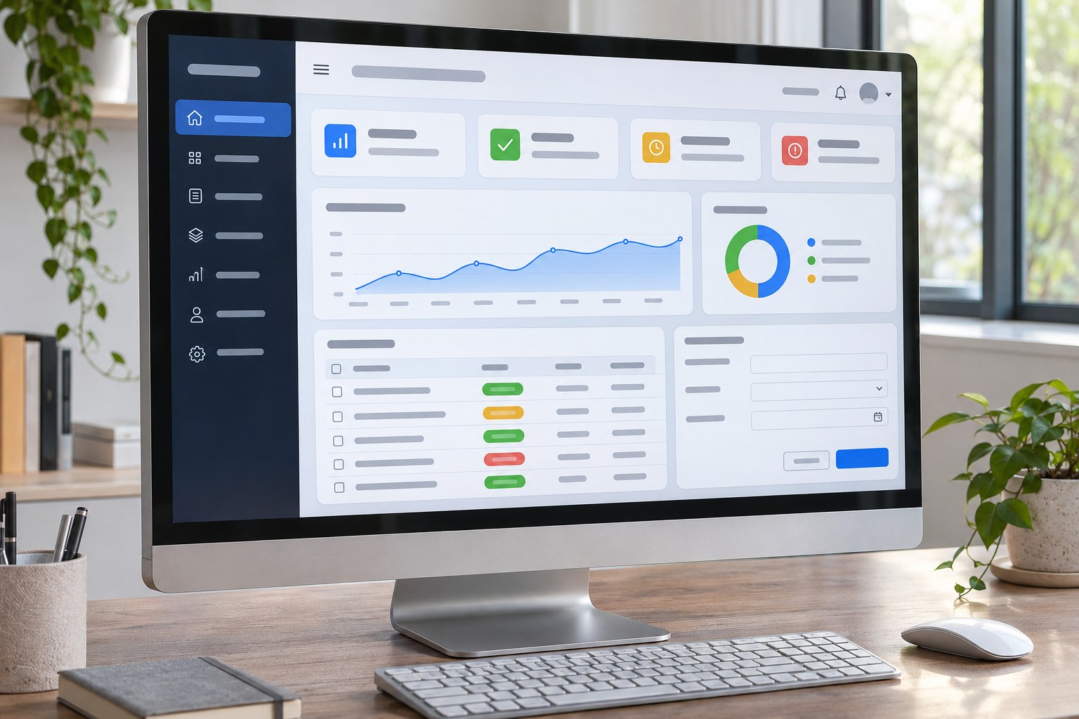
| Information | Cards, tables, status badges, alerts, tooltips, progress indicators | Readable hierarchy, accurate status, accessible alternatives and context |
| Containers and overlays | Panels, accordions, drawers, dialogs, modals | Purpose, opening and closing behaviour, focus management and content order |
Interactive components need a documented state model . For a button, that means default, hover, keyboard focus, pressed, disabled and loading. Fields have empty, filled, invalid, valid and read-only states. Search results need populated, empty, loading and failure views. Without those states, a neat mock-up leaves developers to guess how the real product behaves.
A greyed-out Submit button can be a dead end if users cannot tell what is missing. Explain the requirement beside the control or fields. During a slow submission, prevent duplicate requests and show that the system is still working.

A practical UI design process
Start with the task, not the colour palette. Sketch, prototype, test and document the behaviour developers need to reproduce.
- Define the task and constraints. Identify users, devices, assistive technology, success criteria, business rules, privacy obligations, technical limits and brand requirements.
- Understand users and existing behaviour. Examine interviews, support requests, analytics and usability sessions. Check assumptions against people with different devices, languages and access needs.
- Map information and journeys. Use user flows, task flows and information architecture to decide what each screen contains, how choices connect and where people can go back.
- Sketch low-fidelity wireframes. Solve layout, navigation and content order before styling. The main task should make sense without decorative cues.
- Build the visual system. Set type, colour roles, spacing, grids, icons and responsive rules. Reusable components and design tokens keep changes manageable.
- Prototype interactions and edge cases. Connect screens; include validation, empty results, payment failures, slow connections, account recovery and confirmations. Use microinteractions when they explain a state change.
- Test, hand off and refine. Watch people attempt realistic tasks, test accessibility manually and with tools, and give developers the behaviour specifications. Review the built product and failures after release.
A worked example: booking a service online
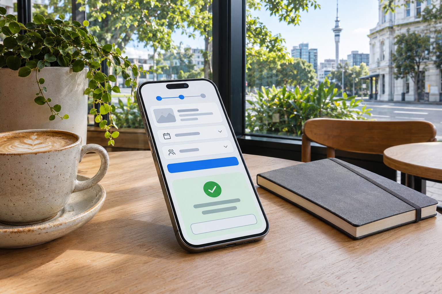
A Wellington resident booking an appointment needs an available time, a place to enter details and proof of the booking. An attractive calendar does little if the slots are hard to distinguish.
Start with service and location, then show available dates and times. Keep the selected slot visible as the user enters details and reviews the booking. The calendar must work by keyboard as well as touch. Where time zones matter, display the zone explicitly; do not use colour alone to mark unavailable times.
Now suppose the session expires before the person submits the form. The interface needs to say that the slot is no longer held, retain details it can safely keep and offer current availability. Successful submission calls for a separate confirmation state with appointment details and a reference number, if issued. These are ordinary service conditions, yet a single static screen will not expose them.
Responsive UI design for mobile, tablet and desktop
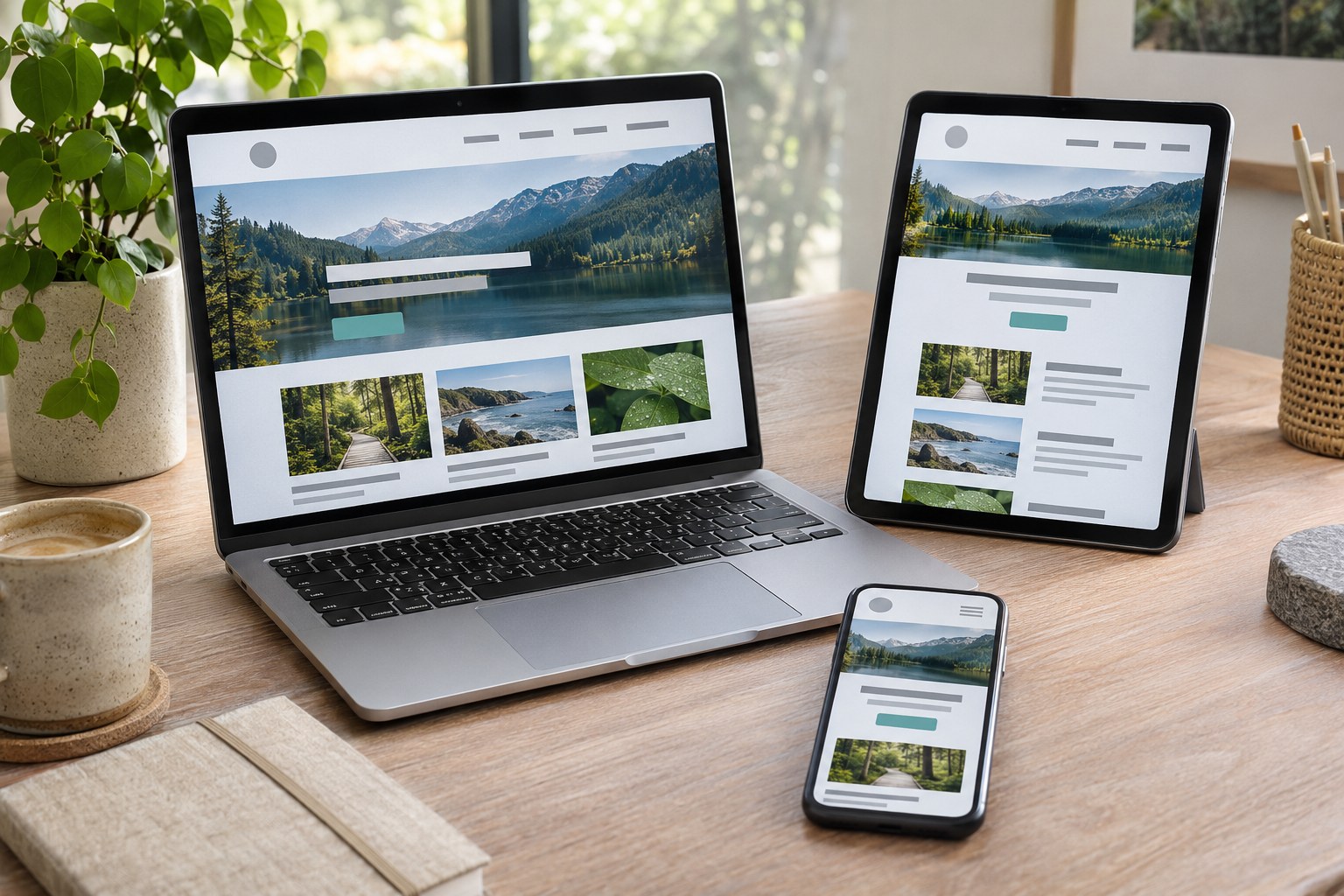
Responsive UI design changes the arrangement of content as the viewport changes. It does not simply shrink a desktop page. A three-column card grid might collapse to one column on a phone; a wide table may need a different presentation, while navigation has to remain usable.
Build for a narrow screen first, then give the content room where it needs it. CSS Grid, Flexbox, relative units and media queries support those changes. Breakpoints should follow the layout, not a list of phone models.
Try the interface with long labels, enlarged text, 200% zoom, landscape orientation, slower connections and an open on-screen keyboard. Ordinary reading content should not force horizontal scrolling. Check the widths between design artboards too: a component that works at two preset sizes can break halfway between them.
Accessibility and UI design in New Zealand
Accessible interfaces let people perceive information, use controls and understand what happened, including when they rely on assistive technology. The WCAG 2.2 accessibility standard give teams testable web requirements. A successful visual review does not establish accessibility on its own.
The NZ Government Web Accessibility Standard 1.2 took effect on 17 March 2025. It requires WCAG 2.2 Level AA conformance for pages covered by the standard at mandated government organisations. That mandate does not automatically extend to every private business. Other accessibility duties depend on the organisation and the service.
- Colour and contrast: WCAG Level AA generally requires at least 4.5:1 contrast for normal text and 3:1 for large text, with defined exceptions. Non-text controls and important graphical information also have contrast requirements. Never convey an error using red alone.
- Keyboard and focus: People should reach and operate interactive elements without a mouse. Focus indicators must be visible, focus order should follow the task and dialogs need controlled keyboard behaviour.
- Target size: WCAG 2.2 criterion 2.5.8 sets a 24 by 24 CSS pixel minimum for pointer targets at Level AA, subject to specific spacing and other exceptions. Larger targets are often more comfortable for touch interaction.
- Forms: Visible labels, grouped related fields, concise instructions and helpful error messages support comprehension. Correct HTML semantics are generally more reliable than rebuilding a button or checkbox from a generic container.
- Content and media: Use meaningful heading levels, descriptive links, alternative text where needed, captions for relevant video content and controls that do not require a single sensory ability.
- Verification: Automated accessibility checks can identify some problems, but keyboard walkthroughs, screen-reader checks and testing with disabled users reveal issues that software alone misses.
Sun glare, an injured hand, a cracked phone or a slow connection can make an otherwise tidy interface unusable. Access problems are not confined to permanent disability.
Designing for Aotearoa New Zealand
For New Zealand customers, a form must handle NZD , local address conventions and four-digit postcodes when a postcode is required. Dates deserve particular care: “5 November 2026” avoids the month-first ambiguity of “05/11/26” in mixed-audience services.
An NZ address does not have a US state or ZIP code. Accept local phone numbers and international numbers when the service needs both. Cross-border bookings need a stated time zone. Where GST affects a purchase, make it clear whether the displayed price includes it.
Preserve macrons in te reo Māori names, interface labels and data fields. A bilingual site also needs a coherent language switch, translated help and errors, content ownership and appropriate language markup for screen readers. The NZ Digital Government guidance on language and macrons provides a useful reference. Depending on the audience and service, New Zealand Sign Language (NZSL) and other accessible formats also warrant consideration.
A rural health service and an Auckland online shop may have very different connectivity, language, privacy and access constraints. Test with people who use the service rather than an imagined “typical Kiwi user”.
Design systems, tools and developer handoff
A
design system
combines reusable UI components with visual rules, interaction patterns and documentation. Style articles set choices such as typography and colour; component libraries also specify behaviour. Design tokens -
colour.text.primary
and
spacing.medium
, say - let designers and developers apply shared values across screens.
Figma, FigJam and Sketch support design and collaboration, while interactive prototypes let teams try a flow before building it. Google’s Material Design, Apple’s interface design documentation and the Atlassian Design System offer established approaches to components and tokens. New Zealand public-sector teams can look to the Ministry of Education’s design system too. A borrowed pattern still needs checking against the product, platform and accessibility requirements.
Developers need more than a picture. A useful handoff includes component names, responsive rules, real content, focus order, validation text, interaction triggers, loading and empty states, asset details and design tokens. Specify whether each control navigates or performs an action. The HTML, CSS and JavaScript implementation must preserve those decisions.
How to measure whether a UI works
Watch participants attempt a realistic task without directing them. Prototype tests expose confusing paths; a live website reveals browser behaviour, load times and service-integration failures.
| Measure | What it reveals | Useful qualification |
|---|---|---|
| Task completion rate | Whether users achieve the intended outcome | Define what counts as a successful completion before testing |
| Time on task | How much effort a task requires | Interpret alongside accuracy and user confidence, not alone |
| Error rate and recovery | Where people make mistakes and whether they can recover | Distinguish user mistakes from service or technical failures |
| First-click success | Whether the initial choice leads towards the right path | Useful for comparing navigation and page hierarchy |
| Form abandonment | Where people leave a multi-step process | Check whether the cause is UI friction or something external |
| Accessibility findings | Barriers affecting specific ways of using the site | Combine automated checks with manual and user testing |
For a booking form, success means a correctly completed appointment, not a click on Confirm. A faster form that produces more wrong-date bookings has not improved the service. Compare like-for-like tasks and audiences, and look for errors that simply moved to the next screen.
Common UI design mistakes and better alternatives
- Designing only the ideal state: Specify empty results, validation failures, slow responses, expired sessions and success confirmations.
- Using an example value as a label: Keep the field’s purpose visible after someone starts typing.
- Relying on colour or icons alone: Pair meaningful statuses with text and accessible names.
- Making every action visually prominent: Establish one primary action per decision point and give secondary actions appropriate weight.
- Copying fashionable interactions without a task fit: A carousel, animated menu or custom select control should earn its complexity through usability.
- Ignoring content length and localisation: Test long names, macrons, translated labels, currency strings and real error messages.
- Treating a design file as the finished experience: Check the built interface in browsers, on devices and with assistive technology.
Frequently asked UI design questions
Does UI design require coding?
Not all UI designers write production code. Knowing HTML, CSS, browser behaviour and accessibility still helps them specify workable interactions and talk through trade-offs with developers.
Wireframe, Mock-up and Prototype: Key Differences
A wireframe sketches structure and content priority with little visual styling. A mock-up shows how the screen is meant to look. A prototype connects screens or controls so someone can try the interaction. An early clickable wireframe often answers more useful questions than a polished static image.
How do you know when a UI design is finished?
Release readiness is about whether main tasks work, states are defined and applicable accessibility requirements are met. The build needs device and browser checks. Actual usage will uncover the next problems.
Can a design system replace usability testing?
No. A design system keeps components consistent; it cannot tell a team whether its booking flow asks the right questions. An accessible button can still be in the wrong place.
For a booking service, a finished interface has to do three things: make an available slot clear, let someone correct a mistake and show that the appointment was confirmed. Visual polish cannot replace those behaviours.