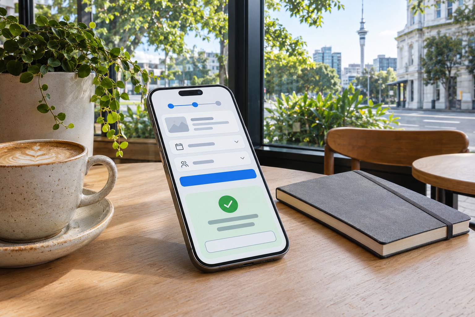

Responsive design adapts layout, content and controls to available screen space. A service page may place contact details beside its description on desktop and stack them above a form on mobile. Visitors should still find the service and complete the same task.
For businesses and organisations in Aotearoa New Zealand, the real design challenge is not fitting a desktop page onto a smaller display. It is protecting the tasks people came to complete: checking opening hours, finding a local service, comparing products, booking an appointment or accessing public information. Screen size is one constraint; touch input, browser zoom, slower connections, readable text and clear content hierarchy matter just as much.
What Is Responsive Web Design?
Responsive web design (RWD) is an approach in which a website's interface responds to the dimensions and capabilities of the user's viewing environment. A responsive website uses flexible layouts, scalable media and CSS rules rather than assuming a fixed desktop width. Its foundations are commonly described as fluid grids, flexible images and media queries , the combination popularised by web designer Ethan Marcotte in 2010.
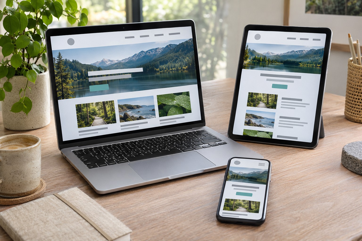
A responsive page normally serves the same URL and underlying HTML to mobile and desktop users. CSS changes the presentation: columns can become a single column, navigation can use a compact control, and images can occupy a different portion of the screen. The result does not have to look identical everywhere. It needs to preserve meaning and functionality wherever the interface is used.
Responsive design is a method, not a particular framework or template. A site built with custom HTML and CSS, WordPress, Shopify or another content management system can be responsive. The theme or platform does not, by itself, guarantee accessible controls, fast loading or usable forms.
Responsive, Mobile-First and Adaptive Layouts
These terms describe different choices and should not be treated as synonyms.
| Approach | How it works | Best fit and trade-off |
|---|---|---|
| Responsive design | Flexible layouts adapt continuously, with breakpoints where the design needs a structural change. | Strong default for content sites, online shops and service websites; still requires careful testing. |
| Mobile-first design | The smallest practical layout and essential tasks are designed first, with enhancements added as space increases. | A design strategy that works with responsive CSS; helps expose unnecessary content and interaction complexity early. |
| Adaptive design | Several predefined layouts are selected for particular width ranges or contexts. | Useful when a specialised interface needs distinctly different arrangements; maintaining multiple layouts adds work. |
| Separate mobile site | A desktop site and a mobile site use different URLs or separately maintained experiences. | Usually a legacy arrangement; content parity, redirects, analytics and ongoing maintenance need extra attention. |
Mobile-first is a starting point; responsive is a delivery approach. A desktop-heavy analytics dashboard may need a compact summary on a phone and an expansive data view on a wide monitor. A local café website has a simpler priority: hours, menu, location and bookings should remain easy to use at any width. Neither scenario is solved by shrinking every element proportionally.
How Responsive Design Works
Fluid grids and flexible layouts
A fluid grid allocates space using proportions and constraints rather than fixed-width columns. CSS Grid handles page structure and multi-column arrangements; Flexbox is particularly useful for one-dimensional groups such as navigation, buttons and card content. Relative units including
%
,
rem
,
em
and
fr
allow elements to respond to their container and text settings.
A card layout can create as many columns as the available width allows without matching a specific phone model:
.card-grid {
  display: grid;
  grid-template-columns: repeat(auto-fit, minmax(min(100%, 16rem), 1fr));
  gap: 1.25rem;
}
The
minmax()
and
auto-fit
functions keep cards flexible. A sensible
max-width
on the main content container also prevents very long lines on large screens. Long product names, URLs and user-generated content still need testing because intrinsic content size can break an otherwise flexible grid.
Media queries and content-led breakpoints
CSS media queries change styles when viewport features meet a condition. The points at which the layout changes are called breakpoints . They should be chosen when the content stops fitting comfortably, not solely because a popular device happens to be a certain width.
.page-layout {
  display: grid;
  grid-template-columns: 1fr;
  gap: 1.5rem;
}

@media (min-width: 48rem) {
  .page-layout {
    grid-template-columns: minmax(0, 2fr) minmax(0, 1fr);
  }
}
The narrow layout works before the media query is applied. Wider screens receive a two-column arrangement when sufficient room exists. Relative breakpoint units also respond more appropriately to text-sizing preferences than a collection of device-specific pixel values. Portrait and landscape orientation can be checked, but a design should not rely on orientation alone to determine whether the user has enough space.
Container queries for reusable interface components
A media query considers the viewport. A CSS container query responds to space inside a component's parent container. This is useful when the same product card appears in a wide catalogue, a narrow sidebar and a search-results panel. Each copy can change layout as its available space changes, even when the browser width stays the same.
.card-region {
  container-type: inline-size;
}

@container (min-width: 30rem) {
  .product-card {
    display: grid;
    grid-template-columns: 10rem minmax(0, 1fr);
    gap: 1rem;
  }
}
Container queries complement rather than replace media queries. Viewport rules remain appropriate for the page-wide layout; container rules keep reusable components from depending on where they are placed.
Responsive images, video and typography
An image must fit its container and use a suitable file for the user's screen.
max-width: 100%
prevents a large image from overflowing its column. The HTML
srcset
and
sizes
attributes allow a browser to choose an appropriate image resource, while the
<picture>
element supports art direction when a narrow screen needs a different crop. WebP and AVIF can reduce transfer size when suitable fallback formats are considered.
Image
width
and
height
attributes, or an appropriate CSS
aspect-ratio
, reserve space before the file arrives. Below-the-fold images can use lazy loading. A prominent hero image that determines
Largest Contentful Paint
should not be delayed indiscriminately. Video players, maps, embeds and data visualisations also need bounded widths and a usable small-screen presentation.
Type must scale without becoming too small to read or excessively large on desktop displays. A fluid heading can use
font-size: clamp(1.75rem, 3vw, 3rem)
. Body text needs comfortable line height, adequate contrast and a readable measure. A responsive type system should survive browser text enlargement, content written in te reo Māori, long place names and translations without clipping labels or controls.
The viewport setting
A mobile browser needs the correct viewport configuration to interpret CSS layout widths as intended. In the document head, the usual setting is:
<meta name="viewport" content="width=device-width, initial-scale=1">Disabling pinch zoom with restrictive viewport settings creates an accessibility barrier. The layout itself must tolerate enlargement rather than prevent visitors from using it.
Design for the Task, Not Just the Screen
Responsive interface planning starts with content priority . A visitor on a phone may be standing outside a shop, travelling between appointments or using a device with limited bandwidth. The same person may return later on a laptop to compare detailed specifications. The required information does not change; its order and presentation can.
Navigation and information architecture
Primary navigation needs clear labels, predictable hierarchy and an operable menu control. A hamburger icon is not sufficient on its own: the control needs an accessible name, an accurate expanded state, keyboard operation and visible focus. Dropdowns that work only on hover fail for touch input and many keyboard users. Search, breadcrumbs and internal links should remain usable when a large desktop navigation bar collapses.
A compact interface should not remove vital pages or make users guess where the contact, delivery or returns information went. Disclosures and accordions can reduce visual clutter, provided their controls work and the content remains available.
Forms and checkout
Enquiry, booking and checkout forms are common points of mobile friction. Labels should remain visible, validation messages should identify the field and the remedy, and the on-screen keyboard should match the input. An email field can use
type="email"
; a phone field can use
type="tel"
;
autocomplete
can reduce repeated typing. Avoid unnecessarily splitting a short form into many screens.
Fixed bottom bars, cookie notices and chat widgets need special care: they can obscure a submit control or a validation message after the mobile keyboard opens. A form that looks correct in a screenshot can still be difficult to finish.
New Zealand use cases
On a tradesperson?s site, put service area, hours and contact options before the portfolio. A retailer needs usable variants, stock, delivery, returns and payment details without horizontal scrolling. Public information must keep eligibility and forms accessible, including on slow connections.
These are content and interaction decisions, not separate designs for separate cities. Analytics and usability testing should establish the actual priorities of each audience rather than relying on assumptions about what all mobile visitors want.

Responsive Design and Accessibility
A page is not accessible simply because its columns stack on a phone. People use keyboard navigation, screen readers, voice input, browser zoom, high contrast settings and text enlargement. Responsive design must preserve content and functionality across those conditions.
WCAG 2.2 Reflow requires most content to work at 320 CSS pixels without loss or unnecessary two-way scrolling; 1280px at 400% zoom is one check. Complex tables and maps have exceptions. W3C explanation of reflow
Touch targets also need sufficient area or spacing. WCAG 2.2 Level AA criterion 2.5.8 sets a minimum target size of 24 × 24 CSS pixels , subject to specific exceptions; larger targets can make mobile interfaces more comfortable. Legible labels, keyboard focus visibility, sensible reading order, descriptive alternative text, colour contrast and controls that do not depend on hover remain essential.
In New Zealand, the NZ Government Web Accessibility Standard 1.2 requires WCAG 2.2 Level AA for the government organisations within its scope, effective from 17 March 2025. That public-sector requirement should not be described as an identical legal obligation for every private business. WCAG remains a useful technical benchmark for commercial websites as well.
A responsive accessibility review needs real interaction testing: tab through the interface, activate menus without a mouse, increase text size, zoom, inspect screen-reader labels and check whether sticky elements hide focus. Automated scans identify some defects, but they cannot establish whether the whole task makes sense to a user.
Performance, Core Web Vitals and SEO
Responsive layouts and fast websites are related but distinct. A page can fit beautifully on a phone while downloading oversized images, executing heavy JavaScript and shifting content during loading. Performance deserves its own engineering budget.
Google's Core Web Vitals give three complementary measures of real-user experience:
| Metric | What it measures | Good threshold |
|---|---|---|
| Largest Contentful Paint (LCP) | When the largest visible content element renders | 2.5 seconds or less |
| Interaction to Next Paint (INP) | Responsiveness to user interactions | 200 milliseconds or less |
| Cumulative Layout Shift (CLS) | Unexpected movement of visible content | 0.1 or less |
These thresholds are evaluated at the 75th percentile of field measurements. The Core Web Vitals definitions distinguish loading, interaction and visual stability; a successful responsive layout does not automatically pass any of them.
Effective optimisations include selecting appropriately sized image assets, reserving dimensions for media, avoiding needless third-party scripts, reducing blocking resources and keeping interaction handlers lightweight. Lazy loading is useful for offscreen resources, not for content a visitor needs immediately. A responsive navigation component should remain quick to open even on a mid-range Android device.
What responsive design changes for Google Search
Google uses the mobile version of a site's content for mobile-first indexing . It recommends responsive design because one URL and the same underlying HTML are comparatively straightforward to maintain. An alternative configuration can still be indexed, but serving different mobile and desktop content introduces extra opportunities for inconsistency.
Important headings, body content, internal links, images, structured data and metadata should be available to mobile users and crawlers. An accordion may change how information is displayed without removing that information from the page. Responsive design is not a ranking guarantee, a replacement for useful content or a substitute for crawlable navigation. Google's mobile-first indexing guidance sets out the configuration and content-parity considerations.
For a New Zealand business, search visibility is only one part of the outcome. A local landing page also needs accurate location details, clear services, relevant contact information and a form or telephone interaction that actually works on mobile.
Responsive Design Mistakes and How to Diagnose Them
| Problem | Underlying cause | Useful check or remedy |
|---|---|---|
| Horizontal scrolling on a phone | Fixed-width media, oversized grid tracks, long strings or third-party widgets | Inspect the overflowing element at narrow widths; apply flexible constraints and test unbroken text. |
| Tiny links and hard-to-tap controls | Desktop spacing retained on a touch layout | Check target size, gaps, focus and tap accuracy on a physical phone. |
| Unreadable text | Small type, long lines, low contrast or restricted zoom | Test text enlargement, contrast and a 320 CSS pixel equivalent viewport. |
| Missing information on mobile | Content hidden to simplify the interface | Compare key tasks and content between mobile and desktop; keep essential information available. |
| Slow mobile loading | Oversized images, blocking scripts or unnecessary widgets | Review mobile field data and inspect LCP resources and JavaScript costs. |
| Jumping buttons and images | Unreserved media space or late-loading content | Set dimensions, review font loading and monitor CLS. |
| Menu or form failure | Hover-only interactions, overlays or keyboard obstruction | Use keyboard, touch and screen-reader testing; finish a real task end to end. |
One common shortcut deserves special attention: hiding desktop components with
display: none
can make the page appear cleaner without reducing the data already downloaded. A smaller layout is not necessarily a smaller page. Likewise, placing a wide table inside an separately scrollable region can preserve essential data, but the scroll region still needs an accessible label, visible affordance and keyboard access.
A Reliable Responsive Design Workflow
- Map the audience and tasks. Identify top journeys using site analytics, customer enquiries and observed behaviour. Distinguish discovering information from completing an enquiry, checkout or application.
- Audit content and components. List headings, navigation items, cards, tables, media, forms, filters and third-party embeds. Decide which items must remain available at every width.
- Design a small-screen content hierarchy. Use realistic copy, product names and validation messages. Sketch a mobile-first wireframe before expanding to tablet and desktop.
- Build flexible foundations. Use semantic HTML, Grid, Flexbox, relative dimensions and constrained media. Add breakpoints when the content requires them; use container queries for reusable components.
- Make interaction and accessibility explicit. Implement working menu states, labels, focus order, pointer targets and error recovery. Apply progressive enhancement so essential content does not depend unnecessarily on advanced scripts.
- Optimise transfer and rendering. Prepare responsive image variants, set dimensions, manage fonts and remove nonessential JavaScript. Check critical content before adding decorative effects.
- Test and monitor. Cover real browsers, devices, zoom settings and user journeys. Revisit the design after content edits, plugin updates and new interface components.
Browser developer tools in Chrome, Firefox and Safari can simulate many viewport sizes and inspect computed CSS. Chrome DevTools helps identify overflow and responsive breakpoints; Lighthouse and PageSpeed Insights reveal performance and some accessibility issues; Google Search Console helps monitor indexing and search performance. Device emulation is a diagnostic aid, not proof that the experience works on actual iOS and Android hardware.
How to Judge Whether a Responsive Website Is Working
Measure outcomes tied to the task: completed checkouts and payment errors for a shop; qualified enquiries and tap-to-call success for a service; task completion and barriers for public information. Visual consistency alone is not a success measure.
A useful acceptance test covers a narrow phone, a mid-sized tablet, a wide desktop, 200% text enlargement, a 320 CSS pixel equivalent viewport and keyboard-only operation. The key content should remain present, images should not cause page-level overflow, and the primary task should be possible from beginning to end. Repeat the same test with real copy and controls.
Compare mobile and desktop performance with a shared set of tasks, then segment results by template and device rather than relying on a single site-wide score. A pricing table, product filter or checkout step can fail even when the homepage appears responsive. Track the fix against a relevant metric, and verify that a faster or shorter interface has not removed information users need to make a sound decision.
Frequently Asked Questions
Can WordPress or Shopify Sites Be Made Responsive?
A suitable theme and targeted CSS or component changes may resolve many layout problems. Custom templates, old plugins, oversized media and complicated checkout extensions can require deeper work. The decision should follow a template-by-template audit of content, accessibility, performance and conversion paths rather than a theme label alone.
Should mobile users see less content than desktop users?
They can see a different arrangement and a more focused initial view, but essential facts and functions should remain available. Reordering, grouping and accessible disclosures are safer than deleting key product information, service conditions, internal links or form instructions from the mobile experience.
The Standard to Aim For
A responsive website succeeds when people can complete the same important tasks across different screens, input methods and viewing conditions. Flexible CSS provides the mechanics; meaningful content order, accessibility, efficient assets and real-device testing make those mechanics useful. For New Zealand websites, that standard applies equally to local services, online retail, community information and digital public services.